ggplot的geom_tile,如何去除垂直白线?

4

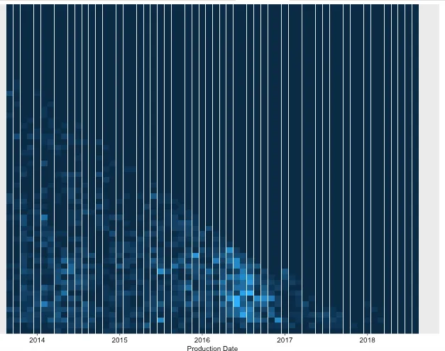
我有以下代码可以获取下面的附加图像,现在我正在寻找一种方法来消除那些白色条纹,或者至少使每行和每列的样式一致。是否有办法实现这个目标?(同时,这些白条纹是由什么引起的?)

ttfCountCompleted <- tibble(`Production Date` = c(rep(as.Date("2013-09-01"),4), rep(as.Date("2013-10-01"),4), rep(as.Date("2013-11-01"),4) ),
                        `Months in Service` = c(rep(1:4,3)),
                        `nServ` = 1:12)

textcol <- "black"
ggplot(ttfCountCompleted, 
       aes(x = `Production Date`, 
           y = `Months in Service`,
           fill=`nServ`
       )
)+ 
  geom_tile()+
  #remove extra space
  scale_y_discrete(expand=c(0,0))+
  #set base size for all font elements
  theme_grey(base_size=10)+
  theme(
    #remove legend title
    legend.title=element_blank(),
    #remove legend margin
    legend.spacing = grid::unit(0,"cm"),
    #change legend text properties
    legend.text=element_text(colour=textcol,size=7,face="bold"),
    #change legend key height
    legend.key.height=grid::unit(0.8,"cm"),
    #set a slim legend
    legend.key.width=grid::unit(0.2,"cm"),
    #set x axis text size and colour
    axis.text.x=element_text(size=10,colour=textcol),
    #set y axis text colour and adjust vertical justification
    axis.text.y=element_text(vjust = 0.2,colour=textcol),
    #change axis ticks thickness
    axis.ticks=element_line(size=0.4),
    #change title font, size, colour and justification
    #remove plot background
    plot.background=element_blank(),
    #remove plot border
    panel.border=element_blank())

enter image description here,


1
当寻求绘图帮助时,如果您提供一些示例数据,那将会更容易让我们运行和测试代码。此外,您为什么还标记了"shiny"呢? - MrFlick
好的,我现在会生成示例数据。我不知道是什么导致了这些行,所以我认为提供完整的上下文可能是相关的(如果问题仍然存在,我可以在没有闪亮效果的情况下进行检查并删除标签)。 - ozgeneral
可能重复:https://dev59.com/aanka4cB1Zd3GeqPRaaK - MrFlick
请查看编辑。(@MrFlick size=0.6或类似值并没有解决它) - ozgeneral
1个回答

2

我认为这与您的日期格式和日期刻度有关。我将其转换为因子,它们似乎可以正常工作:

ttfCountCompleted <- ttfCountCompleted %>% mutate(month = factor(months(`Production Date`)))

textcol <- "black"
ggplot(ttfCountCompleted, 
       aes(x = month, 
           y = `Months in Service`,
           fill=`nServ`
       )
)+ 
  geom_tile(color=NA)+
  #remove extra space
  scale_y_discrete(expand=c(0,0))+
  #set base size for all font elements
  theme_grey(base_size=10)+
  theme(
    #remove legend title
    legend.title=element_blank(),
    #remove legend margin
    legend.spacing = grid::unit(0,"cm"),
    #change legend text properties
    legend.text=element_text(colour=textcol,size=7,face="bold"),
    #change legend key height
    legend.key.height=grid::unit(0.8,"cm"),
    #set a slim legend
    legend.key.width=grid::unit(0.2,"cm"),
    #set x axis text size and colour
    axis.text.x=element_text(size=10,colour=textcol),
    #set y axis text colour and adjust vertical justification
    axis.text.y=element_text(vjust = 0.2,colour=textcol),
    #change axis ticks thickness
    axis.ticks=element_line(size=0.4),
    #change title font, size, colour and justification
    #remove plot background
    plot.background=element_blank(),
    #remove plot border
    panel.border=element_blank())

可以了,非常感谢!顺便说一下,示例是我实际拥有的东西的缩小版本,所以 month = factor(months(... 一年后就不起作用了,这就是为什么我最终只使用因子并手动选择 x 轴断点的原因。 - ozgeneral
@ÖzgenEren 我猜想可能是这种情况,很高兴你找到了解决方案。 - Chris

网页内容由stack overflow 提供, 点击上面的
可以查看英文原文,
原文链接