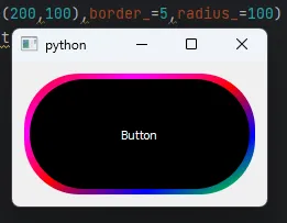
这可能对你有帮助,虽然有点晚但可能对其他人有帮助。
import sys
from PyQt5.QtCore import pyqtSignal
import sys
from PyQt5.QtWidgets import QApplication, QPushButton, QVBoxLayout,
QWidget, QFrame
class StyledButton(QFrame):
clicked = pyqtSignal()
def __init__(self, parent=None, size_=(150, 50), border_=3,
radius_=10):
super().__init__(parent)
self.size_ = size_
self.border_ = border_
self.radius_ = radius_
self.init_ui()
def init_ui(self):
if self.size_ is not None:
self.setFixedSize(self.size_[0] + (self.border_ * 2), self.size_[1] + (self.border_ * 2))
self.setFrameStyle(QFrame.Box | QFrame.Plain)
self.setStyleSheet(f"border-radius: {self.radius_}px;")
gradient_style = f"border: none; border-radius: {self.radius_ * 0.5}px; background: qlineargradient(x1: 0, y1: 0, x2: 1, y2: 1, stop: 0 #f00, stop: 0.25 #f0f, stop: 0.5 #f00, stop: 0.75 #00f, stop: 1 #0f0);"
self.setStyleSheet(gradient_style)
self.button = QPushButton('Button')
self.button.setFixedSize(self.size_[0], self.size_[1])
self.button.setStyleSheet('background-color: black; color: white;')
self.layout = QVBoxLayout(self)
self.layout.setContentsMargins(self.border_, self.border_, self.border_, self.border_)
self.layout.addWidget(self.button)
self.button.clicked.connect(self.emit_custom_signal)
def emit_custom_signal(self):
self.clicked.emit()
def fun():
print("Button is clicked")
def main():
app = QApplication(sys.argv)
layout = QVBoxLayout()
combined_widget = StyledButton()
combined_widget1 = StyledButton()
combined_widget1.button.setStyleSheet('background-color: green; color: red;')
combined_widget2 = StyledButton()
combined_widget3 = StyledButton()
combined_widget.clicked.connect(fun)
layout.addWidget(combined_widget)
layout.addWidget(combined_widget1)
layout.addWidget(combined_widget2)
layout.addWidget(combined_widget3)
window = QWidget()
window.setLayout(layout)
window.show()
sys.exit(app.exec_())
if __name__ == "__main__":
main()
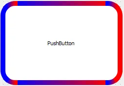
带有渐变的圆形按钮
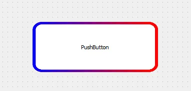
带有渐变的圆形按钮