浏览器忽略了meta name="viewport"标签吗?

8

以前在 <HEAD> 中它是这样的

<meta name="viewport" content="width=device-width, initial-scale=1.0"/>

如您所见,我在下面附上的屏幕截图中遇到了UI破裂问题。因此,我已经更新了<HEAD>标签,并添加了以下代码。

<meta http-equiv="Content-Type" content="text/html; charset=UTF-8" />
<meta name="viewport" content="width=device-width; initial-scale=0.9; maximum-scale=0.9; minimum-scale=0.9;" />

但问题仍然存在

网页在分辨率为1280 X 800时运作良好,您可以查看此图片

enter image description here

这三列(由黑色垂直线分隔)是在一个固定宽度的容器中的<td>,由于某些限制,我无法将其更改为%。只有主容器的宽度为100%,(主容器:在所有页面内容后面具有全页宽度-白色背景)。
我已经附上了屏幕分辨率问题的截图。
1024 X 768

enter image description here

您可以看到,在分辨率为1024 X 768的浏览器上,“移动图片”超出了白色框(主容器)。

1920 X 1080上。

enter image description here

这里的浏览器比例是1920 X 1080,主容器(白色框)的宽度为100%,但是那三列(<TD>)不是,所有三列的宽度保持与之前的图像相同,而主容器则为100%。 更新:代码链接 https://jsfiddle.net/p6x6jsgt/3/

1
你的CSS在哪里? - Justinas
链接无法访问。不过,容器是表格吗?那么 width 属性将被视为 min-width;如果有更多的内容,表格会自适应宽度以适应内容。 - Mr Lister
寻求代码帮助的问题必须在问题本身中包含最短的代码以便复现,最好使用Stack Snippet。请参阅如何创建一个最小、完整和可验证的示例 - Paulie_D
问题是由于您的固定宽度引起的。如果将宽度更改为百分比,会有什么问题? - SESN
第一列包含同一移动预览的2-3个缩小版本(右侧),中间列包含一个较大的版本。因此,我已经相应地设置了字体大小...以便在所有3列中换行应该相同这就是为什么我不能分配%值,如果我这样做,3个位置的换行将不同,然后无法控制所有列中文本块的外观。 - Chandrakant
为什么你在2016年还在使用表格进行布局? - Aziz
5个回答

7
问题不在于你的meta viewport标签。在阅读了所有评论后,以下是解决你问题的几个方案:
一个非最优的解决方案: 保持表格布局,改为使用百分比宽度,并使用具有 "white-space: nowrap;" 和 "
" 硬编码换行符的文本块,具体字体大小根据设备屏幕大小而定。
- 关于布局: 
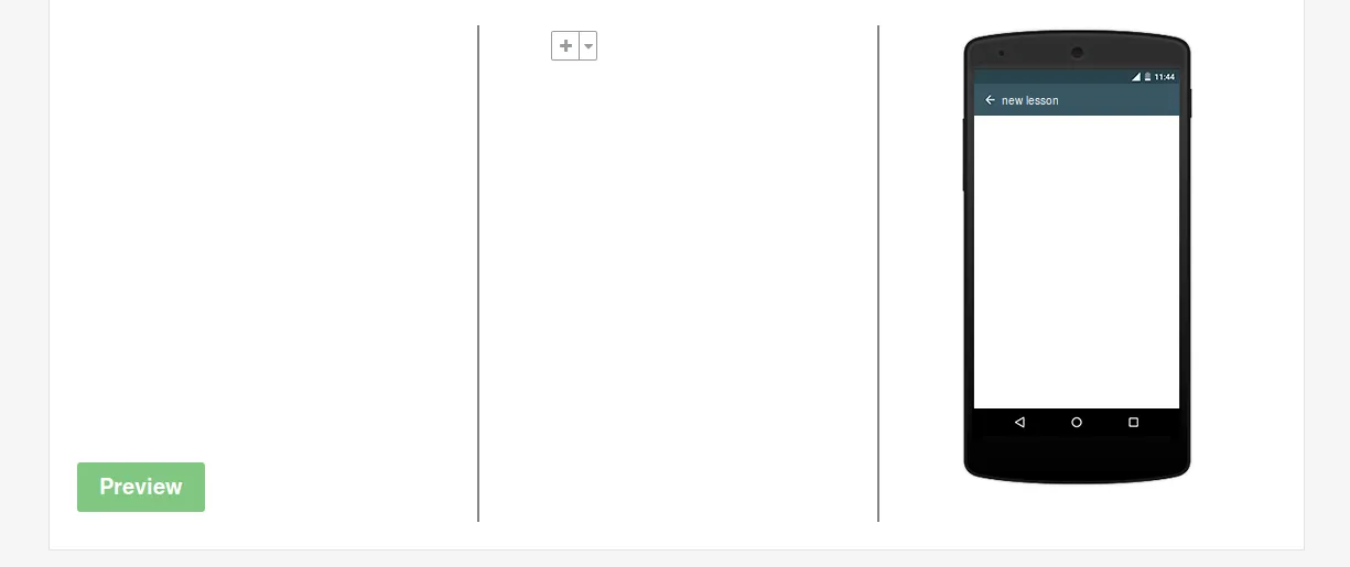
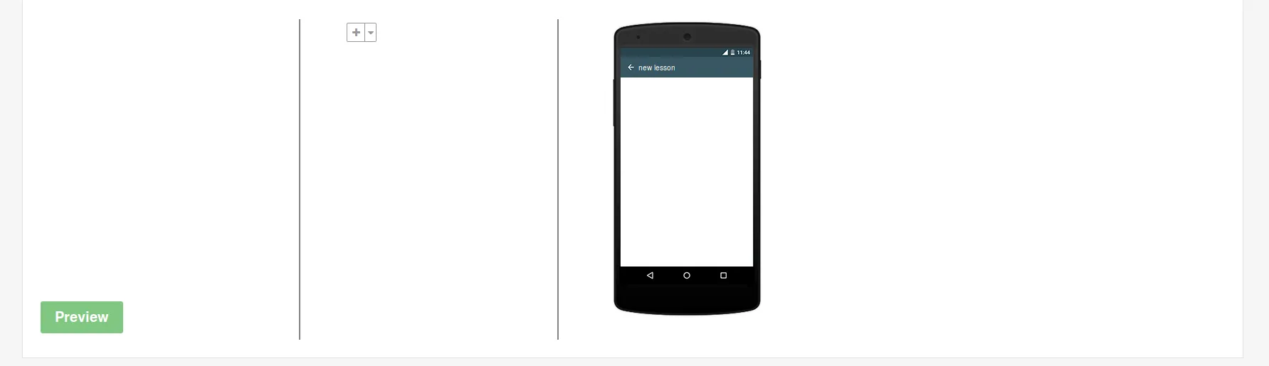
你的 ".preview-panel" 在 "rem" 中具有固定宽度。要解决这个问题,做出以下更改:
.preview-panel {
    background-size:100% auto;
    width:100%;
}

现在你会注意到其他 td 存在布局问题。这是因为你必须将它们设置为百分比宽度,例如:

.template-editor {
    width:100%;
}
.template-editor td {
    width:33%;
}

- 关于文本块:

你说将宽度设为百分比会破坏你的文本块。很不幸,这没有什么神奇的解决方案,你唯一能做的(在当前布局下)就是在放置任何文本块时添加以下内容:

.foo {
    white-space:nowrap;
}

您还需要使用<br>修复您的换行,如下所示:
Lorem ipsum dolor sit amet,<br>
consectetur adipiscing elit.<br>
Fusce pulvinar aliquet luctus.

如果您愿意,可以使用以下代码(HTML)使换行符具有响应性:

<span class="line-break"></span>

(CSS):

.line-break {
    display:block;
}

然后您就可以在媒体查询中设置不同的字体大小,并且还可以使用 display:none; 隐藏有目的的换行符。我认为,这比传统的 <br> 更好。

通过这种方式,您的布局应该在所有设备上都会更好。话虽如此,这仍然是一种不太好的解决方案,我认为需要完全不同的方法。

更好的解决方案:

当您的布局本质上不是表格时,请使用 flex 或可能只是浮动项,而不是 table。您有三个面板,为什么要强制使用表格布局呢?以下是一个使用 flex 的示例:

.container {
  display:flex;
  align-items:stretch;
  justify-content:center;
}
.container__panel {
  flex-grow:1;
  height:600px;
  border:1px solid black;
}
<div class="container">
  <div class="container__panel"></div>
  <div class="container__panel"></div>
  <div class="container__panel"></div>
</div>

免责声明:奇怪的container__panel是BEM符号表示法:http://getbem.com/introduction/


您IP地址为143.198.54.68,由于运营成本限制,当前对于免费用户的使用频率限制为每个IP每72小时10次对话,如需解除限制,请点击左下角设置图标按钮(手机用户先点击左上角菜单按钮)。 - Chandrakant
然后您可以添加 position:absolute;,这样文本就不会换行,而是保持原样。 - fnune

4

添加

td{
    width: 33%;
}

为了平均分配列宽,

请从以下类中删除 width css,以便它可以根据父类调整宽度(我已经注释了要从css中删除的代码)

  #cardListHolder {
        padding-top: 0.4375rem;
        /*width: 21.5625rem;*/
    }

 .edit-card .inner {
        margin: auto;
        padding: 0 2.1875rem;
    /*  width: 18.75rem;*/
    }
.preview-panel {
        background: rgba(0, 0, 0, 0) url("http://cdnsq.ur-nl.com/assets/mobile-898fc89b167945138c3d9f551a5ce551.png") no-repeat scroll center 0;
        height: 26.25rem;
        margin: auto;
        padding: 3.4375rem 0.8125rem 0;
     /* width: 13.3125rem;*/
    }

尝试使用您自己的CSS替换整个CSS。我希望这可以解决您的问题。

    *,
    *::before,
    *::after {
        box-sizing: border-box;
    }

    ul {
        list-style: outside none none;
        margin: 0;
    }

    .sectional-content {
        background: #f6f6f6;
        color: #222;
        cursor: auto;
        font-family: "Helvetica Neue", Helvetica, Roboto, Arial, sans-serif;
        font-style: normal;
        font-weight: normal;
        line-height: 1.5;
        margin: 0;
        padding: 0;
        position: relative;
    }

    .wrapper {
        min-height: 100%;
        position: relative;
    }

    .centered-container {
        margin-left: auto;
        margin-right: auto;
        width: 96.6667%;
        padding-left: 0.3125rem;
        padding-right: 0.3125rem;
        position: relative;
    }

    .tabs-content {
        background: #fff none repeat scroll 0 0;
        border: 1px solid red;
        margin-top: -1px;
        padding: 1.5625rem;
        margin-bottom: 0;
        width: 100%;
    }

    .divider1 {
        height: 18px;
    }

    .template-editor {
        background: #fff none repeat scroll 0 0;
        border: 0 none;
        margin-bottom: 1.25rem;
        table-layout: auto;
    }

    .template-editor tr {
        background: transparent none repeat scroll 0 0 !important;
    }

    td{
        width: 33%;
    }

    .add-remove-template,
    .edit-card {
        padding-top: 5px !important;
        vertical-align: top;
    }

    .add-remove-template {
        border-left: 0 none;
        padding-left: 0 !important;
        padding-right: 0 !important;
        vertical-align: top;
    }

    table tr th,
    table tr td {
        color: #222;
        font-size: 0.875rem;
        padding: 0.5625rem 0.625rem;
        text-align: left;
    }

    #cardListHolder {
        padding-top: 0.4375rem;
    }

    .preview-template,
    .edit-card {
        border-left: 2px solid #808285;
        padding: 0 1.875rem !important;
        vertical-align: top;
    }

    .edit-card .inner {
        margin: auto;
        padding: 0 2.1875rem;
    }

    .preview-panel {
        background: rgba(0, 0, 0, 0) url("http://cdnsq.ur-nl.com/assets/mobile-898fc89b167945138c3d9f551a5ce551.png") no-repeat scroll center 0;
        height: 26.25rem;
        margin: auto;
        padding: 3.4375rem 0.8125rem 0;
    }

你不应该只是粘贴代码答案并说“用这个替换”。解释有何不同,帮助发帖人理解已更改的内容以及原因将非常有帮助。 - Lee
1
我已经在答案中添加了解释,希望能对你有所帮助。 - Hamza Dairywala

2
我认为您需要的是这样一种方法,它可以在任何分辨率下自适应。

.section {
  box-sizing: border-box;
  padding: 0 16px;
  width: 33%;
  float: left;
}
.scroll-container {
  height: 360px;
  overflow-y: auto;
  border-right: 1px solid black;
}
.edit-card {
  height: 360px;
  border-right: 1px solid black;
}
.preview-panel img {
  width: 100%;
  max-width: 250px;
}
<div class="content">
  <div class="section scroll-container" style="height: 360px">
    <ul id="cardListHolder">
      <li></li>
    </ul>
  </div>
  <div class="section edit-card">
    <p>
    edit something
    </p>
  </div>
  <div class="section preview-panel">
    <img src="http://cdnsq.ur-nl.com/assets/mobile-898fc89b167945138c3d9f551a5ce551.png"/>
  </div>
</div>


我可以更改CSS,但是无法更改我的HTML布局..抱歉。 - Chandrakant

1
可能在这里忽略了…… 你尝试过使用媒体查询来解决这个问题吗? 看看这个链接是否有用。 https://developers.google.com/web/fundamentals/design-and-ui/responsive/fundamentals/use-media-queries?hl=zh-cn 当然,这意味着需要更多的编码才能使其流畅运行,并且需要进行更改。
你是否也在css中使用了text-align:center;属性对列中的文本段落进行居中对齐,而不是“完美地设置”以正确对齐所有三列,然后当然删除/设置空白处。
从我所看到的,我认为这可能可以解决你的问题。

1

移除你已经定义的宽度

,保留HTML,不要解释。
#cardListHolder {
padding-top: 0.4375rem;
width: 21.5625rem;

}

and in

.edit-card .inner {
margin: auto;
padding: 0 2.1875rem;
width: 18.75rem;

}

和使用

th,td{
width: 33%;

}

<!doctype html>
<html>
<head>
<meta name="viewport" content="width=device-width, initial-scale=1.0"/>
<style>
 *, *::before, *::after {
    box-sizing: border-box;
}
ul {
    list-style: outside none none;
    margin: 0;
}
.sectional-content{
      background: #f6f6f6;
    color: #222;
    cursor: auto;
    font-family: "Helvetica Neue",Helvetica,Roboto,Arial,sans-serif;
    font-style: normal;
    font-weight: normal;
    line-height: 1.5;
    margin: 0;
    padding: 0;
    position: relative;

}
.wrapper {
    min-height: 100%;
    position: relative;
}
.centered-container{
   margin-left: auto;
    margin-right: auto;
width: 96.6667%;
padding-left: 0.3125rem;
    padding-right: 0.3125rem;
    position: relative;
}
.tabs-content {
    background: #fff none repeat scroll 0 0;
    border: 1px solid red;
    margin-top: -1px;
    padding: 1.5625rem;
     margin-bottom: 0;
    width: 100%;
}
.divider1{
  height: 18px;
}
 .template-editor {
    background: #fff none repeat scroll 0 0;
    border: 0 none;
    margin-bottom: 1.25rem;
    table-layout: auto;
}
.template-editor tr {
    background: transparent none repeat scroll 0 0 !important;
    position:relative;
}
.add-remove-template, .edit-card {
    padding-top: 5px !important;
    vertical-align: top;
}
.add-remove-template {
    border-left: 0 none;
    padding-left: 0 !important;
    padding-right: 0 !important;
    vertical-align: top;
}
table tr th, table tr td {
    color: #222;
    font-size: 0.875rem;
    padding: 0.5625rem 0.625rem;
    text-align: left;
}
#cardListHolder {
    padding-top: 0.4375rem;
    
}
.preview-template, .edit-card {
    border-left: 2px solid #808285;
    padding: 0 1.875rem !important;
    vertical-align: top;
}
.edit-card .inner {
    margin: auto;
    padding: 0 2.1875rem;
    
}
.preview-panel {
    background: rgba(0, 0, 0, 0) url("http://cdnsq.ur-nl.com/assets/mobile-898fc89b167945138c3d9f551a5ce551.png") no-repeat scroll center 0;

    height: 26.25rem;
    margin: auto;
    padding: 3.4375rem 0.8125rem 0;
    width: 13.3125rem;
}

th,td{
 width: 33%;
}
</style>
</head>
<body>
<div class="sectional-content"> 
  <div class="wrapper">
      <div class="centered-container">
          <div class="tabs-content">
            <div class="divider1"></div>

            <table class="template-editor" cellpadding="0" cellspacing="0">

              <tbody>
                <tr>
                  <td class="add-remove-template">
                    <div class="scroll-container" style="height: 360px">
                      <ul id="cardListHolder">
                        <li></li>
                      </ul>
                    </div>
                  </td>
                  <td class="edit-card">
                    <div class="inner">
                      
                    </div>
                  </td>
                  <td class="preview-template">
                    <div class="preview-panel">
                     
                    </div>
                  </td>
                </tr>
              </tbody>
            </table>

          </div>
        </div>
      </div>
   </div>
   </body>
   </html>


仍然存在同样的问题!在更大的屏幕上右侧有更多的空白。 - Chandrakant

网页内容由stack overflow 提供, 点击上面的
可以查看英文原文,
原文链接