考虑到
文档中的示例也存在相同的问题,这表明解决这个问题并不容易。
看起来你需要接受自动标签,使用
manual放置或者亲自动手解决。
为了达成妥协,我建议尝试以下两种方法。两种方法都是基于让
matplotlib为你推荐标签位置,然后再处理那些距离轴线太近的标签。
较为简单且更为安全的方法是,直接去掉那些靠近边界的
clabel,填充等高线线条。
import matplotlib
import numpy as np
import matplotlib.cm as cm
import matplotlib.mlab as mlab
import matplotlib.pyplot as plt
delta = 0.025
x = np.arange(-3.0, 3.0, delta)
y = np.arange(-2.0, 2.0, delta)
X, Y = np.meshgrid(x, y)
Z1 = mlab.bivariate_normal(X, Y, 1.0, 1.0, 0.0, 0.0)
Z2 = mlab.bivariate_normal(X, Y, 1.5, 0.5, 1, 1)
Z = 10.0 * (Z2 - Z1)
plt.figure()
CS = plt.contour(X, Y, Z)
CLS = plt.clabel(CS, inline=1, fontsize=10)
thresh = 0.05
xmin,xmax,ymin,ymax = plt.axis()
Dx = xmax-xmin
Dy = ymax-ymin
keep_labels = []
for label in CLS:
lx,ly = label.get_position()
if xmin+thresh*Dx<lx<xmax-thresh*Dx and ymin+thresh*Dy<ly<ymax-thresh*Dy:
keep_labels.append((lx,ly))
for cline in CS.collections:
cline.remove()
for label in CLS:
label.remove()
CS = plt.contour(X, Y, Z)
CLS = plt.clabel(CS, inline=1, fontsize=10, manual=keep_labels)
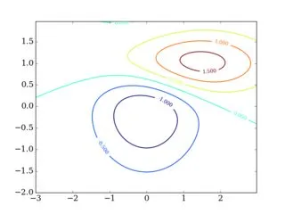
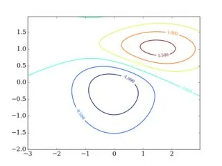
缺点是有些标签显然会丢失,当然5%的阈值需要手动调整以适应您特定的应用程序。与原始结果相比(观察顶部),以上操作的结果如下:
我提到的另一个解决方案是,取出有问题的标签,查看它们各自的
CS.collections数据的
Path,并尝试找到更靠近图形内部的点。由于将每个轮廓线路径与其多个线段配对以对应
CS.collections的单个元素并不容易,所以这可能并不值得花费所有的精力。特别是你可能会面对非常短的等高线,无法在其上放置标签,并且你还需要估算每个标签的大小。
考虑到您的情况下等高线相对简单,您也可以尝试查看每条等高线,并找到距离图形中心最近的点。因此,这里是为演示目的重构您的数据集:
X,Y = np.meshgrid(np.logspace(-3,7,200),np.logspace(13,31,200))
Z = X/Y*10**21
Vrange = range(-3,5)
V = [10**k for k in Vrange]
fmt = {lev: '$10^{%d}$'%k for (k,lev) in zip(Vrange,V)}
fig = plt.figure(figsize=(3,3))
ax = fig.add_subplot(111)
ax.set_xscale('log')
ax.set_yscale('log')
ax.set_xlabel(r'$T_e$ (eV)', fontsize=10)
ax.set_ylabel(r'$n_e$ (1/cm$^3$)', fontsize=10)
ax.set_xlim(0.1, 1e4)
ax.set_ylim(1e16, 1e28)
CS = ax.contour(X, Y, Z, V, colors='k')
ax.clabel(CS, inline=True, inline_spacing=3, rightside_up=True, colors='k', fontsize=8, fmt=fmt)
通过明确使用您的两个轴都是对数轴,主要思想是将上述最后一次调用
clabel替换为:
xmin,xmax,ymin,ymax = plt.axis()
logmid = (np.log10(xmin)+np.log10(xmax))/2, (np.log10(ymin)+np.log10(ymax))/2
label_pos = []
for line in CS.collections:
for path in line.get_paths():
logvert = np.log10(path.vertices)
logdist = np.linalg.norm(logvert-logmid, ord=2, axis=1)
min_ind = np.argmin(logdist)
label_pos.append(10**logvert[min_ind,:])
ax.clabel(CS, inline=True, inline_spacing=3, rightside_up=True, colors='k', fontsize=8, fmt=fmt, manual=label_pos)
结果(第二个)与原始值(第一个)相比:
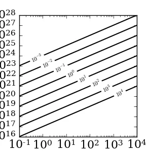
I didn't make much of an effort to make the axes annotations pretty, so please ignore these details. You can see that the labels are indeed nicely gathered near the middle of the figure. Depending on your application, this might or might not be what you want.
作为最后的说明,标签没有放置在轴对角线上是因为X轴和Y轴的缩放不同。这可能会导致一些标签仍然超出轴范围。最可靠的解决方案是考虑[xmin,ymax] - [xmax,ymin](对数)线,并找到该线与每个路径的交点。如果值得投入大量精力,那么你也可以完全手动地放置标签。