对数图中坐标轴刻度标签重叠问题

6

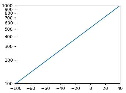
我有一些代码,在一年左右的时间里使用pyplot很好用;我使用plt.plot(x,y)制作了一个图,使用对数y轴,并将y轴刻度和刻度标签替换为以下自定义设置:

# set the axis limits
Tmin = -100  # min temperature to plot
Tmax = 40    # max temperature
Pmin = 100   # min pressure
Pmax = 1000  # max pressure
plt.axis([Tmin, Tmax, Pmax, Pmin])

# make the vertical axis a log-axis
plt.semilogy()

# make a custom list of tick values and labels
plist = range(Pmin,Pmax,100)
plabels = []
for p in plist:
    plabels.append(str(p))

plt.yticks(plist,plabels)

最近将 Python 更新到当前版本的 Miniconda 后,我发现新标签仍然出现,但在科学计数法中会被 Matplotlib 的默认标签部分覆盖。因此,看起来该代码曾经用于 替换 默认刻度和标签,但现在只是添加它们。

我需要做什么才能恢复所期望的行为?为什么它会首先发生变化?


可能是一个bug.. 只有在比例尺不是线性的情况下才会发生。 - Gerges
如果是一个错误,是否有解决方法?另外,应该在哪里报告可能的错误? - Grant Petty
请在GitHub页面上尝试。 - Gerges
2个回答

5
您遇到的问题是已知的漏洞,这是不容易修复的。问题的核心是主刻度和副刻度的混合;设置yticks会重新定义主刻度,而次刻度会导致重叠。
在问题得到修复之前的解决方法是手动禁用次刻度,使用plt.minorticks_off()(或使用面向对象API的ax.minorticks_off()):
Tmin = -100  # min temperature to plot
Tmax = 40    # max temperature
Pmin = 100   # min pressure
Pmax = 1000  # max pressure
plt.axis([Tmin, Tmax, Pmax, Pmin])

# make the vertical axis a log-axis
plt.semilogy()
plt.minorticks_off() # <-- single addition

# make a custom list of tick values and labels
plist = range(Pmin,Pmax,100)
plabels = []
for p in plist:
    plabels.append(str(p))

plt.yticks(plist,plabels)

result with minor ticks disabled: no overlaps

关于变化发生的时间:随着matplotlib 2.0的默认样式更改,它就出现了

1
也许值得一提的是,通常情况下标记轴的方式是自动执行的。根据要显示的值的范围,应用不同的设置,并且 matplotlib 样式更改到 2.0 版本为:

对于对数轴上的次刻度,当轴视图限制跨越小于或等于两个主刻度之间的间隔的范围时,现在会进行标记。

从这个意义上说,报告的行为并不是真正的 bug;它是期望的。
当涉及更改默认轴标签时,仍可以使用自动标签。使用matplotlib.ticker的定位器和格式化程序创建刻度和标签。可以通过以下方式获得所需的绘图,其中MultipleLocator每100个单位设置一个刻度,并且通过设置NullLocator关闭次刻度。要将刻度格式化为标量值而不是科学格式,可以使用ScalarFormatter
from matplotlib import pyplot as plt
import matplotlib.ticker

plt.axis([-100, 40, 100, 1000])

plt.semilogy()

plt.gca().yaxis.set_major_locator(matplotlib.ticker.MultipleLocator(100))
plt.gca().yaxis.set_minor_locator(matplotlib.ticker.NullLocator())
plt.gca().yaxis.set_major_formatter(matplotlib.ticker.ScalarFormatter())

plt.plot([-100, 40], [100, 1000])
plt.show()

enter image description here

总的来说,这个解决方案比通过 .yticks 手动设置刻度更加灵活多用。

网页内容由stack overflow 提供, 点击上面的
可以查看英文原文,
原文链接