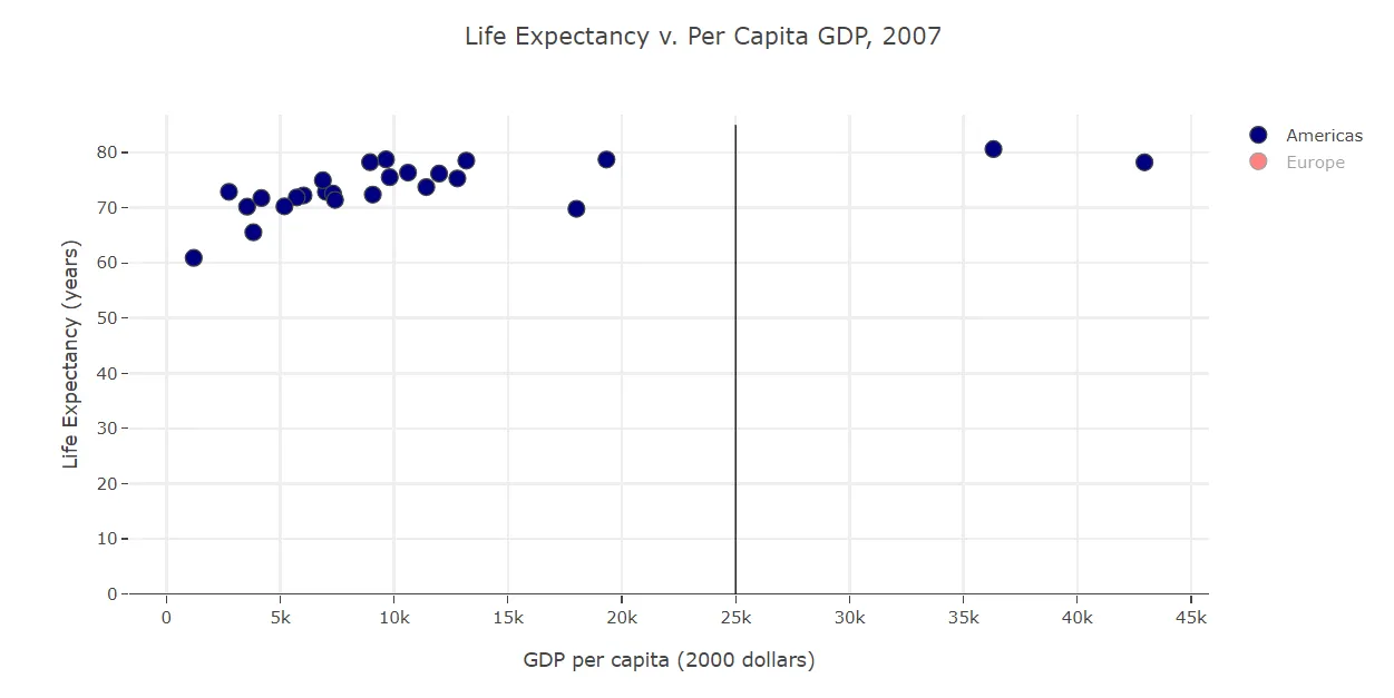
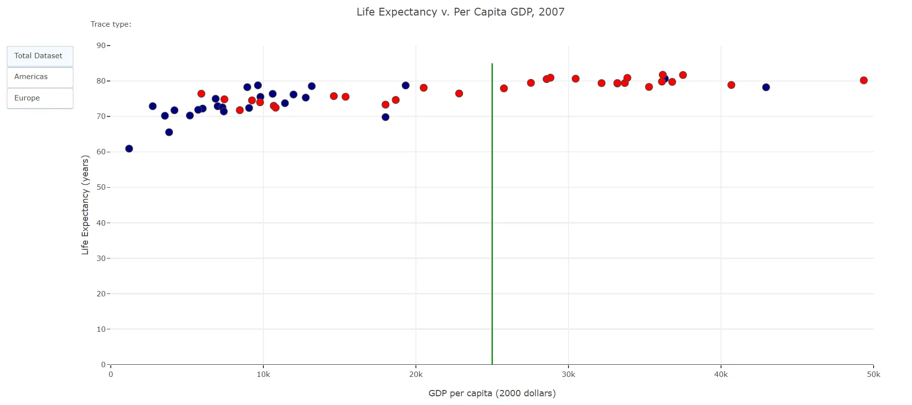
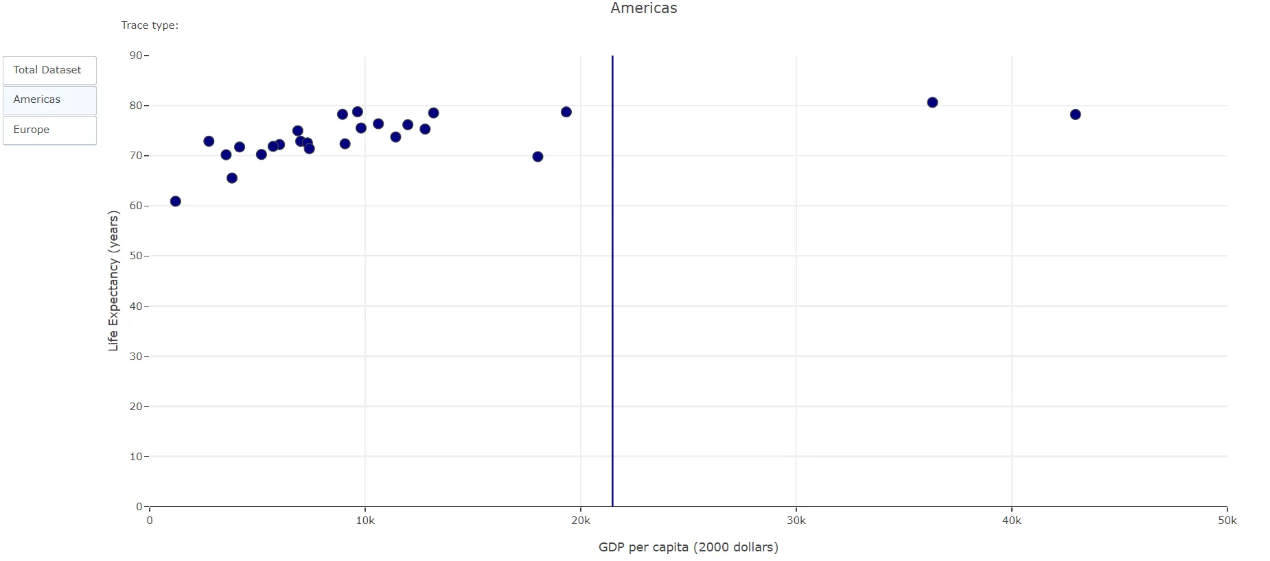
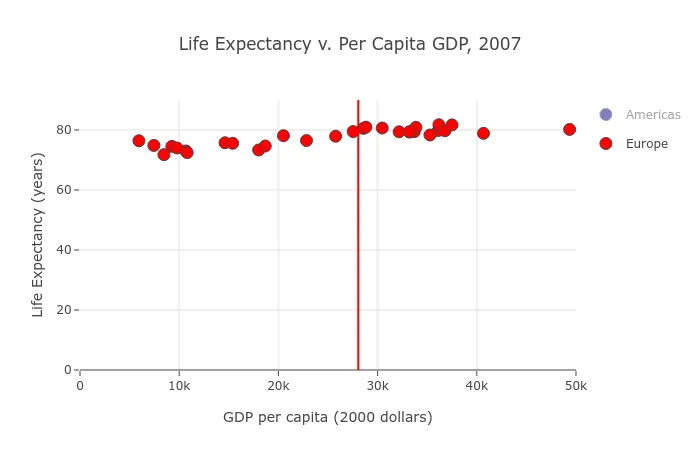
我正在尝试绘制一条垂直线,该线的位置是动态确定的。当发生过滤时,该线将相应地移动位置。例如,在下面的代码中,我可以在25K处绘制一个静态的竖直线,它在完整数据集中作为中位数起作用。但是当数据被过滤为仅“美洲”时,由于x轴范围现在是45K,所以该线不再在中位数位置。
那么,如何绘制一条垂直线,使其位于x轴范围的中位数位置呢?谢谢
import pandas as pd
import plotly.graph_objs as go
from plotly.offline import init_notebook_mode, iplot
init_notebook_mode(connected=True)
df = pd.read_csv('https://raw.githubusercontent.com/yankev/test/master/life-expectancy-per-GDP-2007.csv')
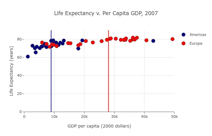
americas = df[(df.continent=='Americas')]
europe = df[(df.continent=='Europe')]
trace_comp0 = go.Scatter(
x=americas.gdp_percap,
y=americas.life_exp,
mode='markers',
marker=dict(size=12,
line=dict(width=1),
color="navy"
),
name='Americas',
text=americas.country,
)
trace_comp1 = go.Scatter(
x=europe.gdp_percap,
y=europe.life_exp,
mode='markers',
marker=dict(size=12,
line=dict(width=1),
color="red"
),
name='Europe',
text=europe.country,
)
data_comp = [trace_comp0, trace_comp1]
layout_comp = go.Layout(
title='Life Expectancy v. Per Capita GDP, 2007',
hovermode='closest',
xaxis=dict(
title='GDP per capita (2000 dollars)',
ticklen=5,
zeroline=False,
gridwidth=2,
range=[0, 50_000],
),
yaxis=dict(
title='Life Expectancy (years)',
ticklen=5,
gridwidth=2,
range=[0, 90],
),
shapes=[
{
'type': 'line',
'x0': 25000,
'y0': 0,
'x1': 25000,
'y1': 85,
'line': {
'color': 'black',
'width': 1
}
}
]
)
fig_comp = go.Figure(data=data_comp, layout=layout_comp)
iplot(fig_comp)
xaxis和yaxis添加了范围。 - rpanaiplotly_express可以做魔术。除了中位数之外,你可以用一行代码得到相同的图表。在导入import plotly_express as px后,你可以运行px.scatter(df, x="gdp_percap", y="life_exp", color="continent", range_x=[0,50_000], range_y=[0,90], hover_name="country")。 - rpanai