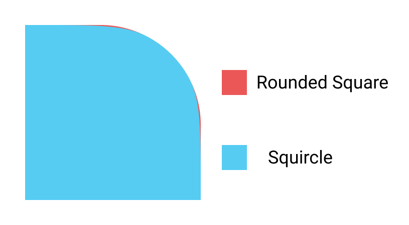
我一直在努力尝试使用The Code Player的CSS3 Squircles示例在我的网站上创建类似于iOS-7风格的应用程序图标(在Safari浏览器中测试)。该示例使用伪类标签来裁剪背景颜色,而我需要围绕<img>进行裁剪。如果您不熟悉,squircle类似于圆角矩形,但是边缘会超出角半径,如下所示:

.icons img {
  width: 100px;
  height: 100px;

  border-radius: 24%;
}

.icons a {
  text-decoration: none;
  display: inline-block;
  position: relative;
}
/*Now we will create fish-eye shapes using pseudo elements and clip them to add a curve to the sides of the icons*/
.icons a:before, .icons a:after {
  content: '';
  position: absolute; left: 0; top: 0;
  width: 100%; height: 100%;
  background: inherit;
  border-radius: 100%; /*circle*/
  /*time to transform the circle into fish-eye shape. iOS7 style now.*/
  -webkit-transform: scaleX(2) scaleY(1.05);
  transform: scaleX(2) scaleY(1.05);
  /*clipping the left and right sides - 17px from the left and right*/
  clip: rect(0, 66px, 100px, 34px);
  /*pushing it behind the icon*/
  z-index: -1;
}
/*duplicating the :before element and rotating it 90deg and swapping the X/Y transforms*/
.icons a:after {
  -webkit-transform: scaleY(2) scaleX(1.05) rotate(90deg);
}<div class="icons">
<a href="#"><img src="http://lorempixel.com/256/256/abstract/2/" /></a>
</div>