我有一个Pandas数据框,其中列a表示一个虚拟变量:
我想做的是给我的标记一个颜色,跟随列的值,除非在列中的值等于1,在这种情况下,我希望它是灰色。
你有什么办法可以做到这一点?
我想做的是给我的标记一个颜色,跟随列的值,除非在列中的值等于1,在这种情况下,我希望它是灰色。
你有什么办法可以做到这一点?
您需要标记等于1的值并绘制图表:
import matplotlib.pyplot as plt
import numpy as np

# test data
t = np.linspace(0, 2 * np.pi, 30)
x = np.sin(t)
x[3] = 1
y = np.cos(t)

# indices for 'bad' values
indices = x == 1
# calc colors from jet cmap
cmap = plt.get_cmap('jet')
colors = cmap((y - y.min()) / y.ptp())

# normal values
plt.scatter(t[~indices], x[~indices], c = colors[~indices], cmap = cmap)
# bad values
plt.scatter(t[indices], x[indices], c = 'grey')
plt.show()
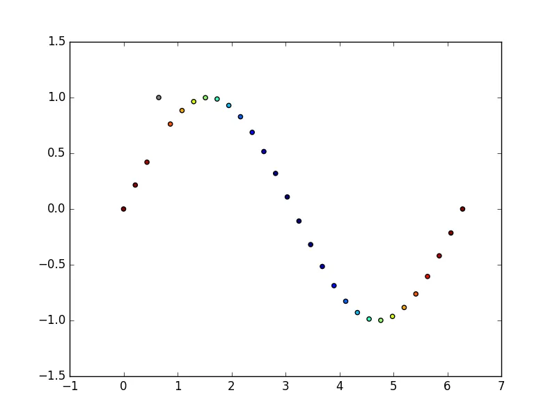
t、x和y数组代表Pandas序列。