在CSS中创建一个右对齐标签和左对齐数值的双列布局。

6

大家好,

在HTML和CSS中创建以下简单布局的最简单方法是什么:

enter image description here

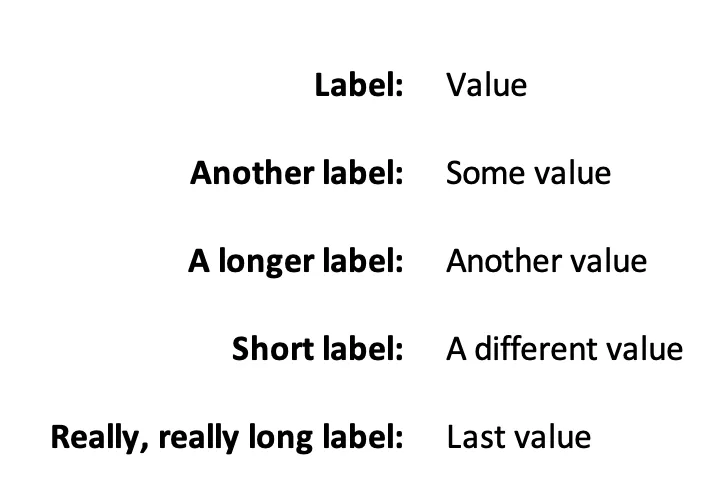
具体来说,左侧右对齐标签,右侧左对齐值。

我不想硬编码左列的宽度 - 它应该根据最长标签的宽度确定。

我正在寻找至少合理语义化的方法,与屏幕阅读器配合良好(例如,屏幕阅读器应先读取标签,然后是值,而不是所有标签,然后所有值),且不需要大量额外的 <div> 元素。

这似乎是一个相当常见的布局,因此我假设有一种非常容易的方法来实现它。但我自己还没有弄清楚。

使用 <table> 可以完美地解决问题,但正如每个人都提醒我的那样,永远不要仅为了布局使用 <table>。而且这显然不是表格数据。

谢谢!


你正在使用哪种HTML? - David Thomas
@DavidThomas HTML5,以及任何相对较新的浏览器(例如,不必支持IE8或IE9)。 - mattstuehler
不是,你使用什么HTML标记来形成标签/输入对? - David Thomas
例如,演示 - David Thomas
1
@DavidThomas - 谢谢!这是一个非常优雅的解决方案 - display: grid 完美地完成了工作。我一直避免使用网格布局,直到支持变得更加普遍,但现在看来我们可能已经足够接近了。如果你把它作为答案,我会将其标记为被接受的答案。 - mattstuehler
3个回答

6

有几个选项可以使用最小的HTML代码;一个是使用CSS Grid,另一个是使用CSS flex-box布局。

CSS Grid:

/* A simple reset to ensure that all elements and
   pseudo-elements have their margin and padding
   set to zero, and all are using the same box-sizing: */
*,
 ::before,
 ::after {
  margin: 0;
  padding: 0;
  box-sizing: border-box;
}


/* here we set the <form> element's layout to use
   grid layout: */
form {
  display: grid;
  /* we use the repeat() function to create 2 columns,
   each column sized with a minimum of 0 width and a
   maximum of 1fr; the 'fr' unit is a fractional unit
   and here forces each column to take one fractional
   unit of the available space to create two equal-sized
   columns: */
  grid-template-columns: repeat(2, minmax(0, 1fr));
  /* we use the 'gap' property (formerly 'grid-gap') to
   specify the gap between grid elements; here we have
   0.5em above and below and 1em to the left and right: */
  gap: 0.5em 1em;
  width: 80vw;
  margin: 0 auto;
}

label {
  /* aligning the text to the right of the <label> element: */
  text-align: right;
}

label::after {
  /* using the 'content' property of the pseudo-element to
   add the colon character: */
  content: ':'
}
<form>
  <!-- using the 'for' attribute to associate the label with the
       relevant <input> element; the value of the 'for' attribute
       must be equal to the 'id' attribute-value of the relevant
       <input> -->
  <label for="input1">label</label>
  <input type="text" id="input1" placeholder="input 1">
  <label for="input2">A longer label</label>
  <input type="text" id="input2" placeholder="input 2">
  <label for="input3">Another slightly longer label</label>
  <input type="text" id="input3" placeholder="input 3">
  <label for="input4">A label that goes on, frankly, for quite a bit further than might be common for the average &lt;label&gt; element</label>
  <input type="text" id="input4" placeholder="input 4">
</form>

JS Fiddle演示

Flexbox:

/* A simple reset to ensure that all elements and
   pseudo-elements have their margin and padding
   set to zero, and all are using the same box-sizing: */
*,
 ::before,
 ::after {
  margin: 0;
  padding: 0;
  box-sizing: border-box;
}

/* setting the layout of the <form> to flexbox: */
form {
  display: flex;
/* allowing the child elements of the <form> to wrap
   to new lines when necessary: */
  flex-wrap: wrap;
  width: 80vw;
  margin: 0 auto;
}

/* Setting common properties for the <label> and <input>
   elements: */
label,
input {
/* assigning the flex-grow and flex-shrink (respectively)
   properties to 1, in order that they grow/shrink by the
   same amount relative to each other; and setting the
   flex-basis to 40% (the percentage derived from the parent)
   in order to assign a width that's too large to accommodate
   more than two elements per line: */
  flex: 1 1 40%;
/* setting the margin above/below each 'row' to be 0.5em,
   and 0 to the left and right: */
  margin: 0.5em 0;
}

label {
  text-align: right;
/* setting the margin-right of the <label> to 1em to enforce a
   gutter between the <label> and the neighbouring <input> (the
   CSS Box Alignment module (level 3) introduces the 'gap' property
   that can also be used in the flexbox layout (among others) but
   that's not yet supported by browsers, so we have to use margins: */
  margin-right: 1em;
}

label::after {
  content: ':'
}
<form>
  <label for="input1">label</label>
  <input type="text" id="input1" placeholder="input 1">
  <label for="input2">A longer label</label>
  <input type="text" id="input2" placeholder="input 2">
  <label for="input3">Another slightly longer label</label>
  <input type="text" id="input3" placeholder="input 3">
  <label for="input4">A label that goes on, frankly, for quite a bit further than might be common for the average &lt;label&gt; element</label>
  <input type="text" id="input4" placeholder="input 4">
</form>

JS Fiddle演示

现在,使用以上两种方法都有一个要求,可能不适合您的用例: <label>元素必须实现一个for属性,这要求相关的<input>也必须有一个id属性(并且这些值必须相等)。

为了避免这种情况,我们可以将<input>嵌套在<label>内部,这会自动关联<label><input>;这将产生(可能)更清晰的HTML:

再次使用网格:

*,
::before,
::after {
  margin: 0;
  padding: 0;
  box-sizing: border-box;
}

form {
  display: grid;
  grid-template-columns: repeat(2, minmax(0, 1fr));
  gap: 0.5em 1em;
  width: 80vw;
  margin: 0 auto;
}

label {
/* it's a crude simplification, but effectively we remove
   the <label> from the DOM and instead show its contents;
   the text portion, and the <input>, become independant
   grid-items (sort of): */
  display: contents;
}
<form>
  <label>label
    <input type="text" placeholder="input 1"></label>
  <label>A longer label
    <input type="text" placeholder="input 2"></label>
  <label>Another slightly longer label
    <input type="text" placeholder="input 3"></label>
  <label>A label that goes on, frankly, for quite a bit further than might be common for the average label element
    <input type="text" placeholder="input 4"></label>
</form>

JS Fiddle演示

在上面的代码片段中,您可能会注意到以下几点:

  1. 我们不再使用label::after来插入表现形式的':'字符,因为那样显然会放置在<label>内容之后,在<input>之后并创建另一个网格项目(演示),
  2. <label>文本不再右对齐;这是因为text-align似乎不能作用于文本。

*,
::before,
::after {
  margin: 0;
  padding: 0;
  box-sizing: border-box;
}

form {
  display: grid;
  grid-template-columns: repeat(2, minmax(0, 1fr));
  gap: 0.5em 1em;
  width: 80vw;
  margin: 0 auto;
}

label {
  display: contents;
  text-align: right;
}
<form>
  <label>label
    <input type="text" placeholder="input 1"></label>
  <label>A longer label
    <input type="text" placeholder="input 2"></label>
  <label>Another slightly longer label
    <input type="text" placeholder="input 3"></label>
  <label>A label that goes on, frankly, for quite a bit further than might be common for the average label element
    <input type="text" placeholder="input 4"></label>
</form>

JS Fiddle演示

我们可以通过将<label>的文本内容包装在一个元素中,比如一个<span>来改善视觉效果,以恢复那种呈现方式:

*,
::before,
::after {
  margin: 0;
  padding: 0;
  box-sizing: border-box;
}

form {
  display: grid;
  grid-template-columns: repeat(2, minmax(0, 1fr));
  gap: 0.5em 1em;
  width: 80vw;
  margin: 0 auto;
}

label {
  display: contents;
  text-align: right;
}

label span::after {
  content: ':';
}
<form>
  <label><span>label</span>
    <input type="text" placeholder="input 1"></label>
  <label><span>A longer label</span>
    <input type="text" placeholder="input 2"></label>
  <label><span>Another slightly longer label</span>
    <input type="text" placeholder="input 3"></label>
  <label><span>A label that goes on, frankly, for quite a bit further than might be common for the average label element</span>
    <input type="text" placeholder="input 4"></label>
</form>

值得注意的是,CSS Grid 和 CSS Flexbox 都允许我们在浏览器中以不同于 DOM 中的顺序重新排序元素;例如,这可以使我们根据关联的 <input> 元素的状态来为 <label> 元素设置样式。

Grid:

*,
::before,
::after {
  margin: 0;
  padding: 0;
  box-sizing: border-box;
}

form {
  display: grid;
  /* to ensure that the layout backfills the empty spaces
     created by moving content around: */
  grid-auto-flow: dense;
  grid-template-columns: repeat(2, minmax(0, 1fr));
  gap: 0.5em 1em;
  width: 80vw;
  margin: 0 auto;
}

label {
  display: contents;
  text-align: right;
}

input {
  /* positioning the <input> elements in the secpond
     grid-track/column: */
  grid-column: 2;
}

label span {
  /* positioning the <span> elements in the first
     grid-track/column: */
  grid-column: 1;
}

label span::after {
  content: ':';
}

input:placeholder-shown+span {
  color: rebeccapurple;
}

input:not(:placeholder-shown)+span {
  color: limegreen;
  font-weight: bold;
}

input:focus+span,
input:active+span {
  color: #f90;
}
<form>
  <label>
    <input type="text" placeholder="input 1">
    <span>label</span>
  </label>
  <label>
    <input type="text" placeholder="input 2">
    <span>A longer label</span>
  </label>
  <label>
    <input type="text" placeholder="input 3">
    <span>Another slightly longer label</span>
  </label>
  <label>
    <input type="text" placeholder="input 4">
    <span>A label that goes on, frankly, for quite a bit further than might be common for the average label element</span>
  </label>
</form>

JS Fiddle演示

弹性盒子布局:

*,
::before,
::after {
  margin: 0;
  padding: 0;
  box-sizing: border-box;
}

form {
  width: 80vw;
  margin: 0 auto;
}

label {
  display: flex;
  margin: 0.5em 0;
}

label span,
label input {
  flex: 1 1 50%;
}

label span {
  order: 1;
  text-align: right;
  margin-right: 1em;
}

label input {
  order: 2;
}

label span::after {
  content: ':';
}

label span::after {
  content: ':';
}

input:placeholder-shown+span {
  color: rebeccapurple;
}

input:not(:placeholder-shown)+span {
  color: limegreen;
  font-weight: bold;
}

input:focus+span,
input:active+span {
  color: #f90;
}
<form>
  <label>
    <input type="text" placeholder="input 1">
    <span>label</span>
  </label>
  <label>
    <input type="text" placeholder="input 2">
    <span>A longer label</span>
  </label>
  <label>
    <input type="text" placeholder="input 3">
    <span>Another slightly longer label</span>
  </label>
  <label>
    <input type="text" placeholder="input 4">
    <span>A label that goes on, frankly, for quite a bit further than might be common for the average label element</span>
  </label>
</form>

JS Fiddle演示

需要注意的是,grid-auto-flow: dense以及重新排列元素的视觉呈现可能会给使用屏幕阅读器或键盘交互的Web用户带来问题。因此,虽然它可以实现一些美观效果,但值得考虑的是这种美观是否以可用性(和潜在的合法可访问性)为代价。

此外,在后面的例子中,使用嵌套的<span>元素来允许对<label>元素的文本内容进行样式设置(无论是出于对齐原因、添加':'字符还是响应与<input>元素的交互而进行样式设置),这可能会使HTML标记变得复杂而不简洁。

参考资料:

Selectors: 属性: 属性值:

参考文献:


非常好的答案,但我认为您错过了“我不想硬编码左列的宽度 - 应该根据最长标签的宽度确定”。对我来说,这意味着:标签'列'的宽度应与最长标签一样宽。在您的任何示例中都没有发生。 - zmippie

5
CSS表格来拯救: https://css-tricks.com/almanac/properties/d/display/ 这些不是真正的表格,但可以用来重新创建表格行为。

.notATable {
  display:table;
  list-style:none;
  padding-left:0;
}

.notATable > li 
 {
  display:table-row;
 }
 
 .notATable > li > *
 {
  display:table-cell;
  padding:5px;
 }
 
 
 .notATable label {
  font-weight:bold;
  text-align:right;
 }
 
 .notATable label:after {
  content: ':';
 }
<ul class="notATable">
   <li><label>Label</label><div>Value</div></li>
   <li><label>Another Label</label><div>Some Value</div></li>
   <li><label>A longer Label</label><div>Another Value</div></li>
   <li><label>Short Label</label><div>A different Value</div></li>
   <li><label>Really, Really Long Label</label><div>Last Value</div></li>
</ul>

现在你可以使用CSS来更改标记的布局,例如你可以使用media-queries在移动设备上以不同的方式显示标签和值。

谢谢您的建议!这可能是最好的解决方案。看起来需要比必要的标签多一些,但这可能是不可避免的,特别是如果您需要覆盖尚未支持display:grid的浏览器。 - mattstuehler
是的,理想情况下,它应该是一个容器,每个标签和值对都定义了自己的行。然后你可以潜在地使用定义列表。display:grid得到了相当好的支持。我仍然避免在我的主要工作中使用它,因为我必须支持IE9,我转而使用display:table,因为我更熟悉它。它也相当简单,得到了很好的支持,在这种情况下只有一点标签膨胀。 - Jon P
顺便提一下,额外的标签可以作为额外的样式钩子使用:https://codepen.io/nobloss/pen/KJvmQy - Jon P
这应该是答案:它不使用表单、表格或硬编码的宽度,并保持标签与值一起。 - racitup

2
最初的回答是:

这个简单吗?

*{
  padding: 5px;
  margin: 0;
  font-family: verdana;
}

.d-table {
  display:table;
}

.m-auto{
  margin:auto  
}

.d-flex{
    display:flex;
}    
.d-flex > div{
    height: auto;
    display: flex;
    flex-direction: column;
    justify-content: space-around;
}

label{
  display:block;
  text-align:right;
  font-weight: bold;
  margin-right: 5px;
}
<div class="d-table m-auto">
  <div class="d-flex">
    <div>
      <label>Label:</label>
      <label>Another label:</label>
      <label>A long label:</label>
      <label>Short label:</label>
      <label>Really, really long label:</label>
    </div>
    <div>
      <p>Value</p>
      <p>Some value</p>
      <p>Another value</p>
      <p>A different value</p>
      <p>Last value</p>
    </div>
  </div>
</div>


使用此布局,您将失去标签与值之间的关联。如果标签和/或值需要换行,这将会破坏它们。 - Jon P
1
谢谢您的建议,很不错,但我认为@Jon P是正确的 - 您会失去标签和值之间的连接。屏幕阅读器将读取所有标签,然后读取所有值。 - mattstuehler

网页内容由stack overflow 提供, 点击上面的
可以查看英文原文,
原文链接