过去,我使用了来自sjPlot包的
我尝试使用以下代码绘制模型。
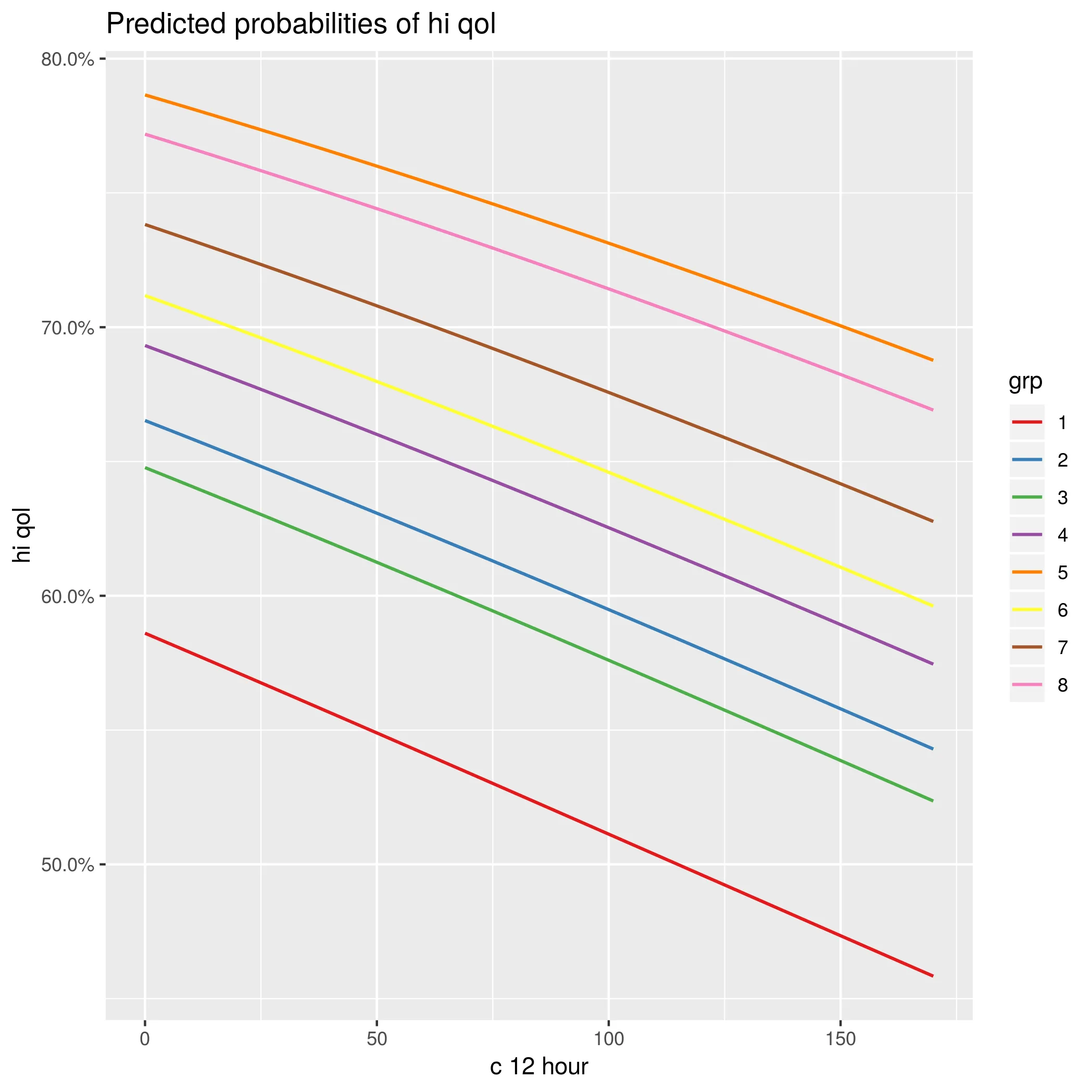
sjp.glmer来可视化广义混合效应模型中不同斜率。然而,使用这个新包,我无法弄清楚如何绘制单个斜率,就像这里所示的固定效应概率随(随机)组水平变化的图形。
这是我认为可以生成该图的代码。但是在新版本的sjPlot中,我似乎无法做到这一点。
library(lme4)
library(sjPlot)
data(efc)
# create binary response
efc$hi_qol = 0
efc$hi_qol[efc$quol_5 > mean(efc$quol_5,na.rm=T)] = 1
# prepare group variable
efc$grp = as.factor(efc$e15relat)
# data frame for 2nd fitted model
mydf <- na.omit(data.frame(hi_qol = as.factor(efc$hi_qol),
                           sex = as.factor(efc$c161sex),
                           c12hour = as.numeric(efc$c12hour),
                           neg_c_7 = as.numeric(efc$neg_c_7),
                           grp = efc$grp))
# fit 2nd model
fit2 <- glmer(hi_qol ~ sex + c12hour + neg_c_7 + (1|grp),
              data = mydf,
              family = binomial("logit"))
我尝试使用以下代码绘制模型。
plot_model(fit2,type="re")
plot_model(fit2,type="prob")
plot_model(fit2,type="eff")
我认为可能缺少某个标志,但是在阅读了文档之后,我找不到这个标志是什么。
type = "ri.prob"是什么意思?您能具体说明一下您尝试过什么以及出了什么问题吗? - Ben Bolker