Android中带有标题的边框

5
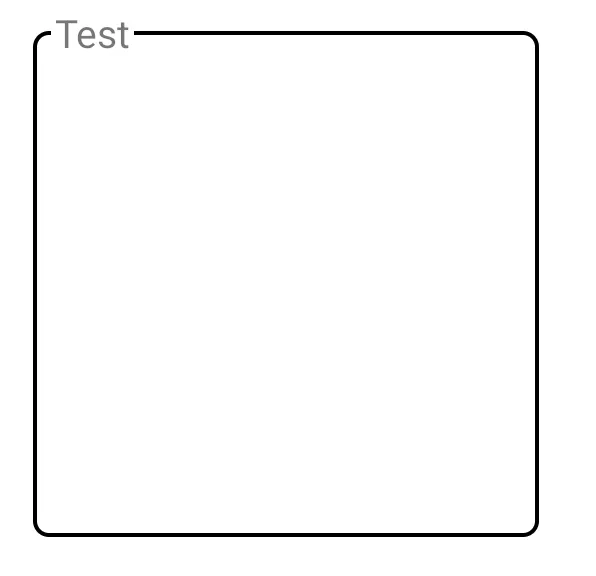
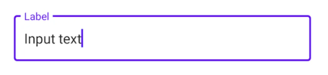
我想在安卓上创建一个组件。这个组件应该是带有标题的边框,类似于TextInputLayout,并且能够包含任何布局。

text input layout

我在这里找到了一个解决方案,但我想知道是否有人能分享一个不同的解决方案。我认为那个解决方案很麻烦。
布局包括两个线性布局,第一个是带标题的顶部边框线,第二个是带左、右和底边框的内容。
你觉得呢?
<?xml version="1.0" encoding="utf-8"?>
<LinearLayout xmlns:android="http://schemas.android.com/apk/res/android"
    android:orientation="vertical" android:layout_width="match_parent"
    android:layout_height="match_parent">

    <RelativeLayout
        android:layout_width="match_parent"
        android:layout_height="match_parent"
        android:padding="20dp">
        <LinearLayout
            android:id="@+id/main"
            android:layout_width="match_parent"
            android:layout_height="20dp"
            android:orientation="horizontal"
            android:gravity="center_vertical"
            android:weightSum="2">
            <View
                android:layout_width="fill_parent"
                android:layout_height="2dp"
                android:layout_weight="1"
                android:background="#2ebadc"/>
            <TextView
                android:gravity="bottom"
                android:layout_width="wrap_content"
                android:layout_height="wrap_content"
                android:textSize="20sp"
                android:text="Hello World" />
            <View
                android:layout_width="wrap_content"
                android:layout_height="2dp"
                android:layout_marginRight="5dp"
                android:background="#2ebadc"/>
        </LinearLayout>
        <LinearLayout
            android:layout_width="match_parent"
            android:layout_height="wrap_content"
            android:orientation="vertical"
            android:layout_marginTop="10dp"
            android:padding="10dp"
            android:background="@drawable/topless_border">
            <TextView
                android:layout_width="match_parent"
                android:layout_height="wrap_content"
                android:gravity="center"
                android:text="This is a border with title"/>
            <TextView
                android:layout_width="match_parent"
                android:layout_height="wrap_content"
                android:gravity="center"
                android:text="The top inset of the border is set to -3 to make it disappear and then it's covered with a line with text in the middle by using LinearLayout with two Views and one TextView"/>
        </LinearLayout>
    </RelativeLayout>

</LinearLayout>

<?xml version="1.0" encoding="utf-8"?>
<layer-list xmlns:android="http://schemas.android.com/apk/res/android">
    <item android:top="-3dp">
        <shape>
            <solid android:color="@android:color/transparent" />
            <stroke android:width="2dp" android:color="#2ebadc" />
            <corners android:radius="1dp" />
        </shape>
    </item>
</layer-list>

提前感谢。

1个回答

8
我查看了Material Components库中的实现方式。他们使用 CutoutDrawable 来实现这个效果。不幸的是,由于构造函数是包私有的,所以不能直接使用。但我们可以将该类“直接”导入到项目中。
为了获得期望的效果,我会在 ConstraintLayout 中添加两个视图,一个用于标签,一个用于内容。这种解决方案同样适用于任何其他父布局来定位视图,但是使用 ConstraintLayout 可以轻松地定位视图位置。
    <androidx.constraintlayout.widget.ConstraintLayout
        android:layout_width="200dp"
        android:layout_height="200dp">

        <View
            android:id="@+id/content"
            android:layout_margin="8dp"
            android:layout_height="0dp"
            android:layout_width="0dp"
            app:layout_constraintBottom_toBottomOf="parent"
            app:layout_constraintEnd_toEndOf="parent"
            app:layout_constraintStart_toStartOf="parent"
            app:layout_constraintTop_toTopOf="parent" />

        <com.google.android.material.textview.MaterialTextView
            android:id="@+id/label"
            android:layout_width="wrap_content"
            android:layout_height="wrap_content"
            android:layout_marginLeft="8dp"
            android:text="Test"
            app:layout_constraintBottom_toTopOf="@+id/content"
            app:layout_constraintLeft_toLeftOf="@+id/content"
            app:layout_constraintTop_toTopOf="@+id/content" />
    </androidx.constraintlayout.widget.ConstraintLayout>

内容视图是将获得CutoutDrawable的视图。除了设置背景之外,我们还需要添加一些机制来更新要“剪切”的位置 - 根据标签视图的位置。我通过使用OnLayoutChangeListener解决了这个问题:

        // configuration of the shape for the outline
        val shape = ShapeAppearanceModel.Builder()
            .setAllCorners(RoundedCornerTreatment())
            .setAllCornerSizes(16f)
            .build()

        // configuration of the CutOutDrawable - replace with themed values instead of hard coded colors
        val drawable = CutoutDrawable(shape).apply {
            setStroke(4f, Color.BLACK)
            fillColor = ColorStateList.valueOf(Color.WHITE)
        }
        // content is the view with @+id/content
        content.background = drawable
        // label is the view with @+id/label
        label.addOnLayoutChangeListener { _, left, top, right, bottom, _, _, _, _ ->
            // offset the position by the margin of the content view
            val realLeft = left - content.left
            val realTop = top - content.top
            val realRigth = right - content.left
            val realBottom = bottom - content.top
            // update the cutout part of the drawable
            drawable.setCutout(
                realLeft.toFloat(),
                realTop.toFloat(),
                realRigth.toFloat(),
                realBottom.toFloat()
            )
        }

这种策略也可以应用到自定义视图中,该视图配置一个CutoutDrawable作为背景,并注册另一个视图位置的监听器以更新切口位置。

以下是结果:

输入图片描述

还可以通过调整标签TextView的填充来调整文本和线之间的间距。


网页内容由stack overflow 提供, 点击上面的
可以查看英文原文,
原文链接