使用R的plotly绘制带有树状图的聚类热图

12

我正在按照这个例子使用Rplotly创建带有树形图的聚类热图。以下是示例:

library(ggplot2)
library(ggdendro)
library(plotly)

#dendogram data
x <- as.matrix(scale(mtcars))
dd.col <- as.dendrogram(hclust(dist(x)))
dd.row <- as.dendrogram(hclust(dist(t(x))))
dx <- dendro_data(dd.row)
dy <- dendro_data(dd.col)

# helper function for creating dendograms
ggdend <- function(df) {
  ggplot() +
    geom_segment(data = df, aes(x=x, y=y, xend=xend, yend=yend)) +
    labs(x = "", y = "") + theme_minimal() +
    theme(axis.text = element_blank(), axis.ticks = element_blank(),
          panel.grid = element_blank())
}

# x/y dendograms
px <- ggdend(dx$segments)
py <- ggdend(dy$segments) + coord_flip()

# heatmap
col.ord <- order.dendrogram(dd.col)
row.ord <- order.dendrogram(dd.row)
xx <- scale(mtcars)[col.ord, row.ord]
xx_names <- attr(xx, "dimnames")
df <- as.data.frame(xx)
colnames(df) <- xx_names[[2]]
df$car <- xx_names[[1]]
df$car <- with(df, factor(car, levels=car, ordered=TRUE))
mdf <- reshape2::melt(df, id.vars="car")
p <- ggplot(mdf, aes(x = variable, y = car)) + geom_tile(aes(fill = value))

mat <- matrix(unlist(dplyr::select(df,-car)),nrow=nrow(df))
colnames(mat) <- colnames(df)[1:ncol(df)-1]
rownames(mat) <- rownames(df)

# hide axis ticks and grid lines
eaxis <- list(
  showticklabels = FALSE,
  showgrid = FALSE,
  zeroline = FALSE
)

p_empty <- plot_ly(filename="r-docs/dendrogram") %>%
  # note that margin applies to entire plot, so we can
  # add it here to make tick labels more readable
  layout(margin = list(l = 200),
         xaxis = eaxis,
         yaxis = eaxis)

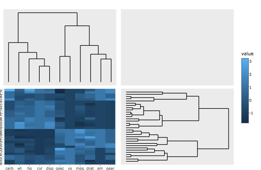
subplot(px, p_empty, p, py, nrows = 2, margin = 0.01)
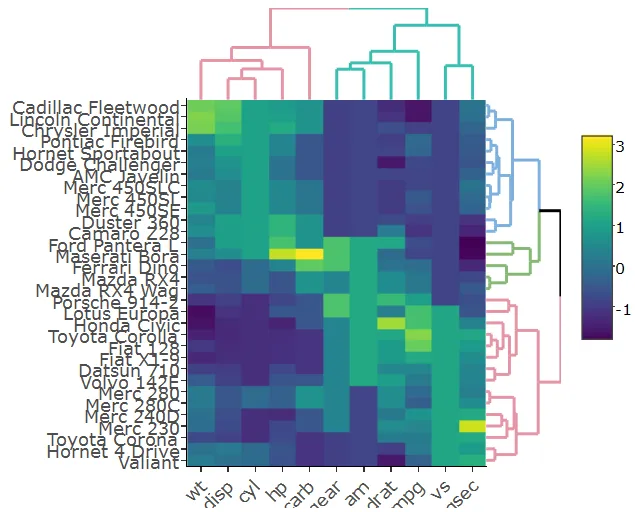
这将会得到:

在此输入图片描述

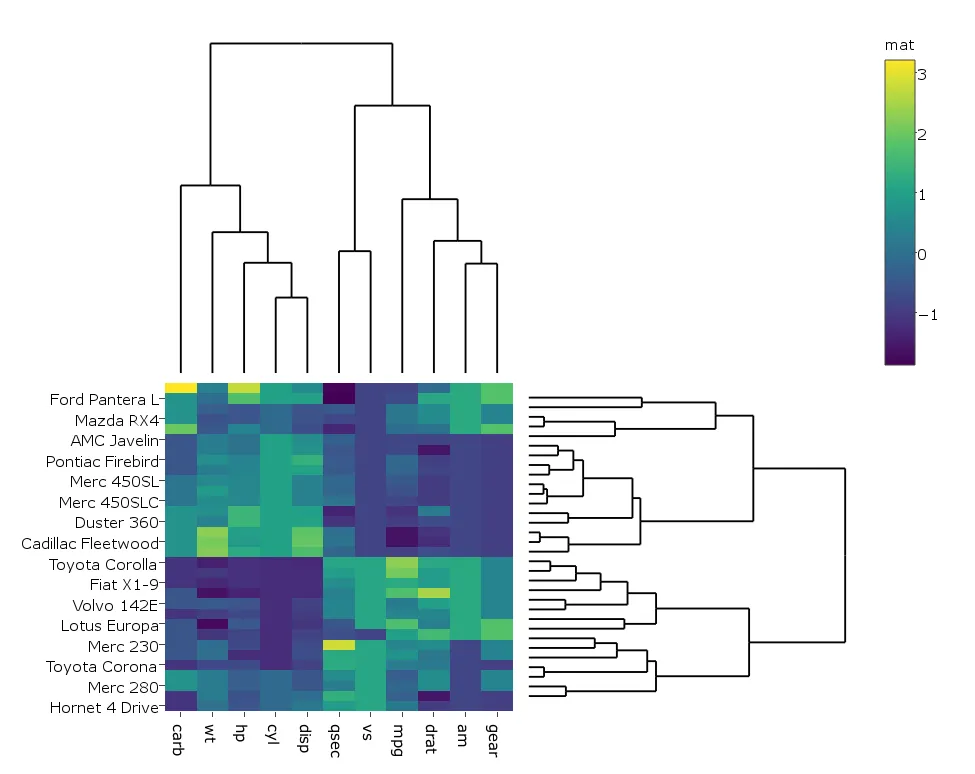
我稍微修改了一下代码,因为在我的情况下使用plotly生成的热图比ggplot更快,所以我这么做:

heatmap.plotly <- plot_ly() %>% add_heatmap(z=~mat,x=factor(colnames(mat),lev=colnames(mat)),y=factor(rownames(mat),lev=rownames(mat)))

然后:

subplot(px, p_empty, heatmap.plotly, py, nrows = 2, margin = 0.01)

该代码将生成以下内容: enter image description here

我的问题是:

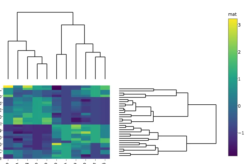
  1. 如何避免热力图的行和列标签被切断?这在两个图中都出现了。

  2. 第二张图中着色器的标签更改为“mat”,有什么办法可以防止这种情况发生?

  3. 如何更改热力图和树状图之间的边距?

2个回答

13

使用Plotly制作完全工作的聚类热图并不像一开始看起来那么简单。幸运的是,有一个名为heatmaply的R包可以做到这一点。您可以在在线文档中看到许多功能示例。

例如:

install.packages("ggplot2")
install.packages("plotly")
install.packages("heatmaply")

library(heatmaply)
heatmaply(scale(mtcars), k_row = 3, k_col = 2)

图片描述在此

这个图是完全交互式的(从热力图和树状图都可以)。请注意,它使用dendextend(ggdendro的更发展版本,例如也可以考虑分支颜色/线型/线宽)。

具体来说,设置树状图的边距是一个开放的问题(刚刚提出),但这可能很快得到解决。


感谢@Tal Galili。heatmaply看起来很棒。有没有办法创建一个heatmapr对象,其中cellnote是字符矩阵而不是数字?目的是悬停在单元格上将显示文本信息,除了行和列标签之外(例如,如果这是基因表达式按样本的热图,则希望显示基因的描述、其访问等)。我尝试将这样的字符矩阵传递给cellnote,但它会崩溃。有什么解决方案吗? - user1701545
另外,我尝试将ggdend对象传递给heatmapr中的Rowv和Colv,但它们没有显示出来。 - user1701545
嗨,@user1701545。 (1) 关于cellnote,这是个有趣的想法。请创建一个小的自包含示例,并提交一个问题供我们查看 https://github.com/talgalili/heatmaply/issues (2) 你应该将一个常规的树状图(也许使用dendextend::color_branches进行修改)传递给Rowv和Colv。所有ggdend操作都在函数内完成。 - Tal Galili
控制热图和树状图的比例问题已于今天早些时候解决。请参见以下示例:https://github.com/talgalili/heatmaply/issues/63#issuecomment-299473545 - Tal Galili

7
我如何获取热力图的行和列标签,以免像两个图表中一样被截断?尝试在生成图表后设置margin
sply <- subplot(px, p_empty, heatmap.plotly, py, nrows = 2)
sply <- layout(sply,
               margin = list(l = 150,
                             r = 0,
                             b = 50,
                             t = 0
                            )
               )

第二幅图的标签被更改为“mat”。有任何防止这种情况的想法吗? 没有防止这种情况的想法,但您可以覆盖标签。
sply$x$data[[3]]$colorbar$title <- 'mat'

我该如何修改热图和树状图之间的边距?
您可以为每个子图的每个轴指定域。 yaxis 对应于左上角的绘图,yaxis2 对应于紧挨着它的右侧的绘图,以此类推。
增加距离比减小距离效果更好。
sply <- layout(sply,
               yaxis = list(domain=c(0.47, 1)),
               xaxis = list(domain=c(0, 0.5)),
               xaxis3 = list(domain=c(0, 0.5)),
               xaxis4 = list(domain=c(0.5, 1)),
               )

enter image description here

pl <- subplot(px, p_empty, p, py, nrows = 2)
heatmap.plotly <- plot_ly() %>% add_heatmap(z=~mat,x=factor(colnames(mat),lev=colnames(mat)),y=factor(rownames(mat),lev=rownames(mat)))
sply <- subplot(px, p_empty, heatmap.plotly, py, nrows = 2)
sply$x$data[[3]]$colorbar$title <- 'mat'
sply <- layout(sply,
               yaxis = list(domain=c(0.47, 1)),
               xaxis = list(domain=c(0, 0.5)),
               xaxis3 = list(domain=c(0, 0.5)),
               xaxis4 = list(domain=c(0.5, 1)),
               margin = list(l = 150,
                             r = 0,
                             b = 50,
                             t = 0
                             )


               )

sply

我会使用colorbar(sply, title = "mat")而不是直接访问plotly对象中的字段,因为该接口有些容易发生变化。 - alan ocallaghan

网页内容由stack overflow 提供, 点击上面的
可以查看英文原文,
原文链接