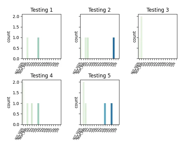
我有一个类似下面表格的数据集。我需要为每个列 TS1 到TS5 创建一个条形图,计算该列中每个项的数量。这些项是以下之一:NOT_SEEN NOT_ABLE HIGH_BAR 和介于110和140之间的数字值,以2为间隔(因此为110,112,114等)。
我已经找到了一种行之有效的方法,但我的问题是是否有一种创建循环或其他东西的方法,这样我就不必复制并粘贴相同的代码5次(对于这5个列)?
这是我尝试过且有效的:
num_range = list(range(110,140, 2))
OUTCOMES = ['NOT_SEEN', 'NOT_ABLE', 'HIGH_BAR']
OUTCOMES.extend([str(num) for num in num_range])
OUTCOMES = CategoricalDtype(OUTCOMES, ordered = True)

fig, ax =plt.subplots(2, 3, sharey=True)
fig.tight_layout(pad=3)
以下是我复制了5次并仅更改标题(Testing 1,Testing 2等)和第一行中的TS1、TS2等的内容。
df["outcomes"] = df["TS1"].astype(OUTCOMES)
bpt=sns.countplot(x= "outcomes", data=df, palette='GnBu', ax=ax[0,0])
plt.setp(bpt.get_xticklabels(), rotation=60, size=6, ha='right')
bpt.set(xlabel='')
bpt.set_title('Testing 1')
接下来的代码位于上述"5"个实例之后。
ax[1,2].set_visible(False)
plt.show()
我相信有更好的方法来做这件事,但我对这些都很陌生。
同时,我需要确保 barplot 的柱按照以下顺序从左到右排列:
NOT_SEEN NOT_ABLE HIGH_BAR 以及 110、112、114 等等。使用 Python 2.7(不是我的选择)和 Pandas 0.24.2。
+----+------+------+----------+----------+----------+----------+----------+
| ID | VIEW | YEAR | TS1      | TS2      | TS3      | TS4      | TS5      |
+----+------+------+----------+----------+----------+----------+----------+
| AA | NO   | 2005 |          | 134      |          | HIGH_BAR |          |
+----+------+------+----------+----------+----------+----------+----------+
| AB | YES  | 2015 |          |          | NOT_SEEN |          |          |
+----+------+------+----------+----------+----------+----------+----------+
| AB | YES  | 2010 | 118      |          |          |          | NOT_ABLE |
+----+------+------+----------+----------+----------+----------+----------+
| BB | NO   | 2020 |          |          |          |          |          |
+----+------+------+----------+----------+----------+----------+----------+
| BA | YES  | 2020 |          |          |          | NOT_SEEN |          |
+----+------+------+----------+----------+----------+----------+----------+
| AA | NO   | 2010 |          |          |          |          |          |
+----+------+------+----------+----------+----------+----------+----------+
| BA | NO   | 2015 |          |          |          |          | 132      |
+----+------+------+----------+----------+----------+----------+----------+
| BB | YES  | 2010 |          | HIGH_BAR |          | 140      | NOT_ABLE |
+----+------+------+----------+----------+----------+----------+----------+
| AA | YES  | 2020 |          |          |          |          |          |
+----+------+------+----------+----------+----------+----------+----------+
| AB | NO   | 2010 |          |          |          | 112      |          |
+----+------+------+----------+----------+----------+----------+----------+
| AB | YES  | 2015 |          |          | NOT_ABLE |          | HIGH_BAR |
+----+------+------+----------+----------+----------+----------+----------+
| BB | NO   | 2020 |          |          |          | 145      |          |
+----+------+------+----------+----------+----------+----------+----------+
| BA | NO   | 2015 |          | 110      |          |          |          |
+----+------+------+----------+----------+----------+----------+----------+
| AA | YES  | 2010 | HIGH_BAR |          |          | NOT_SEEN |          |
+----+------+------+----------+----------+----------+----------+----------+
| BA | YES  | 2015 |          |          |          |          |          |
+----+------+------+----------+----------+----------+----------+----------+
| AA | NO   | 2020 |          |          |          | 118      |          |
+----+------+------+----------+----------+----------+----------+----------+
| BA | YES  | 2015 |          | 180      | NOT_ABLE |          |          |
+----+------+------+----------+----------+----------+----------+----------+
| BB | YES  | 2020 |          | NOT_SEEN |          |          | 126      |
+----+------+------+----------+----------+----------+----------+----------+