我正在尝试创建一个视图,在该视图中,图标放置在圆形视图中而不是现有的网格或画廊视图中。我尝试过使用Carousel示例,但后来发现它不符合我的要求,因为它是3D应用程序,而我正在寻找2D视图。Android 3D Carousel
这是我所遵循的示例。我能够获得类似于圆形的东西,但为了满足我的要求,我应该坚持2D。
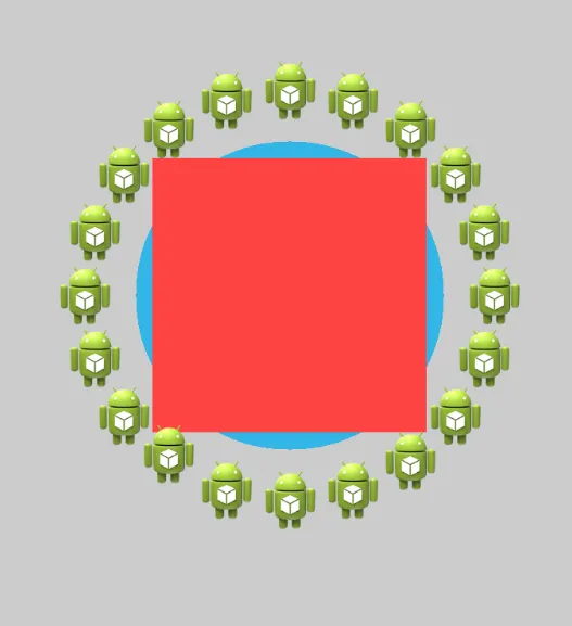
我的另一个主要要求是在圆形视图内,我还必须拥有另一个圆形视图,类似于下面的图像
有人可以帮我解决这个问题吗?
我正在尝试创建一个视图,在该视图中,图标放置在圆形视图中而不是现有的网格或画廊视图中。我尝试过使用Carousel示例,但后来发现它不符合我的要求,因为它是3D应用程序,而我正在寻找2D视图。Android 3D Carousel
这是我所遵循的示例。我能够获得类似于圆形的东西,但为了满足我的要求,我应该坚持2D。
我的另一个主要要求是在圆形视图内,我还必须拥有另一个圆形视图,类似于下面的图像
有人可以帮我解决这个问题吗?
对于每个圆的布局,我建议参考这个回答来解决如何在圆形中放置按钮的问题,因为它会定义你的项目位置相对于包含RelativeLayout的中心而不受其大小的影响。然后,你可以将两个圆形布局重叠在一起:
<RelativeLayout ...>
    <RelativeLayout // outer circle
        android:layout_alignParentCenter>
        ...
    </RelativeLayout>
    <RelativeLayout // inner circle
        android:layout_alignParentCenter>
        ...
    </RelativeLayout>
</RelativeLayout>
如果您想独立旋转每个圆,请按照此答案中的步骤进行操作,该答案回答了“旋转视图层次结构90度”的问题。
如果您不需要一个动画的圆形视图,可以使用绝对布局,并使用算法在代码中定位它们,以检查各个(x,y)位置是否落在圆周上。
假设您希望以(x,y)为中心,半径为r,具有n个项目的圆形视图,则坐标将是:
(x + r, y) // for the first element
....
(x + (r * (FloatMath.cos((p-1) * 2 * Math.PI / n))), y - (r * (FloatMath.sin((p-1) * 2 * Math.PI / n)))) // for the 'p'th element
我有点晚回答这个问题,但是对于任何仍然面临这个问题的人,请看一下这个库:
https://github.com/sababado/CircularView
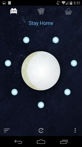
Quick Setup
Adding the view to a layout
<com.sababado.circularview.CircularView
android:id="@+id/circular_view"
android:layout_width="match_parent"
android:layout_height="match_parent"
app:centerBackgroundColor="#33b5e5"
app:centerDrawable="@drawable/center_bg"/> Using the custom attributes requires the following in the layout file. Example
xmlns:app="http://schemas.android.com/apk/res-auto" Adding Markers
A Marker is an object that visual "floats" around the view. Each marker is can represent data or it can simply be for visual effect. Markers must be customized through a CircularViewAdapter.
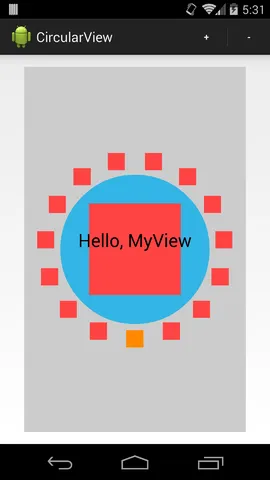
public class MySimpleCircularViewAdapter extends
SimpleCircularViewAdapter {
@Override
public int getCount() {
    // This count will tell the circular view how many markers to use.
    return 20;
}

@Override
public void setupMarker(final int position, final Marker marker) {
    // Setup and customize markers here. This is called every time a marker is to be displayed.
    // 0 >= position > getCount()
    // The marker is intended to be reused. It will never be null.
    marker.setSrc(R.drawable.ic_launcher);
    marker.setFitToCircle(true);
    marker.setRadius(10 + 2 * position);
} }
Once the CircularViewAdapter implementation is ready it can be set on a CircularView object.
mAdapter = new MySimpleCircularViewAdapter(); circularView =
(CircularView) findViewById(R.id.circular_view);
circularView.setAdapter(mAdapter); Receiving click listeners
Click events can be received from the CircularView.
To receive click events set a CircularView.OnClickListener into circularView.setOnCircularViewObjectClickListener(l). For example:
circularView.setOnCircularViewObjectClickListener(new
CircularView.OnClickListener() {
 public void onClick(final CircularView view) {
    Toast.makeText(MainActivity.this, "Clicked center", Toast.LENGTH_SHORT).show();
}

public void onMarkerClick(CircularView view, Marker marker, int position) {
    Toast.makeText(MainActivity.this, "Clicked " + marker.getId(), Toast.LENGTH_SHORT).show();
} }); Animation
There are a few simple animations built into the library at the moment.
Animate Highlighted Degree
The CircularView has animateHighlightedDegree(start, end, duration). The method takes a start and end position in degrees, and a long value for the duration of the animation. The highlighted degree refers to which degree is "highlighted" or "focused". When a degree is focused it can trigger a secondary animation automatically for a Marker.
A listener can be set to receive a callback when this animation ends, and on what object it stopped on.
circularView.setOnHighlightAnimationEndListener(new
CircularView.OnHighlightAnimationEndListener() {
@Override
public void onHighlightAnimationEnd(CircularView view, Marker marker, int position) {
    Toast.makeText(MainActivity.this, "Spin ends on " + marker.getId(), Toast.LENGTH_SHORT).show();
} }); Marker Animation Options
Markers have a simple animation associated with them; up and down. It can repeat or it can happen once. The CircularView can trigger the bounce animation when animateHighlightedDegree(start, end, duration) is called. The bounce animation can be turned off by calling the same method with an additional flag. For example:
animateHighlightedDegree(start, end, duration, shouldAnimateMarkers) In addition there is control over if a marker should bounce while it is highlighted and while the highlighted degree value is constant (aka not animating).
// Allow markers to continuously animate on their own when the highlight animation isn't running. circularView.setAnimateMarkerOnStillHighlight(true); // Combine the above line with the following so that the marker at it's position will animate at the start. circularView.setHighlightedDegree(circularView.BOTTOM); The latter line is necessary in case the bounce animation should also run initially. The highlighted degree is set to CircularView.HIGHLIGHT_NONE by default.
Proguard
If using proguard add the following to your proguard script to make sure animations run
# keep setters in Views so that animations can still work.
# see http://proguard.sourceforge.net/manual/examples.html#beans
-keepclassmembers public class * extends android.view.View {    void set*(***);    *** get*(); }
# keep setters in CircularViewObjects so that animations can still work.
-keepclassmembers public class * extends com.sababado.circularview.CircularViewObject {    void set*(***);
*** get*(); } Developer Hints
Every property that can be customized on a CircularViewObject can also be customized on a Marker object. A Marker object extends from a CircularViewObject. The former is used as a smaller object that floats around the center object. The center object is a CircularViewObject. By default, markers are drawn in the order that they're created; meaning if markers overlap then the first marker will be partially covered by the next marker. An option can be set to draw the highlighted marker on top of the markers next to it with circularView.setDrawHighlightedMarkerOnTop(true);. The flag is false by default. Any CircularViewObject can be hidden and shown independently of other objects using setVisibility(int) In a layout editor use the attribute editMode_markerCount and editMode_markerRadius to see the size and layout of markers. Not supplying a radius will show the default radius. It does exactly what is asked in Question.
我希望这可以帮到你。
你可能需要创建自己的布局CircularLayout来处理项目的定位。请查看http://developer.android.com/guide/topics/ui/custom-components.html,特别是“复合控件”部分。
个人而言,我更喜欢编写一个单一的布局来处理内部和外部圆,而不是尝试编写一个可以正确处理另一个自定义布局嵌套的布局。你描述的情况似乎并不过于复杂。
<RelativeLayout xmlns:android="http://schemas.android.com/apk/res/android"
xmlns:tools="http://schemas.android.com/tools"
android:layout_width="wrap_content"
android:layout_height="wrap_content"
android:gravity="center"
android:paddingBottom="@dimen/activity_vertical_margin"
android:paddingLeft="@dimen/activity_horizontal_margin"
android:paddingRight="@dimen/activity_horizontal_margin"
android:paddingTop="@dimen/activity_vertical_margin"
tools:context=".RoundBtn" >

<Button
    android:id="@+id/button1"
    android:layout_width="45dp"
    android:layout_height="45dp"
    android:layout_marginLeft="222.08203dp"
    android:layout_marginTop="270.53426dp"

    android:text="1" />

<Button
    android:id="@+id/button2"
    android:layout_width="45dp"
    android:layout_height="45dp"
    android:layout_marginLeft="162.08203dp"
    android:layout_marginTop="314.12678dp"

    android:text="2" />
<Button
    android:id="@+id/button3"
    android:layout_width="45dp"
    android:layout_height="45dp"
    android:layout_marginLeft="87.917960dp"
    android:layout_marginTop="314.12678dp"

    android:text="3" />
<Button
    android:id="@+id/button4"
    android:layout_width="45dp"
    android:layout_height="45dp"
    android:layout_marginLeft="27.917960dp"
    android:layout_marginTop="270.53423dp"

    android:text="4" />


<Button
    android:id="@+id/button5"
    android:layout_width="45dp"
    android:layout_height="45dp"
    android:layout_marginLeft="5.0dp"
    android:layout_marginTop="200.00000dp"

    android:text="5" />
<Button
    android:id="@+id/button6"
    android:layout_width="45dp"
    android:layout_height="45dp"
    android:layout_marginLeft="27.917960dp"
    android:layout_marginTop="129.46576dp"

    android:text="6" />
<Button
    android:id="@+id/button7"
    android:layout_width="45dp"
    android:layout_height="45dp"
    android:layout_marginLeft="87.917960dp"
    android:layout_marginTop="85.873218dp"

    android:text="7" />

<Button
    android:id="@+id/button8"
    android:layout_width="45dp"
    android:layout_height="45dp"
    android:layout_marginLeft="162.08203dp"
    android:layout_marginTop="85.873218dp"

    android:text="8" />
<Button
    android:id="@+id/button9"
    android:layout_width="45dp"
    android:layout_height="45dp"
    android:layout_marginLeft="222.08203dp"
    android:layout_marginTop="129.46576dp"

    android:text="9" />
<Button
    android:id="@+id/button10"
    android:layout_width="45dp"
    android:layout_height="45dp"
    android:layout_marginLeft="245.0dp"
    android:layout_marginTop="199.99999dp"

    android:text="0" />


</RelativeLayout>