CSS反向三角形图像覆盖

12

输入图像描述

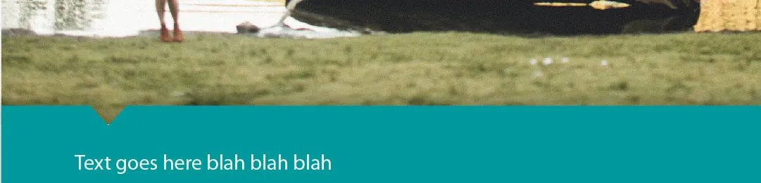
在CSS中是否可以制作这样的东西?我想要一个头部的图片,但我希望下一个部分被剪切成三角形,以便上面的图片显示出来。

我知道如何用边框创建实心CSS三角形(例如:http://www.dailycoding.com/Posts/purely_css_callouts.aspx),但在这种情况下,我需要做相反的事情(从蓝色部分中“取出”一个“块”),或者将三角形制作为图像,使其与所连接的图像完全对齐。如果我可以取出一个“块”,那可能会更容易。

为了使它变得更加复杂,我还将上面的图像设置为background-attachment:fixedbackground-size:cover。因此,当浏览器大小变大时,图像会按比例缩放。

如果我不能仅使用CSS完成它并需要一个图像,则如何制作正确的图像组合,以使三角形与文本保持对齐,如果文本在页面上水平居中对齐会怎么样?我正在考虑像这样使用两个长的div扩展到边缘,以及一个精确宽度的图像在中间,其中三角形是透明的:

_____________________________  ___ ______________________  _________________________
|    (really wide for margin)||   V (960px wide image)   || (really wide box again) |

只使用CSS能完成吗?或者也许有一个SVG解决方案(我对SVG不太熟悉)?如果这肯定仅是“渐进增强”,那么只在现代浏览器中使用的解决方案也可以。

3个回答

10

这是一个三角形边框的变体。

HTML

<div id="container">
    <div id="one"></div>
    <div id="two"></div>
</div>

CSS

#container{
    height: 300px;
    background-color: red;
    position: relative;
}

#one {
    position: absolute;
    width: 100px;
    left: 0;
    bottom: 0;
    border-bottom: 20px solid green;
    border-right: 20px solid transparent;
}

#two {
    position: absolute;
    left: 120px;
    bottom: 0;
    right: 0;
    border-bottom: 20px solid green;
    border-left: 20px solid transparent;
}

另一种方法:我曾使用CSS转换(具体来说是倾斜)完成类似的效果。请参见CSS(3)和HTML切割边缘


我正在使用更多的z-index来编写答案,但我认为这会更适合原帖作者。 - MarsOne
1
你也可以使用 (:):before/(:):after 伪元素来代替 #one/#two,以便保持标记更清晰:http://jsfiddle.net/V2yyH/ - Ilya Streltsyn
你应该将其作为答案发布(连同其他改进)。我会点赞的。 - Tim M.
当它处理background-size: coverbackground-attachment: fixed时,我感到很高兴 :) http://jsfiddle.net/nhqKb/4/ - Matt

3
您可以使用::before::after而不需要太多额外的标记。您只需要在容器上添加overflow: hidden

给定:

<div class="hero">
  <img src="http://farm3.staticflickr.com/2431/3875936992_348d6dd86b_b.jpg" alt=""/>
</div>

CSS的内容如下:
.hero {
    position: relative;
    overflow: hidden;
}
.hero img {
    display: block;
    width: 960px;
    height: auto;
}
.hero::before {
    content: "\00A0";
    display: block;
    border: 960px solid #fff; /* the width of the image */
    border-top-width: 0;
    border-bottom-width: 0;
    height: 30px; /* 1/2 the triangle width */
    width: 60px; /* the triangle width */
    position: absolute;
    bottom: 0;
    left: -630px; /* the left offset - the image width */
}
.hero::after {
    content: "\00A0";
    display: block;
    border: 30px solid #fff; /* 1/2 the triangle width */
    border-top: 30px solid transparent; /* 1/2 the triangle width */
    border-bottom-width: 0;
    height: 0;
    width: 0;
    position: absolute;
    bottom: 0;
    left: 330px; /* the left offset */
}

实时示例:http://codepen.io/aarongustafson/full/nutDB


我会投票支持使用::before::after,但它使用了img而不是background。尽管如此,我还是给它点赞!谢谢! - Matt

0

我用了一种不同的方法来处理这个问题。虽然不完全符合原帖的要求,但看起来很好,可能会对其他人有所帮助。

我使用了z-indexborder-radius来实现这个效果。

演示

HTML

<div>
    <img src="http://lorempixel.com/500/200/sports/" class="lowerpic"/>
    <div class="leftupperdiv"></div>
    <div class="rightupperdiv"></div>
</div>

CSS

.lowerpic {
    z-index:-1;
    position:absolute;
}
.leftupperdiv {
    z-index:1;
    position:absolute;
    margin-top:150px;
    width:100px;
    height:50px;
    border-radius: 0px 30px 0px 0px;
    background-color: blue;
}
.rightupperdiv {
    z-index:1;
    position:absolute;
    margin-top:150px;
    margin-left:100px;
    width:400px;
    height:50px;
    border-radius: 30px 0px 0px 0px;      
    background-color: blue;
}

网页内容由stack overflow 提供, 点击上面的
可以查看英文原文,
原文链接