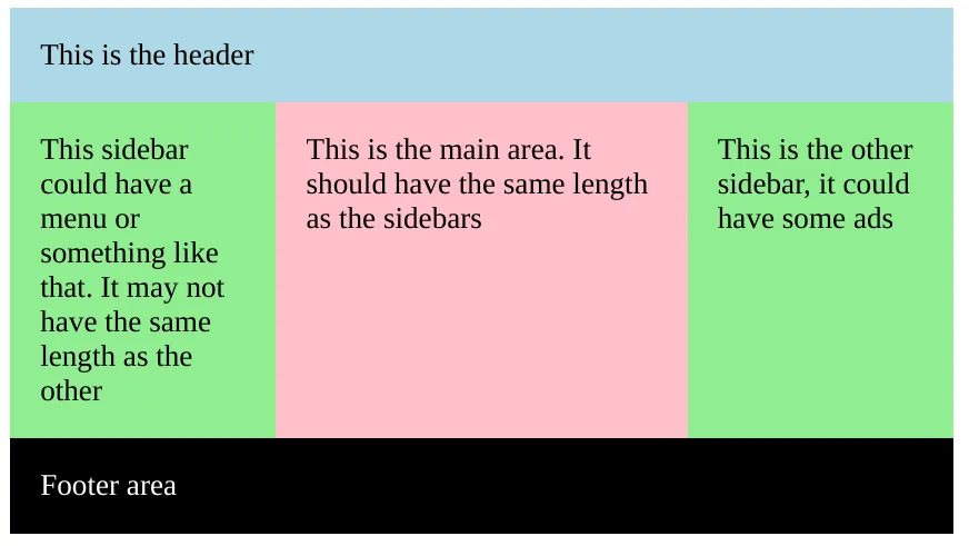
我目前有一个有些奇特的问题,使用 table 来解决,如下所示。基本上,我想要两个 div 占用 100% 的可用宽度,但只占用所需的垂直空间(从图片中并不是很明显)。两个 div 应始终具有完全相同的高度,并有一条小线将它们隔开,如图所示。

(来源:pici.se)
这一切都可以使用 table 很容易实现,这也是我目前正在使用的方法。然而,我对这个解决方案并不太感兴趣,因为从语义上讲,这并不是真正的表格。
我目前有一个有些奇特的问题,使用 table 来解决,如下所示。基本上,我想要两个 div 占用 100% 的可用宽度,但只占用所需的垂直空间(从图片中并不是很明显)。两个 div 应始终具有完全相同的高度,并有一条小线将它们隔开,如图所示。
(来源:pici.se)
这一切都可以使用 table 很容易实现,这也是我目前正在使用的方法。然而,我对这个解决方案并不太感兴趣,因为从语义上讲,这并不是真正的表格。
clear: both 来解决。
当然,现在更好的解决方案是使用 flexbox 或 grid。
如果您想要,可以查看这个 codepen。
.section {
  width: 500px;
  margin: auto;
  overflow: hidden;
  padding: 0;
}

div {
  padding: 1rem;
}

.header {
  background: lightblue;
}

.sidebar {
  background: lightgreen;
  width: calc(25% - 1rem);
}

.sidebar-left {
  float: left;
  padding-bottom: 500rem;
  margin-bottom: -500rem;
}

.main {
  background: pink;
  width: calc(50% - 4rem);
  float: left;
  padding-bottom: 500rem;
  margin-bottom: -500rem;
}

.sidebar-right {
  float: right;
  padding-bottom: 500rem;
  margin-bottom: -500rem;
}

.footer {
  background: black;
  color: white;
  float: left;
  clear: both;
  margin-top: 1rem;
  width: calc(100% - 2rem);
}<div class="section">
<div class="header">
This is the header
</div>
<div class="sidebar sidebar-left">
This sidebar could have a menu or something like that. It may not have the same length as the other
</div>
<div class="main">
This is the main area. It should have the same length as the sidebars
</div>
<div class="sidebar sidebar-right">
This is the other sidebar, it could have some ads
</div>
<div class="footer">
Footer area
</div>
</div>使用JS,在您想要具有相同高度的所有元素中使用data-same-height="group_name"。
例如: https://jsfiddle.net/eoom2b82/
代码:
$(document).ready(function() {
    var equalize = function () {
        var disableOnMaxWidth = 0; // 767 for bootstrap

        var grouped = {};
        var elements = $('*[data-same-height]');

        elements.each(function () {
            var el = $(this);
            var id = el.attr('data-same-height');

            if (!grouped[id]) {
                grouped[id] = [];
            }

            grouped[id].push(el);
        });

        $.each(grouped, function (key) {
            var elements = $('*[data-same-height="' + key + '"]');

            elements.css('height', '');

            var winWidth = $(window).width();

            if (winWidth <= disableOnMaxWidth) {
                return;
            }

            var maxHeight = 0;

            elements.each(function () {
                var eleq = $(this);
                maxHeight = Math.max(eleq.height(), maxHeight);
            });

            elements.css('height', maxHeight + "px");
        });
    };

    var timeout = null;

    $(window).resize(function () {
        if (timeout) {
            clearTimeout(timeout);
            timeout = null;
        }

        timeout = setTimeout(equalize, 250);
    });
    equalize();
});
几年前,使用 display: table; 和 display: table-row; 以及 display: table-cell; 的 float 属性用于解决表格布局的问题。
但是现在,使用 flex 属性,您只需三行代码即可解决它:display: flex; 和 flex-wrap: wrap; 以及 flex: 1 0 50%;
.parent {
    display: flex;
    flex-wrap: wrap;
}

.child {
 // flex: flex-grow flex-shrink flex-basis;
    flex: 1 0 50%;
}
1 0 50% 是我们分别赋予 flex-grow flex-shrink flex-basis 的 flex 值。这是在 flexbox 中相对较新的快捷方式,可以避免逐个输入它们。希望这能帮助到某些人。
<div id="ven">
<section>some content</section>
<section>some content</section>
</div>
CSS
#ven {
height: 100%;
}
#ven section {
width: 50%;
float: left;
height: 100%;
}