ggplot2
A more concise version in ggplot2 using the argument inherit.aes = FALSE inside geom_density to override the default aesthetics used in the previous two layers.
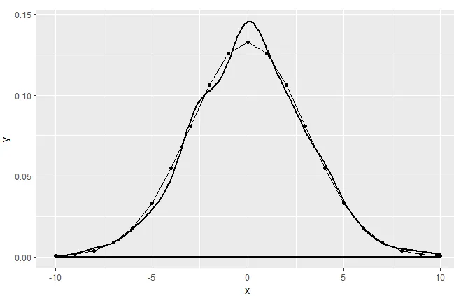
library(ggplot2)
set.seed(2017)
x = -10:10
y = dnorm(x, mean = 0, sd = 3)
df.norm = data.frame('x' = x, 'y' = y)
random = data.frame('x' = rnorm(1000, mean = 0, sd = 3))

ggplot(data = df.norm, aes(x = x, y = y)) +
  geom_line() +
  geom_point() +
  geom_density(data = random,
               aes(x = x),
               inherit.aes = FALSE,
               size = 1)
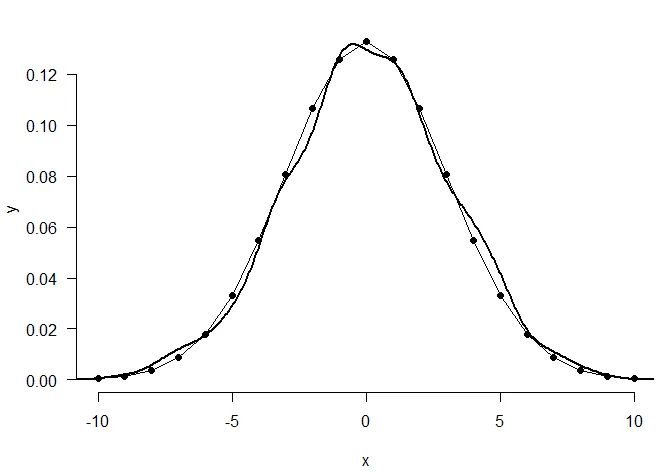
 Base
Base
Adapting the solution provided by scoa to the base package:
plot(df.norm, type = "l", bty = "n", las = 1)
points(df.norm, pch= 19)
lines(density(random$x), lwd = 2)
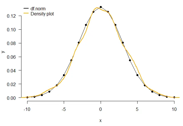
Adding a legend, and a different colour for the density curve:
plot(df.norm, type = "l", bty="n", las = 1)
points(df.norm, pch= 19)
lines(density(random$x), lwd =2, col = 'orange')
legend(x = "topleft",
       c("df.norm", "Density plot"),
       col = c("black", "orange"),
       lwd = c(2, 2),
       bty = "n")
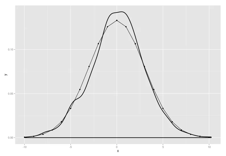
ggplot() + geom_line(data=df.norm, aes(x=x, y=y), colour='red') + geom_point(data=df.norm, aes(x=x, y=y), colour='red') + geom_density(data=random, aes(x=x), size=1, colour='blue') scale_colour_discrete(name ="distribution", labels=c('calculated', 'simulations'))再次感谢! - YJZaes()内添加颜色语句即可:ggplot() + geom_line(data=df.norm, aes(x=x, y=y,colour="red")) + geom_point(data=df.norm, aes(x=x, y=y, colour='red')) + geom_density(data=random, aes(x=x, colour='blue'), size=1) + scale_colour_discrete(name ="分布", labels=c('计算', '模拟'))- scoa