我正在尝试向图表中添加一个额外的数据系列来显示CPU阈值。我可以获取范围并创建没有阈值的图表,但我不知道如何将阈值添加到图表中。
我需要创建另一个图表对象吗?还是可以使用现有的对象并添加新的范围?
你是如何创建图表的?-- 请查看下面的代码。
这个图表已经在Excel文件中创建好了,你想修改Excel文件中的图表吗?
是的,图表已经存在于Excel文件中。
Excel.ChartObjects sCPUChart; Excel.ChartObject sCPUChartObjects;
Excel.ChartObjects sCPUChart; Excel.ChartObject sCPUChartObjects;
        sCPUChart = sDBSheet.ChartObjects(Type.Missing);
        sCPUChartObjects = sCPUChart.Add(49, 15, 360, 215);

        Excel.Chart sChartCPU;

        sChartCPU = sCPUChartObjects.Chart;
        sChartCPU.SetSourceData(cpuChartRange, Missing.Value);
        sChartCPU.ChartWizard(Source: cpuChartRange, Gallery: Excel.XlChartType.xlLine, Format: 2, HasLegend: true);
        sChartCPU.Location(Excel.XlChartLocation.xlLocationAsObject, sDBSheet.Name);

        //CPU Chart Axis
        Excel.Axis xSChartCPUAxis;
        xSChartCPUAxis = sChartCPU.Axes(Excel.XlAxisType.xlCategory, Excel.XlAxisGroup.xlPrimary);


        Excel.Axis ySChartCPUAxis;
        ySChartCPUAxis = syChartCPU.Axes(Excel.XlAxisType.xlValue, Excel.XlAxisGroup.xlPrimary);
        ySChartCPUAxis.HasMajorGridlines = true;
        ySChartCPUAxis.MaximumScaleIsAuto = true;

        //Set Summary CPU Series
        Excel.Series sCPUSeries = sChartCPU.SeriesCollection(1);
        sCPUSeries.Name = "CPU";


//-------
// this is where I am having my issue
//I don't know how to add the threshold line to the graph with the existing graph being displayed

        //sChartCPU.set_HasAxis(Excel.XlAxisType.xlCategory, Excel.XlAxisGroup.xlSecondary, true);
        //summaryChartCPU.SetSourceData(summaryMemThreshold, Type.Missing); -- things break
        //-------
I have now done the following:


   Excel.SeriesCollection threshold = sChartCPU.sseriesCollection();
   Excel.Series line = threshold.NewSeries();
   line.Formula = "=SERIES(Summ!$D$54,Summ!$C$55:$C$56,Summ!$D$55:$D$56)";
   line.ChartType = Excel.XlChartType.xLScatterLinesNoMarkers;


when the threshold line is created I have the following
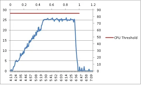
我在单元格D54中拥有的数值-阈值
  C55 = 0
  C56 = 1
  D55 = 75
  D56 = 75
我不知道如何移除图表中出现的两个额外轴。如果我注释掉.ChartType这一行,则轴是正确的,但我只得到一个阈值数据点?? 我不明白为什么会这样。