使用我的数据:
Row | Year | SchoolID | SchoolName | BudgetArea |PaymentPerStudent

001   2011     ABC       PS #1         Staff            12000
002   2012     ABC       PS #1         Staff            10000
003   2011     ABC       PS #1         Lunch            22000
004   2012     ABC       PS #1         Lunch            18000
005   2011     DEF       PS #2         Staff            80000
006   2012     DEF       PS #2         Staff            65000
007   2013     DEF       PS #2         Staff            50000
008   2011     DEF       PS #2         Lunch            23000
009   2012     DEF       PS #2         Lunch            34000
010   2013     DEF       PS #2         Lunch            28000
011   2011     GHI       PS #3         Staff             9000
012   2012     GHI       PS #3         Staff            10000
013   2013     GHI       PS #3         Staff            12000
014   2011     GHI       PS #3         Lunch            22000
015   2012     GHI       PS #3         Lunch            17000
016   2013     GHI       PS #3         Lunch            18000
我希望重现以下图表:
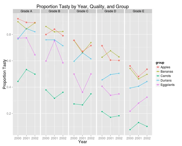
其中:
1)“GradeA”... “GradeN”的值要替换为“SchoolName”的值。
2)“Group”值(如Apples,Bananas等)将被替换为“Budget Area”值(如人员、午餐等)。
3)“Proportion Tasty”值要替换为“PaymentPerStudent”值。
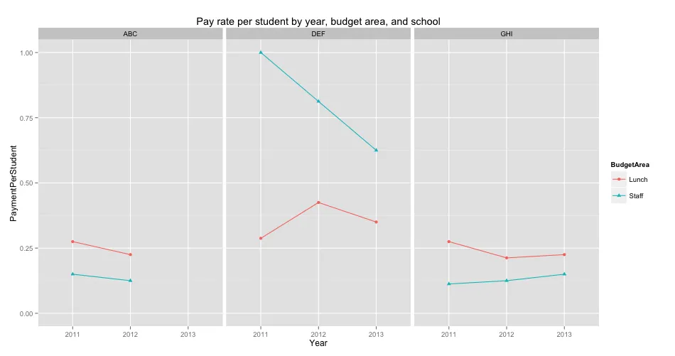
编辑(04/09/2014):我已经尝试了以下内容,并得到了Jaap的输入(请参见下文):
    ggplot(data=Rates_2, aes(x=factor(Year), y=PaymentPerStudent/max(PaymentPerStudent),
                         group=BudgetArea, shape=BudgetArea, color=BudgetArea)) +
  geom_line() +
  geom_point() +
  labs(title = "Pay rate per student by year, budget area, and school") +
  scale_x_discrete("Year") +
  scale_y_continuous("PaymentPerStudent", limits=c(0,1)) +
  facet_grid(.~SchoolID)
然而,它生成以下“压缩”的图表:
我希望找到一种方法,在结果图中将学校(每页可能有9所学校)分割到不同的页面上,以便更好地理解这些图表。
请注意:
1)数据框具有将近2,000行数据,代表400多所学校。
2)时间跨度为2001年至2004年。
3)每个学生支付的变量范围从10,000到100,000。 我希望重新调整变量(使其介于0和1之间),以实现我的制图目标。