我使用ggplot在R中制作了一个热度图。
示例
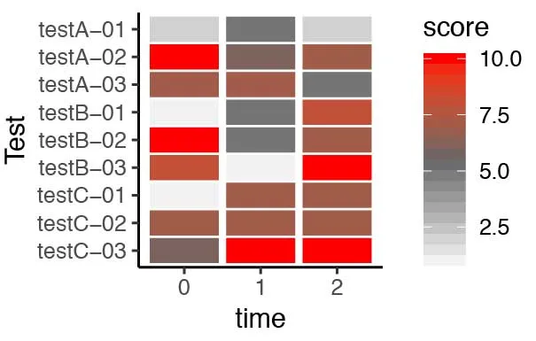
这导致了以下的绘图结果:
# Libraries
library(tidyverse)

# Create data frame
df <- data.frame(test = rep(c("testA-01", "testA-02", "testA-03", "testB-01", "testB-02", "testB-03", "testC-01", "testC-02", "testC-03"),3),
                 time = c( rep(0,9), rep(1, 9), rep(2, 9) ),
                 score = sample(1:10, 27, replace = TRUE) )

# Create heatmap
ggplot(data = df, mapping = aes(x = time, y = test)) +
  geom_tile(mapping = aes(fill = score, width=0.9, height=0.9)) +
  scale_fill_gradientn(limits = c(1,10), colours=c("grey95", "grey40", "red"), na.value = "white" ) +
  scale_y_discrete(name = "Test", limits = c("testC-03", "testC-02", "testC-01", "testB-03", "testB-02", "testB-01", "testA-03",
                                                "testA-02", "testA-01")) +
  theme_classic()
这导致了以下的绘图结果:
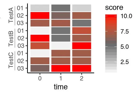
scale_y_discrete()的limits中删除“Test[letter]”部分。接下来,我想在y轴上垂直添加并按测试分组标签(最好用一条垂直线分组测试),就像这样:
期望结果:
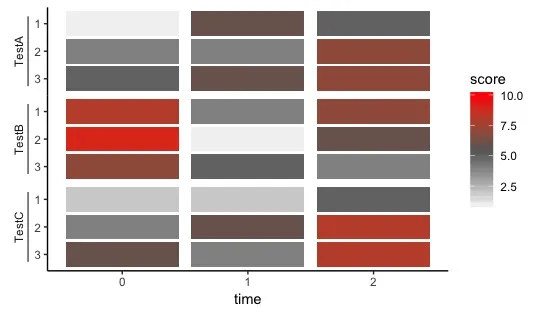
panel.spacing = unit(0.1, "cm")(或者您认为在最终呈现的图表中看起来好的任何价值)。然后轴本身成为垂直线,多余的线可能是冗余的。但这只是我个人对数据墨水比的简洁方法。祝你好运! - Henrik