我正在构建一个落地页,用户首先看到一个主要区域,下面是一个页脚。向下滚动会发现页脚是一个固定的标题,我打算使用纯CSS来实现这一点。为了获得主内容和页脚的全屏外观,我将
这是我页面在删除
我读过使用
我已经在以下浏览器上进行了测试:
height属性设置为两个不同的值:92%和8%(使用vh也不起作用)。无论我在CSS中指定的height是什么(不同的单位等),我的页脚div都无法固定。只要我删除height属性,它就能按预期工作。这是我页面在删除
height属性之前的截图:
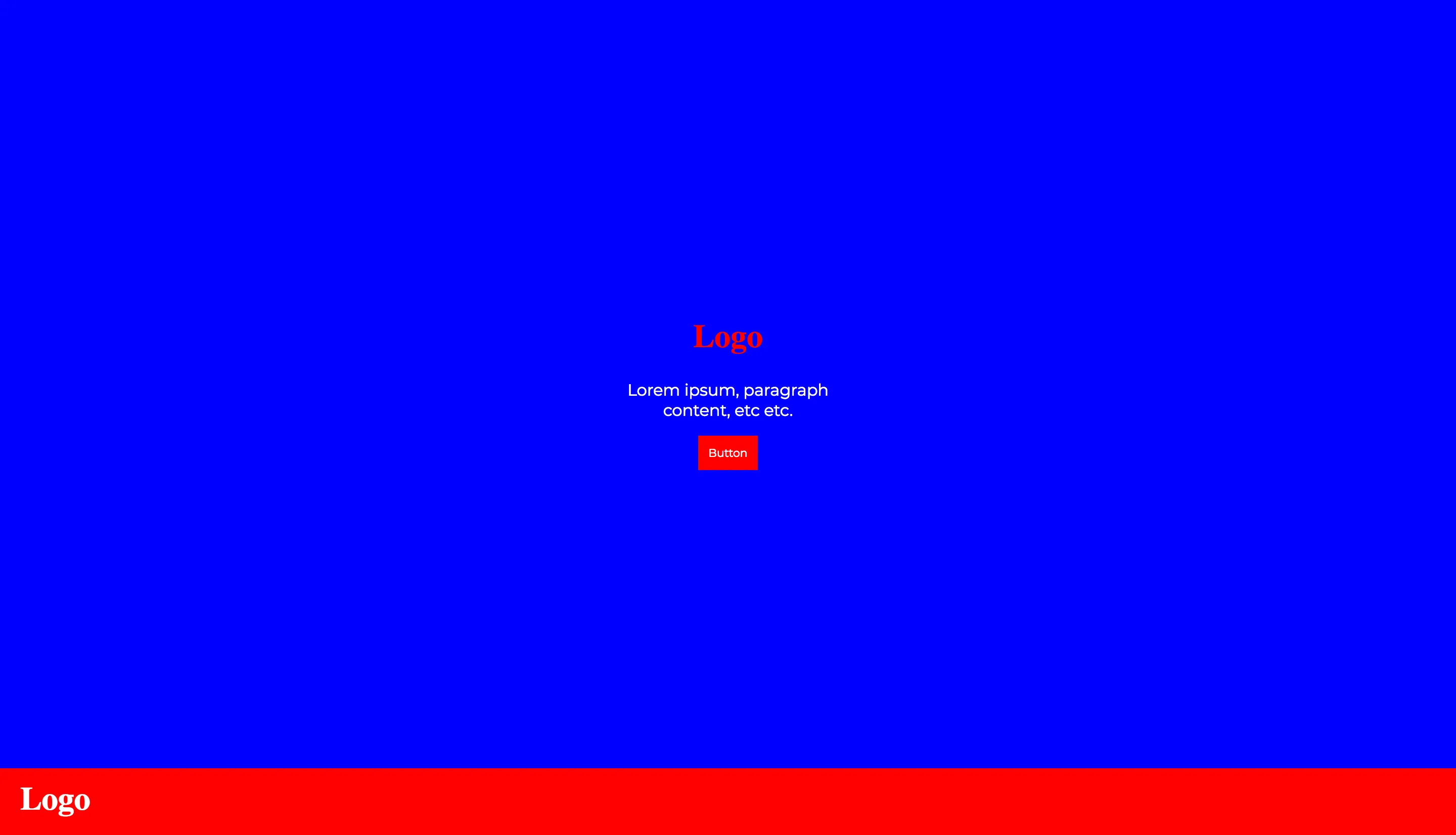

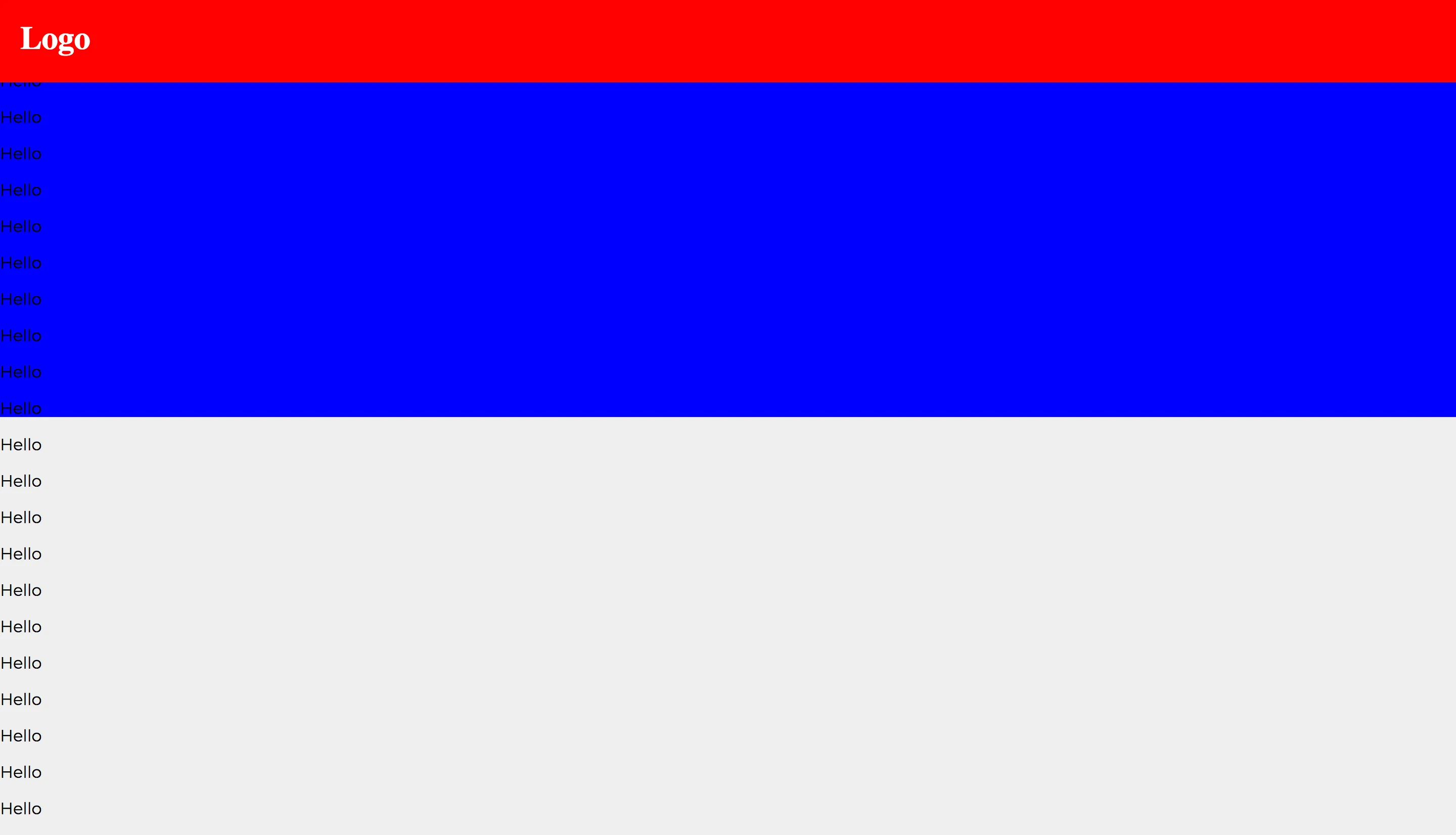
height属性值之后,它确实粘住了。
html,
body {
  height: 100%;
  margin: 0;
}

#main {
  height: 92%;
}

#landing {
  display: flex;
  align-items: center;
  justify-content: center;
  height: 100%;
  text-align: center;
}

#landingContent {
  width: 20vw;
}

#footerNav {
  height: 8%;
  display: flex;
  align-items: center;
  position: -webkit-sticky;
  position: sticky;
  top: 0px;
}<div id="main">
<div id="landing">
<div id="landingContent">
<h1 class="logo">Logo</h1>
<p id="landingParagraph">Lorem ipsum, paragraph content, etc etc.</p>
<button>Button</button>
</div>
</div>
</div>
<div id="footerNav">
<div id="footerNavContent">
<h1 class="logo">Logo</h1>
</div>
</div>
<p>Hello</p>
<p>Hello</p>
<p>Hello</p>
<p>Hello</p>
<p>Hello</p>
<p>Hello</p>
<p>Hello</p>
<p>Hello</p>
<p>Hello</p>
<p>Hello</p>
<p>Hello</p>
<p>Hello</p>
<p>Hello</p>
<p>Hello</p>
<p>Hello</p>
<p>Hello</p>
<p>Hello</p>
<p>Hello</p>
<p>Hello</p>
<p>Hello</p>
<p>Hello</p>
<p>Hello</p>
<p>Hello</p>
<p>Hello</p>
<p>Hello</p>
<p>Hello</p>
<p>Hello</p>overflow属性可能会有问题,尽管它目前不存在,我也没有听说过其他人对height有任何问题。当然,我可能是错的。我已经在以下浏览器上进行了测试:
- Firefox 61(夜间版)
- Safari 53(技术预览版)
- Chrome 65
#main中删除height属性可以使#footerNav保持粘性。