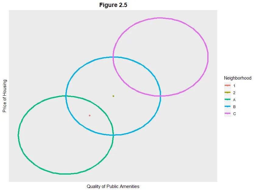
我的图形由三个圆和两个点组成。我希望完成两个看似简单但却很难的任务。我希望 1) 创建两个图例,以及 2) 更改家庭点的形状、大小和颜色。这些圆是使用以下函数生成的...
circleFun <- function(center,diameter, npoints){
  # recovered from
  # https://dev59.com/N2w15IYBdhLWcg3wD3Zk
  r = diameter / 2
  tt <- seq(0,2*pi,length.out = npoints)
  xx <- center[1] + r * cos(tt)
  yy <- center[2] + r * sin(tt)
  return(data.frame(x = xx, y = yy))
}
我随后使用3个不同的输入调用该函数,为每个圆生成100个x-y点。
A <- circleFun(c(0,0), 1, npoints=100) %>%
        cbind("A") %>%
          set_names(c("x", "y", "Neighborhood"))
B <- circleFun(c(.5, .5), 1, npoints=100) %>%
         cbind("B") %>%
          set_names(c("x", "y", "Neighborhood"))

C <- circleFun(c(1, 1), 1, npoints=100) %>%
      cbind("C") %>%
        set_names(c("x", "y", "Neighborhood"))
neigh <- rbind(A, B, C)
接着我创建了我的点数据。
hh <- as.data.frame(matrix(c(.25,.5,.25,.5,1,2), 2, 3)) %>%
        set_names(c("x", "y", "Household"))
到目前为止,我有两个不同的数据集,都是点,都遵循aes(x,y)。但是它们的分组方式不同:第一个数据集按“邻域”分组,第二个数据集按“家庭”分组。
然后,我绘制了目前为止的内容...
  # Plot Neighborhoods and set up plot specifics
  c <- ggplot(data=neigh, aes(x,y, group = Neighborhood, color = Neighborhood)) +
  geom_path(size = 1.5) +
  xlab("Quality of Public Amenities") +
  ylab("Price of Housing") +
  ggtitle("Figure 2.5") +
  theme(panel.grid = element_blank(),
        axis.text.x = element_blank(),
        axis.text.y = element_blank(),
        axis.ticks.x = element_blank(),
        axis.ticks.y = element_blank(),
        plot.title = element_text(hjust=0.5, face = 'bold', size = 14))

 # Add corresponding household points
 c+geom_point(data=hh, aes(x=x,y=y,group = as.factor(Household), color = as.factor(Household)))
这是我的输出结果..
 那么我为什么在这里寻求帮助?我希望1)创建两个图例,一个是关于邻居的,另一个是房屋和2)改变房屋点的形状、大小和颜色。由于它们都是散点图,R不允许我分离这些图的美学(
aes()),这导致我无法完成任务1 & 2。此示例可完全复制。