Flexbox列对齐自身到底部

94

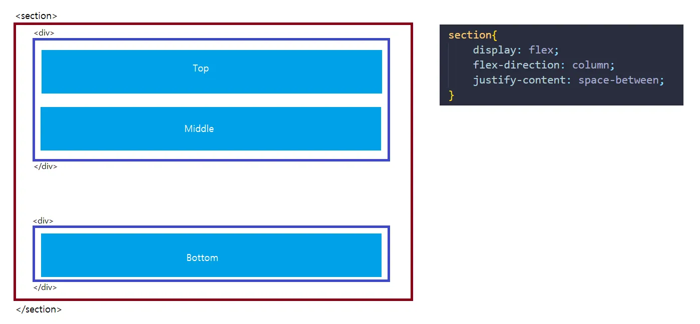
我正在尝试使用Flexbox。这个链接展示了一些很好的对齐选项,但我实际上想要一个顶-顶-底的情况。

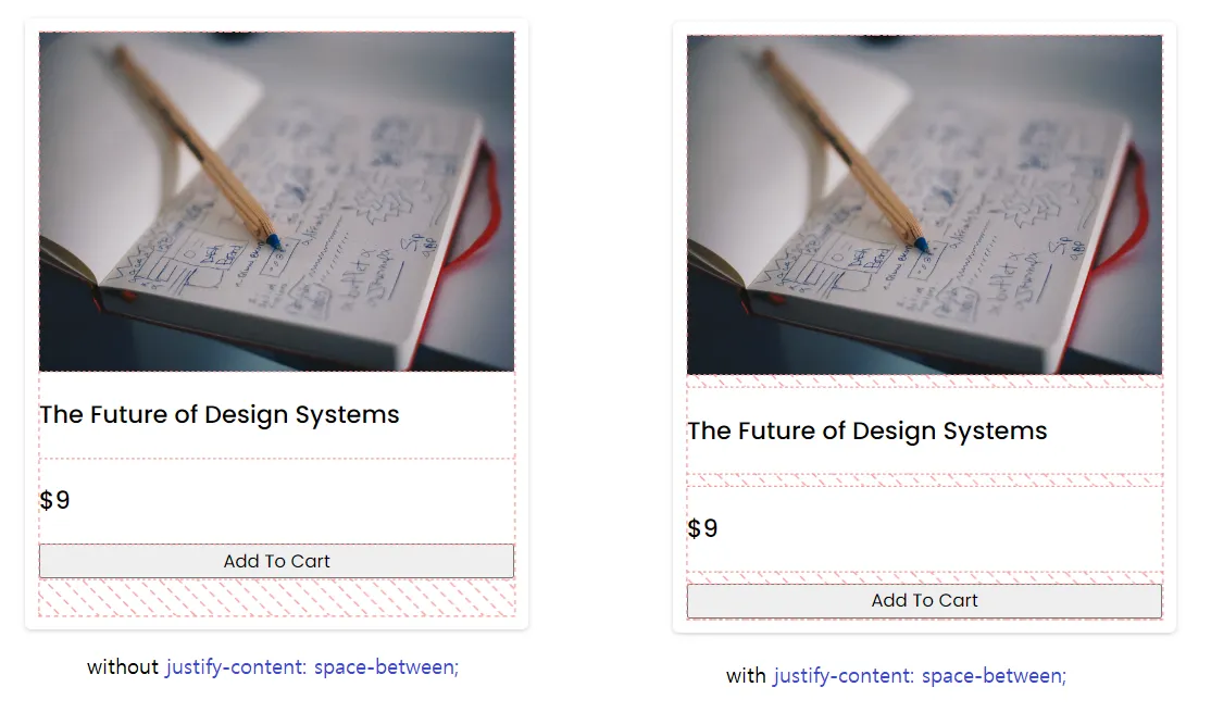
我想要一个div通过flexbox粘在父div的底部。使用flex-direction: columnalign-content: Space-between可以实现这一点,但是中间的div将居中对齐,而我希望中间的div也能粘在顶部。

[顶部]

[中间]

-

-

-

[底部]

align-self: flex-end会使它浮动到右边,而不是底部。

完整的Flexbox文档:http://css-tricks.com/snippets/css/a-guide-to-flexbox/


7
离题了,但似乎很荒谬,这种布局问题不能轻松地通过任何 flex-box 属性解决。 - coffeecola
@coffeecola 如果你没有相关知识,就不要说解决问题不容易。Flex 真的非常强大,感谢查看我的下面的答案。 - T04435
1
这可能是一个 bug 吗?为什么在行模式下相同的选项会将单元格向下推,但在列模式下却不会呢? - Roland
2
不,这不是一个错误,flex-end 在行或列模式下有不同的结束位置。行的末尾(底部)或列的末尾(右侧)。 - Laurens Kling
10个回答

191

虽然我有点晚到这个派对,但这对其他试图达成相同目标的人可能仍然相关:你应该能够做到以下事情:

margin-top: auto

关于问题元素,它应该移至底部。对于Firefox、Chrome和Safari来说,这个技巧应该可以解决。


是的,要将一个元素推到末尾,这样做就可以了。Flexbox对边距的处理略有不同。 - Laurens Kling
2
这个对我来说解决了几个小时的问题。它在IE中也可以工作(至少在11中,我还没有在其他版本中测试)。 - Ghostrydr
8
为了解释为什么这个方法可行:auto 告诉浏览器在元素与其最近的兄弟元素之间尽可能地添加空白间隔。因此,margin-top: auto 的意思是,在元素和其最近的兄弟元素之间上方添加尽可能多的空白间隔。另一个例子,margin-left: auto 将元素推到最右边。 - CodeBiker
这个答案肯定是可行的,但问题明确要求回答中使用flexbox。不过,了解margin auto也非常有帮助。 - Maximus

67

基本上,答案是给中间元素的最后一个添加flex grow 1代码,如下所示:

.middle-last{
  flex-grow: 1; // assuming none of the other have flex-grow set
}

谢谢,T04435。


我必须说,对于给定的例子来说,这实际上是一个更好的解决方案,因为你希望中间占据所有的空间,而不仅仅是边缘留出空白。 - Laurens Kling

14

我找到了自己的解决方案,为了文档价值,我将在此添加;

如果你给中间的块设置height: 100%,它将占据中间的所有空间。因此底部块将位于实际底部,而顶部和中间位于顶部。

更新:这在Chrome上不起作用...

更新:找到了适用于FF/Chrome的方法:为[middle]设置更高的flex-grow值(1就足够了),这将使其占据完整的中间大小。更多信息:http://css-tricks.com/almanac/properties/f/flex-grow/


我不明白你的回答,但这正是我现在遇到困难的确切问题。你能分享一下你实际使用的标记和 CSS 代码吗? - corradomatt
我会尽快发布它,有什么专业的stackoverflow提示吗?我应该将其添加到我的问题中吗? - Laurens Kling
假设其他元素具有 flex-grow: 0,这意味着它们将确定自己的宽度,将最后一个项目之前的元素设置为 flex-grow: 1 将导致它填充容器中的可用空间,将最后一个项目推到底部/末尾。 - Seth

10

align-self属性依赖于项目在交叉轴上的对齐方式,而非主轴。因此这不是实现目标的方法。

你有几个选项可以使用flexbox来完成:

1)在中间项目上使用 flex-grow:1。这将使其扩展并占用容器中所有剩余的空间,从而将最后一个div推到底部。

2)重新设计布局,使其中一个主要的div具有justify-content:space-between属性,以便将最后一个div粘贴到底部:

.container{
    display:flex;
    flex-direction:column;
    justify-content:space-between;
}
.body{
    display:flex;
    flex-direction:column;
}
.bottom{
    /* nothing needed for the outer layout */
}

<div class="container">
    <div class="body">
        <div>top content</div>
        <div>middle content</div>
    </div>
    <div class="bottom">
        bottom content
    </div>
</div>

3) 这有点奇怪,但你甚至可以使用align-self来反转弹性方向并允许项目换行:

.container{
    display:flex;
    flex-direction:row;
    flex-wrap:wrap;
}
.body{
    display:flex;
    flex-direction:column;
    flex-basis:100%;
}
.bottom{
    align-self:flex-end
}

我使用这个免费的flexbox设计工具进行了所有测试: http://algid.com/Flex-Designer

2
考虑到您的网站已经有了基本结构,以下是我在类似情况下使用并应用的解决方案,只需几行代码即可完成: HTML
<div class="site-container">
    <header>your header</header>
    <main>your main with little content</main>
    <footer>your footer</footer>
</div>

CSS

.site-container{
    min-height: 100vh;   //not necessary to calculate the height of the footer
    display: flex;
    flex-direction: column;
}

footer{
    margin-top: auto;
}

1

我知道这是一个旧帖子,但同样的问题,在Flexbox的单轴对齐方面,让我发疯了一个小时。

自动边距是一个不错的技巧,但我想分享我的解决方案,使用CSS Grid。

重要部分是定义grid-template-rows。 使用auto,行与内容具有相同的高度,而1fr将剩余空间用于中间行。

这里有一个关于CSS Grid的好概述: https://css-tricks.com/snippets/css/complete-guide-grid/

.container {
  height: 700px;
  display: grid;
  grid-template-rows: auto 1fr auto;
  grid-gap: 10px;
}

.top {
  height: 30px;
  width: 400px;
  background-color: blue;
}

.middle {
  width: 400px;
  background-color: green;
}

.bottom {
  height: 30px;
  width: 400px;
  background-color: red;
}
<div class="container">

  <div class="top"></div>
  <div class="middle"></div>
  <div class="bottom"></div>
  
</div>


1

这是flexbox的限制,我们必须接受它。

以下是两个可尝试的替代方案:

  1. 使用div将[top] [middle]组合在一起,[bottom]组合在另一个div中。 同时,创建一个section并使用display flex,direction为column,justify-content为space-between来将它们一起覆盖。

enter image description here

PS:通过class/id应用CSS,我仅以section为例。

  1. 由于方向为column,只需使用justify-content: space-between,它就会将所有水平空间平均分配给top、middle和bottom。 虽然不是完美准确的解决方案,但对于卡片和小组件来说已经足够了。

enter image description here


1
.message-container {
    display: flex;
    flex-direction: column;
    place-content: flex-end;
    height: -webkit-fill-available;
}

.message {
    display: table-cell;
}

尝试一下这个。我在 Messenger 上使用它。

.container {
  height: 400px;
}

.message-container {
    display: flex;
    background: #eee;
    flex-direction: column;
    place-content: flex-end;
    height: -webkit-fill-available;
}

.user-message {
    align-self: flex-start;
    display: table-cell;
    padding: 5px;
    margin: 10px;
    border-radius: 10px;
    background-color: rgba(154, 247, 200, 0.692);
}

.friend-message {
    align-self: flex-end;
    display: table-cell;
    padding: 5px;
    margin: 10px;
    border-radius: 10px;
    background-color: rgba(169, 207, 250, 0.692);
}
<div class='container'>
  <div class='message-container'>
    <div class='user-message'>Hello!</div>
    <div class='friend-message'>Hi.</div>
  </div>
</div>


place-content: flex-end; !!!! - Dejan Dozet

0
将父容器的项目与基线对齐,并将子项目作为内联块。

-2

你可以不使用 flex box,像这样:

.footer {
  position: fixed;
  bottom: 0;
  width: 100%;
}

请注意,这将导致一个浮动的固定页脚。 - Arusekk

网页内容由stack overflow 提供, 点击上面的
可以查看英文原文,
原文链接