我有一个带圆角的边框元素,其中包含一个3x3的网格。 网格的角落突出了边框。 我该怎么办? 我尝试使用ClipToBounds,但没有任何效果。感谢您的帮助。
7个回答
71
- 装饰器(如 Border)或布局面板(如 Stackpanel)都没有默认提供此行为。
- ClipToBounds 用于布局。 ClipToBounds 不会阻止元素绘制超出其边界;它只是防止子级布局“溢出”。此外,大多数元素不需要 ClipToBounds=True,因为它们的实现不允许其内容的布局溢出。最明显的例外是 Canvas。
- 最后,Border 将圆角视为其布局内部的绘图。
下面是一个从 Border 继承并实现正确功能的类的示例:
     /// <Remarks>
    ///     As a side effect ClippingBorder will surpress any databinding or animation of
    ///         its childs UIElement.Clip property until the child is removed from ClippingBorder
    /// </Remarks>
    public class ClippingBorder : Border {
        protected override void OnRender(DrawingContext dc) {
            OnApplyChildClip();
            base.OnRender(dc);
        }

        public override UIElement Child
        {
            get
            {
                return base.Child;
            }
            set
            {
                if (this.Child != value)
                {
                    if(this.Child != null)
                    {
                        // Restore original clipping
                        this.Child.SetValue(UIElement.ClipProperty, _oldClip);
                    }

                    if(value != null)
                    {
                        _oldClip = value.ReadLocalValue(UIElement.ClipProperty);
                    }
                    else
                    {
                        // If we dont set it to null we could leak a Geometry object
                        _oldClip = null;
                    }

                    base.Child = value;
                }
            }
        }

        protected virtual void OnApplyChildClip()
        {
            UIElement child = this.Child;
            if(child != null)
            {
                _clipRect.RadiusX = _clipRect.RadiusY = Math.Max(0.0, this.CornerRadius.TopLeft - (this.BorderThickness.Left * 0.5));
                _clipRect.Rect = new Rect(Child.RenderSize);
                child.Clip = _clipRect;
            }
        }

        private RectangleGeometry _clipRect = new RectangleGeometry();
        private object _oldClip;
    }
- Micah
3
68
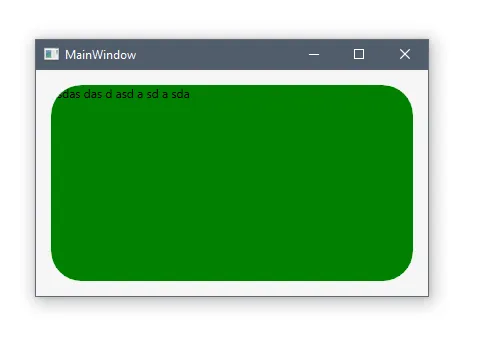
纯XAML:
<Border CornerRadius="30" Background="Green">
    <Border.OpacityMask>
        <VisualBrush>
            <VisualBrush.Visual>
                <Border
                    Background="Black"
                    SnapsToDevicePixels="True"
                    CornerRadius="{Binding CornerRadius, RelativeSource={RelativeSource AncestorType=Border}}"
                    Width="{Binding ActualWidth, RelativeSource={RelativeSource AncestorType=Border}}"
                    Height="{Binding ActualHeight, RelativeSource={RelativeSource AncestorType=Border}}"
                    />
            </VisualBrush.Visual>
        </VisualBrush>
    </Border.OpacityMask>
    <TextBlock Text="asdas das d asd a sd a sda" />
</Border>
更新:发现了一个更好的方法来实现相同的效果。现在你也可以将 Border 替换为任何其他元素。
<Grid>
    <Grid.OpacityMask>
        <VisualBrush Visual="{Binding ElementName=Border1}" />
    </Grid.OpacityMask>
    <Border x:Name="Border1" CornerRadius="30" Background="Green" />
    <TextBlock Text="asdas das d asd a sd a sda" />
</Grid>
- Andrew Mikhailov
4
1为了消除第一个示例中圆角后面的伪影(例如,您可以使用Snoop工具放大查看),您还必须绑定BorderThickness(以相同的方式)并将BorderBrush设置为白色。这将切断边框的边框。 - P.W.
4第一个例子更加通用,因为它可以是透明的(剪切形状不必可见,带有其背景)。 - P.W.
1我也推荐第一个例子,因为它支持透明度。 - Hossein Narimani Rad
1如果您正在使用透明度,解决方案2肯定是失败的。解决方案1的问题在于,如果您有可见的边框(例如细黑线),则内容将溢出该线。我想您可以应用一个Z顺序在其上的第二个边框。在我的情况下,我只是决定摆脱黑线并添加阴影。 - Jamie
13
正如Micah所提到的,ClipToBounds与Border.CornerRadius不兼容。
有UIElement.Clip属性,Border作为子元素支持该属性。
如果您知道边框的确切大小,则可以使用以下解决方案:
<Border Background="Blue" CornerRadius="3" Height="100" Width="100">
      <Border.Clip>
        <RectangleGeometry RadiusX="3" RadiusY="3" Rect="0,0,100,100"/>
      </Border.Clip>
      <Grid Background="Green"/>
</Border>
如果大小未知或动态的话,可以使用
Border.Clip的Converter。请参见此处的解决方案。- Artur A
7
我刚刚发现了一个解决方案,然后跟着Jobi提供的msdn论坛链接并花费20分钟编写了自己的ClippingBorder控件。
接着我意识到CornerRadius属性类型不是double,而是System.Windows.CornerRadius,它接受4个double值,分别对应每个角落。
现在我将列出另一种替代解决方案,这很可能会满足未来许多人遇到此问题的要求...
假设您有以下XAML:
<Border CornerRadius="10">
    <Grid>
        ... your UI ...
    </Grid>
</Border>
问题是Grid元素的背景渗透并且显示在圆角之外。请确保您的具有透明背景,而不是将相同的画刷分配给元素的“Background”属性。没有超过圆角的渗漏,也不需要大量的CustomControl代码。
理论上说,客户端区域仍然有可能超出角落边缘的绘制,但是您可以控制该内容,因此作为开发人员,您应该能够获得足够的填充或确保靠近边缘的控件形状是适当的(在我的情况下,我的按钮是圆形的,所以非常好地适合角落而没有任何问题)。
- DXM
3
将我的网格背景设置为透明正是我所需要的。相反,将颜色放在边框上 :) - Poat
我的图像使用这段代码仍然超出了边界。 - baye dbest
问题在于我想让我的网格的顶行具有不同的背景颜色,并且仍然被剪切到边框的角半径,所以这个方案是行不通的。对于大多数人来说,这是一个好的简单解决方案。 - Jamie
5
使用@Andrew Mikhailov的解决方案,您可以定义一个简单的类,从而无需手动为每个受影响的元素定义VisualBrush:
public class ClippedBorder : Border
{
    public ClippedBorder() : base()
    {
        var e = new Border()
        {
            Background = Brushes.Black,
            SnapsToDevicePixels = true,
        };
        e.SetBinding(Border.CornerRadiusProperty, new Binding()
        {
            Mode = BindingMode.OneWay,
            Path = new PropertyPath("CornerRadius"),
            Source = this
        });
        e.SetBinding(Border.HeightProperty, new Binding()
        {
            Mode = BindingMode.OneWay,
            Path = new PropertyPath("ActualHeight"),
            Source = this
        });
        e.SetBinding(Border.WidthProperty, new Binding()
        {
            Mode = BindingMode.OneWay,
            Path = new PropertyPath("ActualWidth"),
            Source = this
        });

        OpacityMask = new VisualBrush(e);
    }
}
为了测试,只需编译以下两个示例:
<!-- You should see a blue rectangle with rounded corners/no red! -->
<Controls:ClippedBorder
    Background="Red"
    CornerRadius="10"
    Height="425"
    HorizontalAlignment="Center"
    VerticalAlignment="Center"
    Width="425">
    <Border Background="Blue">
    </Border>
</Controls:ClippedBorder>

<!-- You should see a blue rectangle with NO rounded corners/still no red! -->
<Border
    Background="Red"
    CornerRadius="10"
    Height="425"
    HorizontalAlignment="Center"
    VerticalAlignment="Center"
    Width="425">
    <Border Background="Blue">
    </Border>
</Border>
- user1618054
1
在我看来,这是最好的答案。简单易用且可重复利用。 - henon
0
我不喜欢使用自定义控件。相反,创建了一个行为。
using System.Linq;
using System.Windows;
using System.Windows.Interactivity;

/// <summary>
/// Base class for behaviors that could be used in style.
/// </summary>
/// <typeparam name="TComponent">Component type.</typeparam>
/// <typeparam name="TBehavior">Behavior type.</typeparam>
public class AttachableForStyleBehavior<TComponent, TBehavior> : Behavior<TComponent>
        where TComponent : System.Windows.DependencyObject
        where TBehavior : AttachableForStyleBehavior<TComponent, TBehavior>, new()
{
#pragma warning disable SA1401 // Field must be private.

    /// <summary>
    /// IsEnabledForStyle attached property.
    /// </summary>
    public static DependencyProperty IsEnabledForStyleProperty =
        DependencyProperty.RegisterAttached("IsEnabledForStyle", typeof(bool),
        typeof(AttachableForStyleBehavior<TComponent, TBehavior>), new FrameworkPropertyMetadata(false, OnIsEnabledForStyleChanged));

#pragma warning restore SA1401

    /// <summary>
    /// Sets IsEnabledForStyle value for element.
    /// </summary>
    public static void SetIsEnabledForStyle(UIElement element, bool value)
    {
        element.SetValue(IsEnabledForStyleProperty, value);
    }

    /// <summary>
    /// Gets IsEnabledForStyle value for element.
    /// </summary>
    public static bool GetIsEnabledForStyle(UIElement element)
    {
        return (bool)element.GetValue(IsEnabledForStyleProperty);
    }

    private static void OnIsEnabledForStyleChanged(DependencyObject d, DependencyPropertyChangedEventArgs e)
    {
        UIElement uie = d as UIElement;

        if (uie != null)
        {
            var behColl = Interaction.GetBehaviors(uie);
            var existingBehavior = behColl.FirstOrDefault(b => b.GetType() ==
                  typeof(TBehavior)) as TBehavior;

            if ((bool)e.NewValue == false && existingBehavior != null)
            {
                behColl.Remove(existingBehavior);
            }
            else if ((bool)e.NewValue == true && existingBehavior == null)
            {
                behColl.Add(new TBehavior());
            }
        }
    }
}
using System.Windows;
using System.Windows.Controls;
using System.Windows.Data;
using System.Windows.Media;

/// <summary>
/// Behavior that creates opacity mask brush.
/// </summary>
internal class OpacityMaskBehavior : AttachableForStyleBehavior<Border, OpacityMaskBehavior>
{
    protected override void OnAttached()
    {
        base.OnAttached();

        var border = new Border()
        {
            Background = Brushes.Black,
            SnapsToDevicePixels = true,
        };

        border.SetBinding(Border.CornerRadiusProperty, new Binding()
        {
            Mode = BindingMode.OneWay,
            Path = new PropertyPath("CornerRadius"),
            Source = AssociatedObject
        });

        border.SetBinding(FrameworkElement.HeightProperty, new Binding()
        {
            Mode = BindingMode.OneWay,
            Path = new PropertyPath("ActualHeight"),
            Source = AssociatedObject
        });

        border.SetBinding(FrameworkElement.WidthProperty, new Binding()
        {
            Mode = BindingMode.OneWay,
            Path = new PropertyPath("ActualWidth"),
            Source = AssociatedObject
        });

        AssociatedObject.OpacityMask = new VisualBrush(border);
    }

    protected override void OnDetaching()
    {
        base.OnDetaching();

        AssociatedObject.OpacityMask = null;
    }
}
<Style x:Key="BorderWithRoundCornersStyle" TargetType="{x:Type Border}">
    <Setter Property="CornerRadius" Value="50" />
    <Setter Property="behaviors:OpacityMaskBehavior.IsEnabledForStyle" Value="True" />
</Style>
- Der_Meister
0
将网格缩小或边框加大,以便边框元素完全包含网格。
或者尝试使网格的背景透明,这样“突出”的部分就不会引人注目了。
更新:糟糕,没有注意到这是一个 WPF 问题。我对此不熟悉。这是一般的 HTML/CSS 建议。也许有帮助...
- Vilx-
1
但是您说得对,这是一个逻辑上的答案,并且在WPF中也可以使用。 - Jobi Joy
网页内容由stack overflow 提供, 点击上面的可以查看英文原文,
原文链接
原文链接
_oldClip的目的,以及为什么您选择将RadiusX和RadiusY设为this.CornerRadius.TopLeft - (this.BorderThickness.Left * 0.5)。 - Nicholas MillerCanvas),您可以将此控件添加到OnApplyChildClip()方法内的if语句中:&& !(child is Canvas)。 - devpelux