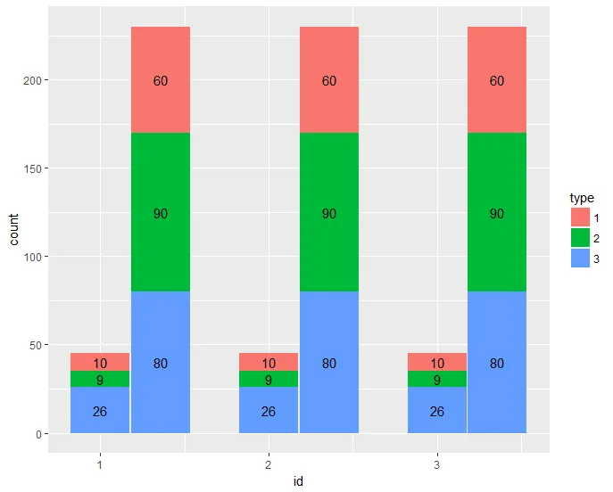
我有一个如下的数据框:
id    month     type    count
___  _______   ______   ______
1      1          1       10
1      1          2       09
1      1          3       26
1      2          1       60
1      2          2       90
2      2          3       80
2      1          1       10
2      1          2       09
2      1          3       26
2      2          1       60
2      2          2       90
2      2          3       80
3      1          1       10
3      1          2       09
3      1          3       26
3      2          1       60
3      2          2       90
3      2          3       80
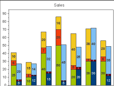
我认为最好的可视化方式是类似下面这样的堆叠组合条形图:
因此,我尝试使用
ggplot(df,aes(x=id,y=count,fill=month))+geom_bar(stat="identity",position=position_dodge())+geom_text(aes(label=count),size=3)
这提供了一个情节,与我的预期有些不同。任何帮助都将不胜感激。
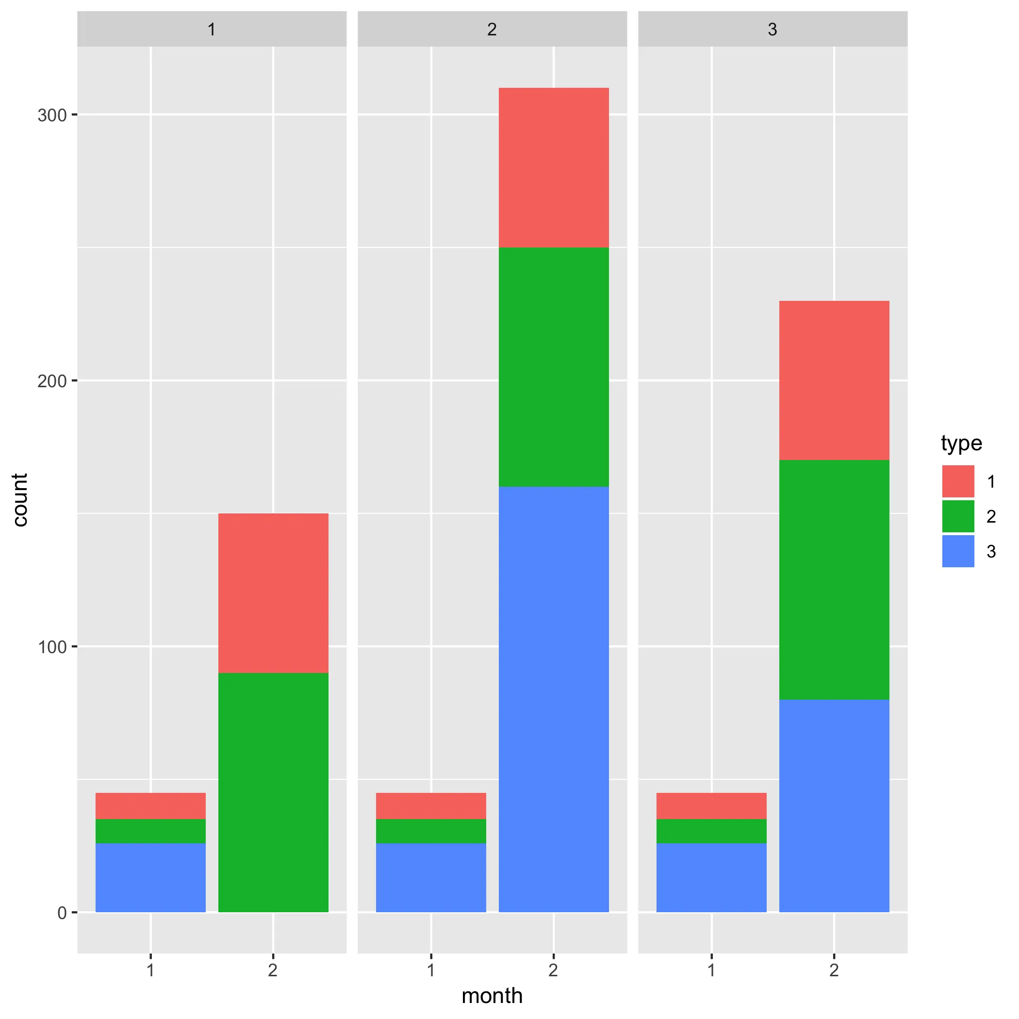
stack和dodge条形图。对我来说,目前还不清楚是否有自动绘制这种图形的方法。 - Psidom