CSS:将div并排显示时出现奇怪的行为

3

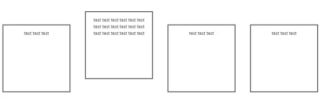
我试图使用css属性display:inline-block;让子元素并排显示,同时将父元素/容器设置为position:relative,代码如下:

<div style="margin-top: 20px; position: relative;">
    <div style="margin: 15px; border: solid 2px; width: 130px; height: 130px; padding: 10px; text-align: center; display:inline-block;">
         test test test
    </div>
    <div style="margin: 15px; border: solid 2px; width: 130px; height: 130px; padding: 10px; text-align: center; display:inline-block;">
        test test test test test test test test test test test test test test test test test test 
    </div>
    <div style="margin: 15px; border: solid 2px; width: 130px; height: 130px; padding: 10px; text-align: center; display:inline-block;">
         test test test
    </div>
    <div style="margin: 15px; border: solid 2px; width: 130px; height: 130px; padding: 10px; text-align: center; display:inline-block;">
         test test test
    </div>
</div>

但是,当其中一个div包含长文本时,结果就不同了。 enter image description here 这是什么原因呢?

我永远不会使用 inline-block 来将容器显示在一行中。 看看 flex-box。你必须学习它。你可以使用 flex boxes 布局整个网站。w3schools 有一些很好的教程。 - Aaron3219
不使用内联CSS的主要原因之一是为了代码可读性。当你请求别人帮助时,你应该考虑这一点。 - Lelio Faieta
1
原因是 vertical-align 的默认值是 baseline … 如果你不喜欢它的效果,可以将其更改为其他值。 - misorude
@Aaron3219 谢谢,现在它可以正常工作了,但是这个结果的原因是什么? - isom
因为misorude所说的话。 - Aaron3219
显示剩余3条评论
3个回答

4

因为inline-block会将所有内容都居中对齐/基线对齐。

可以使用以下两种方法之一:父级 div 使用 display: flex,子级 div 使用 block;或者子级 div 使用 display: table-cell

<div style="margin-top: 20px; position: relative; display: flex">
    <div style="margin: 15px; border: solid 2px; width: 80px; height: 130px; padding: 10px; text-align: center; display: block;">
         test test test
    </div>
    <div style="margin: 15px; border: solid 2px; width: 80px; height: 130px; padding: 10px; text-align: center; display: block;">
        test test test test test test test test test test test test test test test test test test 
    </div>
    <div style="margin: 15px; border: solid 2px; width: 80px; height: 130px; padding: 10px; text-align: center; display: block">
         test test test
    </div>
    <div style="margin: 15px; border: solid 2px; width: 80px; height: 130px; padding: 10px; text-align: center; display: block;">
         test test test
    </div>
</div>


或者在每个 body > div > div 元素上指定 vertical-align: middle(或其他值,具体取决于需求)。 - Armen Michaeli

2
无论是给出周围的 div 还是不给,都可以。
display: flex;

或者给每个子div。
vertical-align: text-top; // Or another alignment

我认为弹性盒子布局是更好的选择。弹性盒子布局通常用于很多方面,特别是动态内容。但即使对于静态内容,它也是确保填充所需内容的绝佳方式。 以下是一份指南,可以帮助任何对弹性盒子布局感兴趣的人(值得阅读): https://css-tricks.com/snippets/css/a-guide-to-flexbox/ 垂直对齐方法也很棒。如其他答案和评论中提到的那样,这种方法是必要的,因为默认情况下,内联块将所有内容都居中或对齐基线。

如果您能解释一下问题的根本原因,那么您的回答会更有用。虽然您尝试提供了一个解决方案(其中之一),但只是在之后才涉及到问题的原因。 - Armen Michaeli
@amn 谢谢您的反馈 :) - Stephan Fuhlendorff

-3

给所有的div添加一个新的样式float: left;,这将解决问题。


float: left 也可以使用,但请记得在最后添加另一个带有 clear: both 的 div。 - Daniel Tran
1
为什么你想清除 @DanielTran 的 float: left,在结尾处使用 float: left 也可以正常工作。 - Sanjeet kumar
如果你有另一个跟在后面的div,那么一切都会混乱。 - Daniel Tran

网页内容由stack overflow 提供, 点击上面的
可以查看英文原文,
原文链接