我正在尝试使用highcharts向我的饼图添加附加数据。
以下是解释:
我有一个浏览器饼图:
这是我的JS代码:
这是一张图片,用于理解我想做的事情: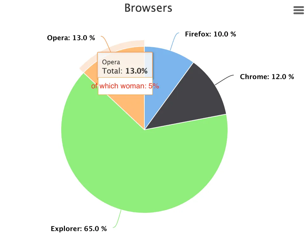 谢谢。
谢谢。
我有一个浏览器饼图:
- 火狐浏览器 - 10%
- 谷歌浏览器 - 12%
- IE浏览器 - 65%
- Opera浏览器 - 13%
- 火狐浏览器 - 10% 其中女性用户占5%
- 谷歌浏览器 - 12% 其中女性用户占10%
- IE浏览器 - 65% 其中女性用户占30%
- Opera浏览器 - 13% 其中女性用户占5%
这是我的JS代码:
<script>
    $(function () {
        $('#container').highcharts({
            chart: {
                plotBackgroundColor: null,
                plotBorderWidth: null,
                plotShadow: false,
                type:'pie'
            },

            title: {
                text: 'Browsers'
            },

            subtitle: {
                text:false,
            },

            tooltip: {
                pointFormat: '{series.name}: <b>{point.percentage:.1f}%</b>'
            },

            plotOptions: {
                pie: {
                    allowPointSelect: true,
                    cursor: 'pointer',
                    dataLabels: {
                        enabled: true,
                        format: '<b>{point.name}</b>: {point.percentage:.1f} %',
                        style: {
                            color: (Highcharts.theme && Highcharts.theme.contrastTextColor) || 'black'
                        }
                    }
                }
            },

            series: [{
                name: "Total",
                colorByPoint: true,
                data: [{
                    name: "Firefox",
                    y: 10,
                }, {
                    name: "Chrome",
                    y: 12,
                }, {
                    name: "Explorer",
                    y: 65,
                }, {
                    name: "Opera",
                    y: 13,
                }]
            }],

        });
    });
</script>
这是一张图片,用于理解我想做的事情:
谢谢。
pointFormat: '{series.name}: <b>{point.percentage:.1f}% 其中女性用户:{value}</b>'- Venugopal