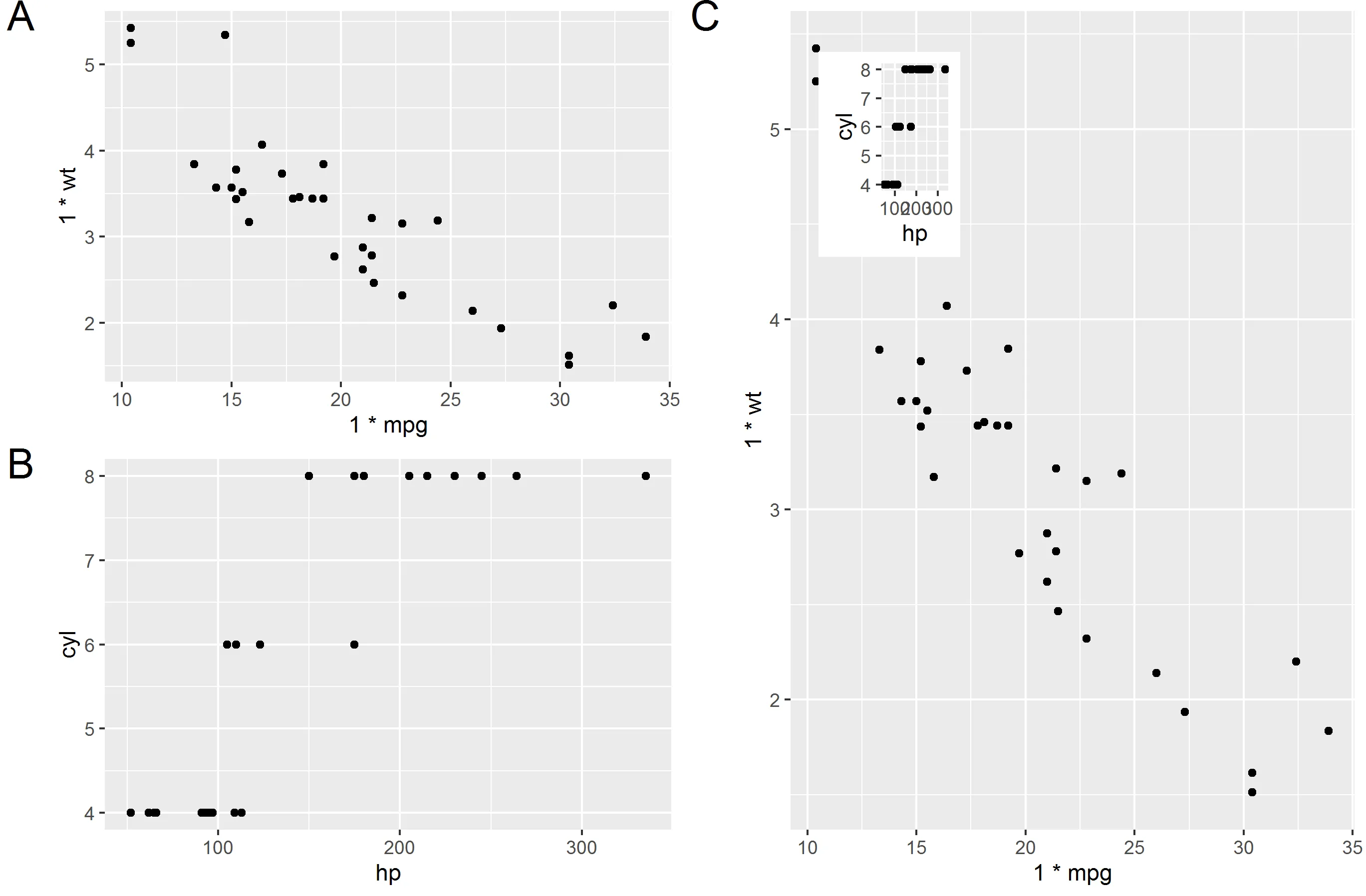
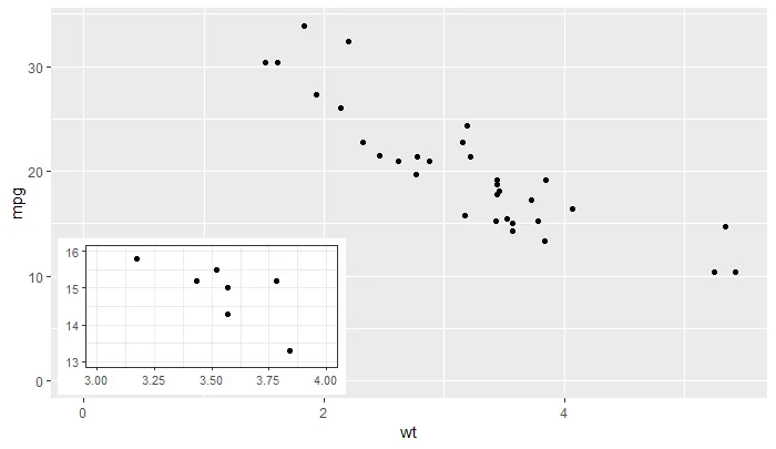
'ggplot2' >= 3.0.0 允许使用新的方法添加插图,因为现在可以将包含列表作为成员列的 tibble 对象作为数据传递。该列表列中的对象甚至可以是完整的 ggplots... 我的软件包 'ggpmisc' 的最新版本提供了 geom_plot()、geom_table() 和 geom_grob(),还提供使用 npc 单位而非 native data 单位定位插图的版本。这些几何对象可以在一次调用中添加多个插图并遵守分面,而 annotation_custom() 则不行。我从帮助页面复制了一个示例,该示例将主绘图的放大细节作为插图添加到其中。
library(tibble)
library(ggpmisc)
p <-
  ggplot(data = mtcars, mapping = aes(wt, mpg)) +
  geom_point()
df <- tibble(x = 0.01, y = 0.01,
             plot = list(p +
                         coord_cartesian(xlim = c(3, 4),
                                         ylim = c(13, 16)) +
                         labs(x = NULL, y = NULL) +
                         theme_bw(10)))
p +
  expand_limits(x = 0, y = 0) +
  geom_plot_npc(data = df, aes(npcx = x, npcy = y, label = plot))
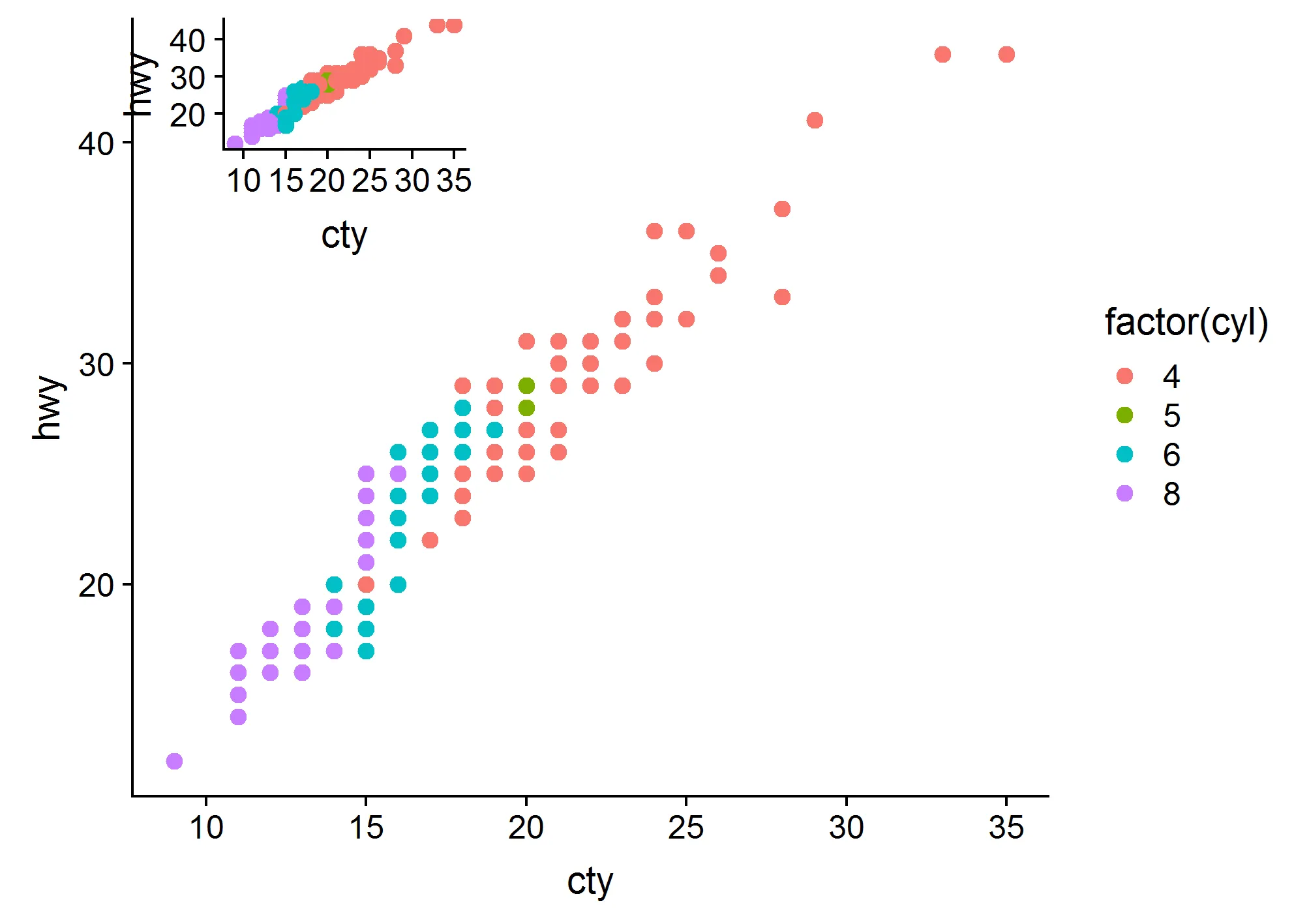
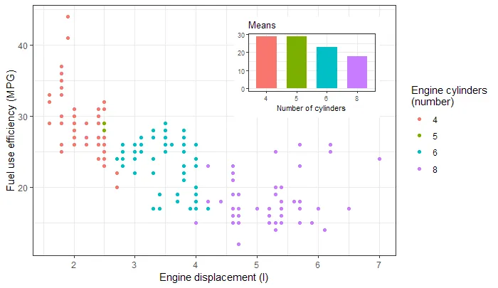
或者从包的使用说明中获取一个条形图插图。
library(tibble)
library(ggpmisc)
p <- ggplot(mpg, aes(factor(cyl), hwy, fill = factor(cyl))) +
  stat_summary(geom = "col", fun.y = mean, width = 2/3) +
  labs(x = "Number of cylinders", y = NULL, title = "Means") +
  scale_fill_discrete(guide = FALSE)
data.tb <- tibble(x = 7, y = 44,
                  plot = list(p +
                                theme_bw(8)))
ggplot(mpg, aes(displ, hwy, colour = factor(cyl))) +
  geom_plot(data = data.tb, aes(x, y, label = plot)) +
  geom_point() +
  labs(x = "Engine displacement (l)", y = "Fuel use efficiency (MPG)",
       colour = "Engine cylinders\n(number)") +
  theme_bw()
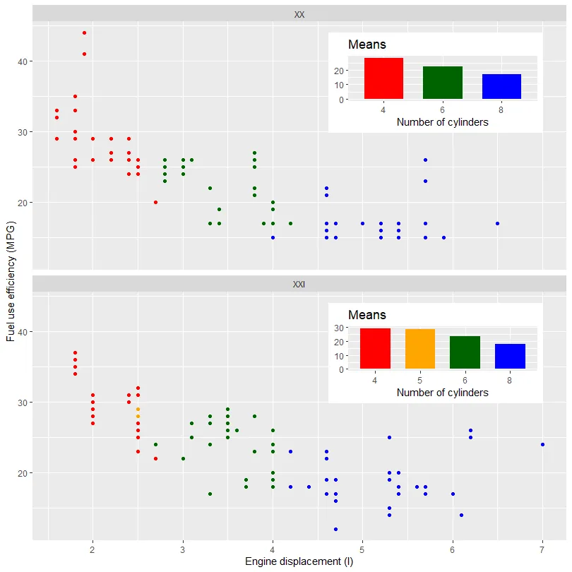
下一个示例展示了如何在分面绘图的不同面板中添加不同的插图。下一个示例使用相同的示例数据,根据世纪拆分数据。该特定数据集在拆分后添加了一个插图中缺少级别的问题。由于这些绘图是独立构建的,因此我们需要使用手动比例来确保颜色和填充在所有绘图中保持一致。对于其他数据集,可能不需要这样做。
library(tibble)
library(ggpmisc)
my.mpg <- mpg
my.mpg$century <- factor(ifelse(my.mpg$year < 2000, "XX", "XXI"))
my.mpg$cyl.f <- factor(my.mpg$cyl)
my_scale_fill <- scale_fill_manual(guide = FALSE,
                                   values = c("red", "orange", "darkgreen", "blue"),
                                   breaks = levels(my.mpg$cyl.f))

p1 <- ggplot(subset(my.mpg, century == "XX"),
             aes(factor(cyl), hwy, fill = cyl.f)) +
  stat_summary(geom = "col", fun = mean, width = 2/3) +
  labs(x = "Number of cylinders", y = NULL, title = "Means") +
  my_scale_fill

p2 <- ggplot(subset(my.mpg, century == "XXI"),
             aes(factor(cyl), hwy, fill = cyl.f)) +
  stat_summary(geom = "col", fun = mean, width = 2/3) +
  labs(x = "Number of cylinders", y = NULL, title = "Means") +
  my_scale_fill

data.tb <- tibble(x = c(7, 7),
                  y = c(44, 44),
                  century = factor(c("XX", "XXI")),
                  plot = list(p1, p2))

ggplot() +
  geom_plot(data = data.tb, aes(x, y, label = plot)) +
  geom_point(data = my.mpg, aes(displ, hwy, colour = cyl.f)) +
  labs(x = "Engine displacement (l)", y = "Fuel use efficiency (MPG)",
       colour = "Engine cylinders\n(number)") +
  scale_colour_manual(guide = FALSE,
                    values = c("red", "orange", "darkgreen", "blue"),
                    breaks = levels(my.mpg$cyl.f)) +
  facet_wrap(~century, ncol = 1)