CSS问题 - 960.gs

4
我决定将表格从我的Web界面中删除,但我在CSS方面遇到了很多问题。
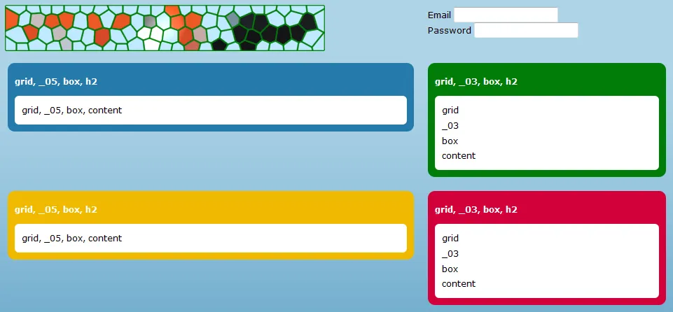
我已经对960.gs进行了一些修改,并制作了自己的网格,仅包含8列,如下所示:
.grid {
    margin-left: auto;
    margin-right: auto;
    width: 960px;
}
.grid ._01,
.grid ._02,
.grid ._03,
.grid ._04,
.grid ._05,
.grid ._06,
.grid ._07,
.grid ._08 {
    display: inline;
    float: left;
    margin: 10px;
    position: relative;
}
.grid ._01 {
    width: 100px;
}
.grid ._02 {
    width: 220px;
}
.grid ._03 {
    width: 340px;
}
.grid ._04 {
    width: 460px;
}
.grid ._05 {
    width: 580px;
}
.grid ._06 {
    width: 700px;
}
.grid ._07 {
    width: 820px;
}
.grid ._08 {
    width: 940px;
}
.grid .clear {
    clear: both;
    display: block;
    height: 0px;
    overflow: hidden;
    visibility: hidden;
    width: 0px;
}

这里是HTML代码:

<div class="grid">
    <div class="_05">
        <img src="../logo.png" alt="" width="450" height="60" vspace="50" />
    </div>
    <div class="_03" align="center">
      <form id="form1" name="form1" method="post" action="">
        <p>
          <label>Email
            <input type="text" name="textfield" id="textfield" style="margin-right: 0;" />
          </label>
        </p>
        <p>
          <label>Password
            <input type="text" name="textfield2" id="textfield2" />
          </label>
        </p>
      </form>
    </div>
    <div class="clear"></div>
    <div class="_05">
        <div class="box">
            <h2>grid, _05, box, h2</h2>
            <div class="content">grid, _05, box, content</div>
        </div>
    </div>
    <div class="_03">
        <div class="box green">
        <h2>grid, _03, box, h2</h2>
            <div class="content">
              <p>grid</p>
              <p>_03</p>
              <p>box</p>
              <p>content</p>
            </div>
        </div>
    </div>
    <div class="clear"></div>
    <div class="_05">
        <div class="box yellow">
            <h2>grid, _05, box, h2</h2>
            <div class="content">grid, _05, box, content</div>
        </div>
    </div>
    <div class="_03">
        <div class="box red">
            <h2>grid, _03, box, h2</h2>
            <div class="content">
              <p>grid</p>
              <p>_03</p>
              <p>box</p>
              <p>content</p>
            </div>
        </div>
    </div>
    <div class="clear"></div>
</div>

我怎样才能做到这个...

bogus UI

看起来更像这样吗? 特别是,我怎么改变黄色框的位置和顶部的登录表单?
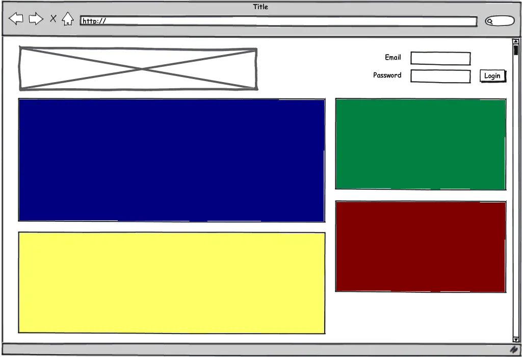
mockup UI

提前感谢您的所有输入!

1个回答

4

既然你刚开始学习 CSS,我建议你放弃框架,从头开始编写代码。

幸运的是,我正在工作中感到无聊 :) 我已经为你编写了整个代码。你可以在http://kevinvancrawford.com/temp/test.html上查看它。

标记:

<div id="container">
 <div id="head">
     <h1><a href="./test.html">Site Banner</a></h1>

        <form id="login">
         <label for="email">Email:</label>
            <input type="text" name="email" id="email" />

            <label for="password">Password:</label>
            <input type="password" name="password" id="password" />

            <input type="submit" value="Login" id="submit" />
        </form>
    </div><!--head-->

    <div id="body">
     <div id="primary">
         <div id="blue"></div>

            <div id="yellow"></div>
        </div><!--primary-->


        <div id="column">
         <div id="green"></div>

            <div id="red"></div>
        </div><!--column-->
    </div><!--body-->
</div><!--container-->

还有CSS部分:

#container { width:960px; margin:1em auto; background-color:#EEEEEE; padding:20px 20px 0; }

#head, #login, #body { /* these elements all contain floats */
 overflow:hidden; /* This will clear the contained floats. "auto" works too */
 width:100%; /* Triggers hasLayout in IE, needed to clear floats */
}

#head h1 {
 float:left;
 margin:0;
 width:500px;
 height:80px;
 background:#000000 url(./img/logo.gif) no-repeat; /* Instead of using an <img> tag, we used CSS to replace the HTML text with an image. Good for SEO */
 position:relative;
}
#head h1 a {
 position:absolute;
 display:block;
 top:0; left:0;
 width:100%; height:100%;
 text-indent:-9999px; /* Hides the text. The properties above make the whole <H1> a link  */
 overflow:hidden;
}

#login { float:right; width:320px; padding:1em 0 0; }
#login label, #login input { float:left; display:block; margin:0 5px 5px 0; }
#login label { text-align:right; clear:left; width:80px; }
#login input { width:150px; }
#login #submit { width:auto; }

#primary { float:left; width:620px; margin-right:20px; }
#primary #blue { background-color:#000080; margin:20px 0; min-height:300px; }
#primary #yellow { background-color:#FFFF66; }

#column { float:right; width:320px; }
#column #green { background-color:#008040; }
#column #red { background-color:#800000; }

#yellow, #green, #red { min-height:200px; margin:20px 0; }

如果您需要我解释其中任何内容,请随时询问 :)

此外,尽管我在这个示例中没有使用它,但我推荐使用Eric Meyer的reset.css。谷歌一下吧。

请注意,我唯一做出的妥协是没有将“登录”按钮对齐到右边缘,因为那将需要将所有元素浮动到右边,并且<input>必须放在<label>之前标记,这让我有所保留。

祝好,

Kevin


非常感谢你,Kevin!我会查看你提供的代码,但是现在我必须说,既然我已经了解了960.gs,我真的很想继续使用这个网格系统。有什么变化可以让我达到和你一样的效果吗? - Alix Axel

网页内容由stack overflow 提供, 点击上面的
可以查看英文原文,
原文链接