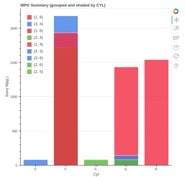
Bokeh 条形图:按类别着色的条形

3

我正在修改位于这里的第二个示例。

以下是我的代码:

from bokeh.charts import BoxPlot, Bar, output_file, show
from bokeh.sampledata.autompg import autompg as df
output_file("bar.html")
p = Bar(df, values='mpg', label='cyl', color='origin', legend="top_left",
            title="MPG Summary (grouped and shaded by CYL)")
show(p)

有三个更改:(1)我使用了一个 Bar 图,(2)我将 color 属性更改为不同的分类变量,(3)我添加了 legend 属性。

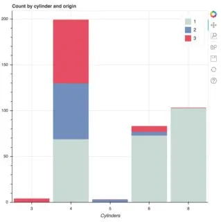
我认为问题出在(2)和(3)之间。更具体地说,当它们不同时,图例成为 label color 属性的元组,因此它们是不同的-当它们相同时,图表和图例可以正常工作。
这是R中ggplot2的基本功能,我认为它会在这里起作用。我做错了什么还是这个程序有漏洞? Bokeh版本0.12.0 附带图片更新: enter image description here
1个回答

1
bokeh.charts API,包括Bar已于2017年被废弃和移除。此后,我们做了大量工作以改进稳定且受支持的bokeh.plottingAPI,并且现在可以轻松创建许多种类的分类和条形图。许多示例可以在用户指南的处理分类数据一章中找到。
不太清楚你要用绘图实现什么。使用相同数据,这里是按原产地和汽缸数分解的汽车数量图:
from bokeh.core.properties import value
from bokeh.plotting import figure, show
from bokeh.sampledata.autompg import autompg as df

# Bokeh categories are strings
df.cyl = [str(x) for x in df.cyl]
df.origin = [str(x) for x in df.origin]

# pivot to wide format
df = df.pivot_table(index='cyl', columns='origin', values='mpg', fill_value=0, aggfunc='count')

p = figure(title="Count by cylinder and origin", x_axis_label="Cylinders",
           x_range=sorted(df.index))
p.y_range.start = 0

p.vbar_stack(df.columns, x='cyl', width=0.9, color=["#c9d9d3", "#718dbf", "#e84d60"],
             source=df, legend=[value(x) for x in df.columns])

show(p)

enter image description here

如果您想使用更少的代码实现这一点,可以尝试Holoviews,它是基于Bokeh构建的数据中心API。


网页内容由stack overflow 提供, 点击上面的
可以查看英文原文,
原文链接