我目前正在研究不同种类蝙蝠的栖息地破碎化问题。我的数据集包含存在数据(1 = 存在,0 = 不存在)和关于碎片大小、体重(连续变量)以及食性组(Feeding.Guild; 分类变量,6个级别:肉食动物、果食动物、昆虫食动物、蜜食动物、杂食动物和吸血动物)的数据。碎片大小(logFrag)和体重(logMass)使用自然对数进行转换以符合正态分布。由于被分类,我无法呈现完整的数据集(bats2)。
为了分析这些数据,我使用逻辑回归。在R中,这是具有二项式系列的glm函数。
bats2 <- read.csv("Data_StackExchange.csv",
                 quote = "", sep=";", dec = ".", header=T, row.names=NULL)
bats2$presence <- ifelse(bats2$Corrected.Abundance == 0, 0, 1)
bats2$logFrag <- log(bats2$FragSize)
bats2$logMass <- log(bats2$Mass)
str(bats2$Feeding.Guild)
     Factor w/ 6 levels "carnivore","frugivore",..: 6 1 5 5 2 2 2 2 2 2 ...
levels(bats2$Feeding.Guild)
    [1] "carnivore"    "frugivore"    "insectivore"  "nectarivore"  "omnivore"     "sanguinivore"


regPresence <- glm(bats2$presence~(logFrag+logMass+Feeding.Guild),
                   family="binomial", data=bats2)
这个回归的结果是通过
summary() 函数获得的,如下所示。Coefficients:
Estimate Std. Error z value Pr(>|z|)
(Intercept) -4.47240 0.64657 -6.917 4.61e-12 ***
logFrag 0.10448 0.03507 2.979 0.002892 **
logMass 0.39404 0.09620 4.096 4.20e-05 ***
Feeding.Guildfrugivore 3.36245 0.49378 6.810 9.78e-12 ***
Feeding.Guildinsectivore 1.97198 0.51136 3.856 0.000115 ***
Feeding.Guildnectarivore 3.85692 0.55379 6.965 3.29e-12 ***
Feeding.Guildomnivore 1.75081 0.51864 3.376 0.000736 ***
Feeding.Guildsanguinivore 1.73381 0.56881 3.048 0.002303 **
---
Signif. codes: 0 ‘***’ 0.001 ‘**’ 0.01 ‘*’ 0.05 ‘.’ 0.1 ‘ ’ 1
我的第一个问题是确认我是否正确解释了这些数据:如何正确解释这些数据?我使用了这个网站来帮助我解释。
此外,我尝试绘制这些数据以进行可视化。然而,在添加facet_wrap函数以为不同的采食行为绘制单独的图表时,与在一个图表中为不同的采食行为着色相比,截距和斜率会发生变化。我使用了以下代码:
图片1:
library(ggplot2)
qplot(logFrag, bats2$presence, colour=Feeding.Guild, data=bats2, se=F) +
  geom_smooth(method = glm, family = "binomial", se=F, na.rm=T) + theme_bw()
情节2:
qplot(logFrag, bats2$presence, data=bats2, se=F) + facet_wrap(~Feeding.Guild,
                                                              scales="free") +
  geom_smooth(method = glm, family = "binomial", se=F, na.rm=T) + theme_bw()
导致以下图片的原因:
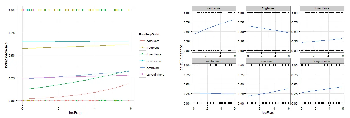
是什么原因导致了这些差异,哪一个才是正确的呢?
样本数据集(未分类的一部分数据集)。