我一直在制作动画地图,展示COVID病例数据的进展情况。为了制作一个最简单的示例,我将代码压缩到以下内容,仅生成一个框架。实际上,我还要读取许多csv文件。我已经试图在这个示例中消除它,但仍然有一个包含县人口数据的文件。我已经将其发布在https://pastebin.com/jCD9tP0X
library(urbnmapr) # For map
library(ggplot2)  # For map
library(dplyr)    # For summarizing
library(tidyr)    # For reshaping
library(stringr)  # For padding leading zeros
library(ggrepel)
library(ggmap)
library(usmap)
library(gganimate)
library(magrittr)
library(gifski)
library(scales)


#first run setup tasks
#these can be commented out once the data frames are in place

###################begin first run only################################

#define census regions
NE_region <- c("ME","NH","VT","MA", "CT", "RI", "NY", "PA", "NJ")

ne_region_bases <-c("Hanscom AFB", "Rome, NY")

# Get COVID cases, available from:
url <- "https://static.usafacts.org/public/data/covid-19/covid_confirmed_usafacts.csv"
COV <- read.csv(url, stringsAsFactors = FALSE)

#sometimes there are encoding issues with the first column name
names(COV)[1] <- "countyFIPS"

Covid <- pivot_longer(COV, cols=starts_with("X"),
                      values_to="cases",
                      names_to=c("X","date_infected"),
                      names_sep="X") %>%
  mutate(infected = as.Date(date_infected, format="%m.%d.%Y"),
         countyFIPS = str_pad(as.character(countyFIPS), 5, pad="0"))

# Obtain map data for counties (to link with covid data) and states (for showing borders)
states_sf <- get_urbn_map(map = "states", sf = TRUE)
counties_sf <- get_urbn_map(map = "counties", sf = TRUE)

# Merge county map with total cases of cov
#use this line to produce animated maps
#pop_counties_cov <- inner_join(counties_sf, Covid, by=c("county_fips"="countyFIPS"))

#use this one for a single map of the latest data
pop_counties_cov <- inner_join(counties_sf, group_by(Covid, countyFIPS) %>%
                             summarise(cases=sum(cases)), by=c("county_fips"="countyFIPS"))

#read the county population data
#csv at https://pastebin.com/jCD9tP0X
counties_pop <- read.csv("countyPopulations.csv", header=TRUE, stringsAsFactors = FALSE)

#pad the single digit state FIPS states
counties_pop <- counties_pop %>% mutate(CountyFIPS=str_pad(as.character(CountyFIPS),5,pad="0"))

#merge the population and covid data by FIPS
pop_counties_cov$population <- counties_pop$Population[match(pop_counties_cov$county_fips,counties_pop$CountyFIPS)]

#calculate the infection rate
pop_counties_cov <- pop_counties_cov %>% mutate(infRate = (cases/population)*100)

#counties with 0 infections don't appear in the usafacts data, so didn't get a population
#set them to 0
pop_counties_cov$population[is.na(pop_counties_cov$population)] <- 0
pop_counties_cov$infRate[is.na(pop_counties_cov$infRate)] <- 0

plotDate="April14"
basepath = "your/output file/path/here/"
naColor = "white"
lowColor = "green"
midColor = "maroon"
highColor = "red"
baseFill = "dodgerblue4"
baseColor = "firebrick"
baseShape = 23
###################end first run only################################


###################Northeast Map################################
#filter out states
ne_pop_counties_cov <- pop_counties_cov %>% filter(state_abbv %in% NE_region)
ne_states_sf <- states_sf %>% filter(state_abbv %in% NE_region)
ne_counties_sf <- counties_sf %>% filter(state_abbv %in% NE_region)

#filter out bases
neBases <- structure(list(Base = c("Hanscom AFB", "Rome, NY"), longitude = c(-71.2743123,
                                                                             -75.4557303),
                          latitude = c(42.4579955, 43.2128473),
                          personnel = c(2906L,822L),
                          longitude.1 = c(2296805.44531269, 1951897.82199569),
                          latitude.1 = c(128586.352781279, 99159.9145180969)),
                          row.names = c(NA, -2L), class = "data.frame")

p <- ne_pop_counties_cov %>%
  ggplot() +
  geom_sf(mapping = aes(fill = infRate, geometry=geometry), color = NA) +
  geom_sf(data = ne_states_sf, fill = NA, color = "black", size = 0.25) +
  coord_sf(datum = NA) +
  scale_fill_gradient(name = "% Pop \nInfected", trans = "log",low=lowColor, high=highColor,
                      breaks=c(0, max(ne_pop_counties_cov$infRate)),
                      na.value = naColor) +
  geom_point(data=neBases,
             aes(x=longitude.1, y=latitude.1,size=personnel),
             shape = baseShape,
             color = baseColor,
             fill = baseFill) +
  theme_bw() +
  labs(size='AFMC \nMil + Civ') +
  theme(legend.position="bottom",
        panel.border = element_blank(),
        axis.title.x=element_blank(),
        axis.title.y=element_blank())

print(p)

###################End Northeast Map################################
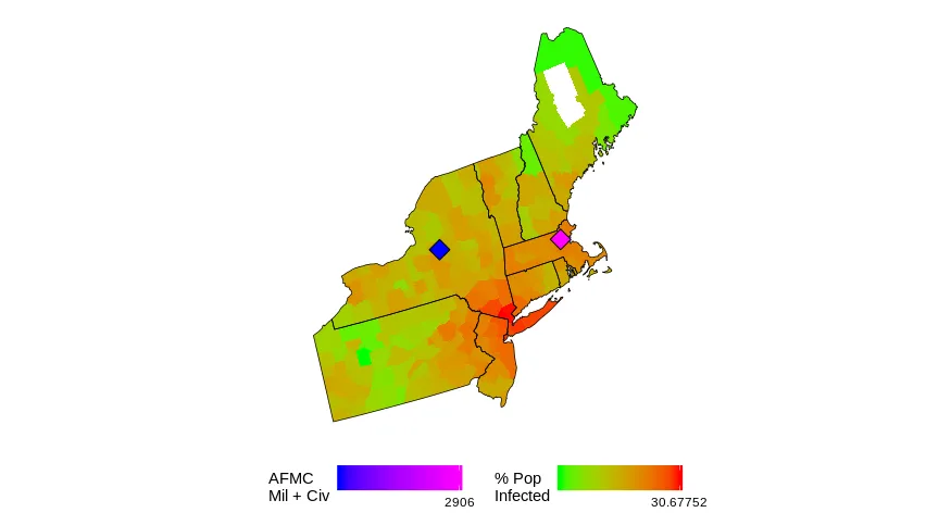
如果你运行这个程序,你应该会得到一个单一的帧...当我做整个动画时,这是最终的帧。
这些钻石代表了我们在该地区感兴趣的空军基地的位置,并且它们的大小根据那里的人员数量而定。
我的任务是使所有的钻石大小相同,但是“颜色编码”填充根据人员数量不同。我认为这不是一个好主意,但我不是老板。
我不知道如何在一个图中有两个渐变的填充?