当使用gganimate时,ggplot的geom_polygon呈现出奇怪的行为

5

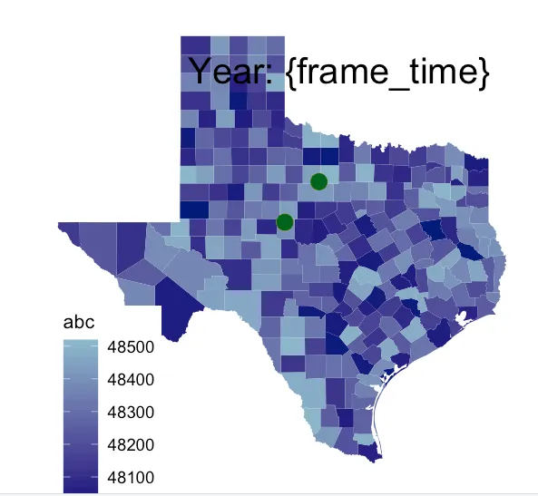
假设我有这些数据。一个用于阴影该州的县,另一个用于绘制点。

library(tidyverse)
library(gganimate)
devtools::install_github("UrbanInstitute/urbnmapr")
library(urbanmapr)

#1. counties dataset for the shading of the background
data(counties)
#keep only Texas counties
counties <- filter(counties, state_fips==48)

#2. dots dataset for dots over time
dots <- data.frame(group = c(rep(1,3), rep(2,3)), 
                    lat = c(rep(32, 3), rep(33, 3)),
                    long = c(rep(-100, 3), rep(-99,3)), 
                    year = c(1:3, 1:3))

然后将它们绘制出来(首先不使用gganimate):

ggplot() +
    geom_polygon(data = counties, aes(long, lat, group = county_fips, fill = as.numeric(county_fips))) +
    scale_fill_gradient(low = "navy", high = "lightskyblue3")   +   
    geom_point(data = dots, aes(long, lat, group=interaction(long, lat), color=year), 
               size=6, show.legend = FALSE) + 
    theme_bw() +
    scale_color_gradientn(colours = c("red", "yellow", "darkgreen")) +
    coord_map() +
    labs(subtitle = paste('Year: {frame_time}')) +  
    theme(plot.subtitle = element_text(hjust = 0.8, vjust=-10, size=30)) +  
    theme(panel.background = element_rect(fill = 'white')) +
    theme(panel.grid = element_blank(),axis.title = element_blank(),
          axis.text = element_blank(),axis.ticks = element_blank(),
          panel.border = element_blank())+
    theme(legend.position = c(0.15, .15)) +
    theme(legend.key.size = unit(2,"line"),legend.title=element_text(size=16), 
          legend.text=element_text(size=14))    +
    labs(fill = "abc")

这里是结果:

这里输入图片描述

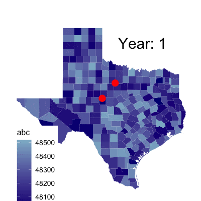
问题出现在我尝试使用gganimate来对点进行动画处理时:

map <- ggplot() +
    geom_polygon(data = counties, aes(long, lat, group = county_fips, fill = as.numeric(county_fips))) +
    scale_fill_gradient(low = "navy", high = "lightskyblue3")   +
    geom_point(data = dots, aes(long, lat, group=interaction(long, lat), color=year), 
               size=6, show.legend = FALSE) + 
    theme_bw() +
    scale_color_gradientn(colours = c("red", "yellow", "darkgreen")) +
    coord_map() +
    labs(subtitle = paste('Year: {frame_time}')) +  
    theme(plot.subtitle = element_text(hjust = 0.8, vjust=-10, size=30)) +  
    theme(panel.background = element_rect(fill = 'white')) +
    theme(panel.grid = element_blank(),axis.title = element_blank(),
          axis.text = element_blank(),axis.ticks = element_blank(),
          panel.border = element_blank())+
    theme(legend.position = c(0.15, .15)) +
    theme(legend.key.size = unit(2,"line"),legend.title=element_text(size=16), 
          legend.text=element_text(size=14))    +
    labs(fill = "abc") +    
    transition_time(year) +
    shadow_mark(size=6)     

anim_save("output/test.gif", map, end_pause=6, width = 800, height = 800, duration=8)

请注意,这两段代码是完全相同的,除了 transition_timeshadow_mark 部分。以下是结果:

enter image description here

背景颜色已经很不同了。可能是颜色反转了或其他情况,我也不确定。但在我的实际示例中,有更多的数据点,并使用了不同的阴影值,此时阴影与实际数据的相似度非常小。 究竟出了什么问题,我该如何解决?

2
counties数据集来自哪个包?也许是 library(noncensus)吗? - Jon Spring
1
“counties”数据集来自Urban Institute的“urbnmapr”。很抱歉没有在代码中包含它;我已经更新了它。我不确定“noncensus”是否包含相同的数据集。 - bill999
2
这看起来很像一个 bug。我看到你也提交了一个 问题报告。在问题解决之前,你可以考虑自己构建动画。最终 gganimate 所做的基本上是为每一帧渲染一个图,并使用 gifsky 或其他渲染器将它们组合起来。 - JBGruber
1个回答

3
我不确定问题的具体原因,但是多边形可能存在问题,因为它们往往违反了“每个观察结果一行”的整洁数据规则。此外,作为一个通用原则,我建议在处理地理空间数据时使用geom_sf()。下面的代码使用geom_sf()重现了您的动画。
理论上,我也应该能够使用geom_sf()绘制点,但我遇到了另一个问题,看起来像是gganimate的一个错误,所以我不得不绕过并提取点的投影坐标,并使用geom_point()绘制。
library(tidyverse)
library(gganimate)
library(sf)
#> Linking to GEOS 3.7.2, GDAL 2.4.2, PROJ 5.2.0

# 1. get shape files for texas
library(tidycensus)
options(tigris_use_cache = TRUE)

# download counties for Texas
counties <- get_acs(
  state = 48, # omit to download all US counties
  geography = "county", year = 2015, geometry = TRUE,
  variables = "B19013_001" # need to specify some variable to download, here median income
)
#> Getting data from the 2011-2015 5-year ACS

# 2. dots dataset for dots over time
dots <- data.frame(
  group = c(rep(1,3), rep(2,3)), 
  lat = c(rep(32, 3), rep(33, 3)),
  long = c(rep(-100, 3), rep(-99,3)), 
  year = c(1:3, 1:3)
)

# add geometry column
dots_sf <- dots %>%
  mutate(
    geometry = st_sfc(
      map2(lat, long, function(lat, long) st_point(x = c(long, lat))),
      crs = "+proj=longlat +ellps=WGS84 +datum=WGS84 +no_defs"
    ) %>%
      st_transform(crs = 3083) # CRS appropriate for Texas, https://epsg.io/3083
  ) %>%
  st_as_sf()

# and extract transformed coords
dots_sf_transf <- dots_sf %>%
  mutate(
    long_transf = map_dbl(geometry, function(x) x[[1]]),
    lat_transf = map_dbl(geometry, function(x) x[[2]])
  )


# 3. static plot
p <- ggplot() +
  geom_sf(data = counties, aes(fill = as.numeric(GEOID))) +
  scale_fill_gradient(low = "navy", high = "lightskyblue3")   +   
  geom_point(
    data = dots_sf_transf, 
    aes(x = long_transf, y = lat_transf, group = group, color = year),
    size = 6, show.legend = FALSE
  ) + 
  scale_color_gradientn(colours = c("red", "yellow", "darkgreen")) +
  coord_sf(crs = 3083) +
  labs(subtitle = "Year: {frame_time}", fill = "abc") +  
  theme_void() +
  theme(legend.position = c(0.15, .15))
p

# animation
p + transition_time(year) + shadow_mark(size=12)  

这段代码是由reprex package (v0.3.0)在2019年11月03日创建的。


哇,这是一个惊人的答案。谢谢! - bill999

网页内容由stack overflow 提供, 点击上面的
可以查看英文原文,
原文链接