在ggplot中将自定义图像添加到geom_polygon填充

75

有个学生问我是否可以使用R重现类似下面的图:
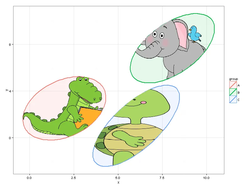
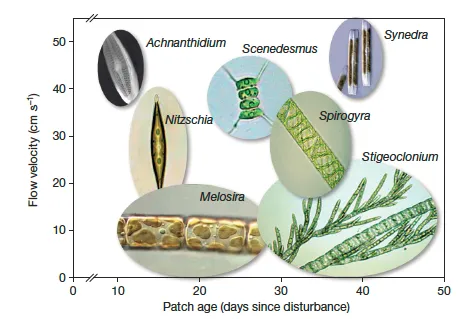
enter image description here 这是来自这篇文章...

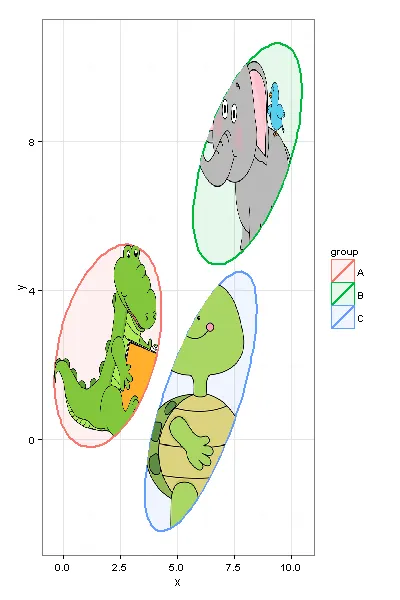
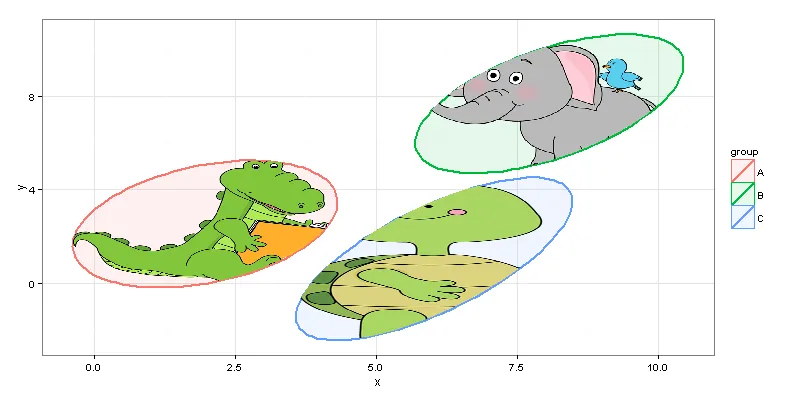
这不是我的专业领域,但我使用了以下代码创建了95%置信区间椭圆,并使用geom_polygon()将它们绘制出来。 我使用rphylopic包从phylopic库中获取图像并进行填充。

#example data/ellipses
set.seed(101)
n <- 1000
x1 <- rnorm(n, mean=2)
y1 <- 1.75 + 0.4*x1 + rnorm(n)
df <- data.frame(x=x1, y=y1, group="A")
x2 <- rnorm(n, mean=8)
y2 <- 0.7*x2 + 2 + rnorm(n)
df <- rbind(df, data.frame(x=x2, y=y2, group="B"))
x3 <- rnorm(n, mean=6)
y3 <- x3 - 5 - rnorm(n)
df <- rbind(df, data.frame(x=x3, y=y3, group="C"))


#calculating ellipses
library(ellipse)
df_ell <- data.frame()
for(g in levels(df$group)){
  df_ell <- rbind(df_ell, cbind(as.data.frame(with(df[df$group==g,], ellipse(cor(x, y), 
                                                                             scale=c(sd(x),sd(y)), 
                                                                             centre=c(mean(x),mean(y))))),group=g))
}
#drawing
library(ggplot2)
p <- ggplot(data=df, aes(x=x, y=y,colour=group)) + 
  #geom_point(size=1.5, alpha=.6) +
  geom_polygon(data=df_ell, aes(x=x, y=y,colour=group, fill=group), alpha=0.1, size=1, linetype=1)


### get center points of ellipses
library(dplyr)
ell_center <- df_ell %>% group_by(group) %>% summarise(x=mean(x), y=mean(y))

### animal images
library(rphylopic)
lion <- get_image("e2015ba3-4f7e-4950-9bde-005e8678d77b", size = "512")[[1]]
mouse <- get_image("6b2b98f6-f879-445f-9ac2-2c2563157025", size="512")[[1]] 
bug <- get_image("136edfe2-2731-4acd-9a05-907262dd1311", size="512")[[1]]

### overlay images on center points
p + add_phylopic(lion, alpha=0.9, x=ell_center[[1,2]], y=ell_center[[1,3]], ysize=2, color="firebrick1")  + 
    add_phylopic(mouse, alpha=1, x=ell_center[[2,2]], y=ell_center[[2,3]], ysize=2, color="darkgreen") +
    add_phylopic(bug, alpha=0.9, x=ell_center[[3,2]], y=ell_center[[3,3]], ysize=2, color="mediumblue") + 
  theme_bw()

以下是结果:

enter image description here

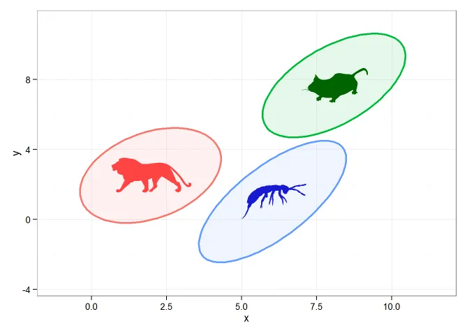
这样做没问题,但我真正想做的是直接将图像添加到geom_polygon的'fill'命令中。这可能吗?


3
我猜官方的答案是“这不可能”(Hadley的回答)。然而,@baptiste在这里提供了一个更近期的答案,可能会有所帮助。 - tonytonov
这并不是你所要求的内容,但出于“合适的工具做合适的事情”的精神:我会在 R 中制作底层图形,并加上数据。然后使用 Photoshop 或者它的免费、开源的近似替代品 GIMP。接着创建不同的图层,并调整它们的透明度来突显椭圆形。 - Mike Williamson
3个回答

20

我们无法为ggplot设置图案填充,但是我们可以通过使用geom_tile来进行一个相当简单的解决方法。首先复制你的初始数据:

#example data/ellipses
set.seed(101)
n <- 1000
x1 <- rnorm(n, mean=2)
y1 <- 1.75 + 0.4*x1 + rnorm(n)
df <- data.frame(x=x1, y=y1, group="A")
x2 <- rnorm(n, mean=8)
y2 <- 0.7*x2 + 2 + rnorm(n)
df <- rbind(df, data.frame(x=x2, y=y2, group="B"))
x3 <- rnorm(n, mean=6)
y3 <- x3 - 5 - rnorm(n)
df <- rbind(df, data.frame(x=x3, y=y3, group="C"))

#calculating ellipses
library(ellipse)
df_ell <- data.frame()
for(g in levels(df$group)){
  df_ell <- 
    rbind(df_ell, cbind(as.data.frame(
      with(df[df$group==g,], ellipse(cor(x, y), scale=c(sd(x),sd(y)), 
                                     centre=c(mean(x),mean(y))))),group=g))
}

我想展示的关键特性是将栅格图像转换成一个 data.frame,其中包含 XYcolor 列,这样我们就可以稍后使用 geom_tile 作图了。

require("dplyr")
require("tidyr")
require("ggplot2")
require("png")

# getting sample pictures
download.file("http://content.mycutegraphics.com/graphics/alligator/alligator-reading-a-book.png", "alligator.png", mode = "wb")
download.file("http://content.mycutegraphics.com/graphics/animal/elephant-and-bird.png", "elephant.png", mode = "wb")
download.file("http://content.mycutegraphics.com/graphics/turtle/girl-turtle.png", "turtle.png", mode = "wb")
pic_allig <- readPNG("alligator.png")
pic_eleph <- readPNG("elephant.png")
pic_turtl <- readPNG("turtle.png")

# converting raster image to plottable data.frame
ggplot_rasterdf <- function(color_matrix, bottom = 0, top = 1, left = 0, right = 1) {
  require("dplyr")
  require("tidyr")

  if (dim(color_matrix)[3] > 3) hasalpha <- T else hasalpha <- F

  outMatrix <- matrix("#00000000", nrow = dim(color_matrix)[1], ncol = dim(color_matrix)[2])

  for (i in 1:dim(color_matrix)[1])
    for (j in 1:dim(color_matrix)[2]) 
      outMatrix[i, j] <- rgb(color_matrix[i,j,1], color_matrix[i,j,2], color_matrix[i,j,3], ifelse(hasalpha, color_matrix[i,j,4], 1))

  colnames(outMatrix) <- seq(1, ncol(outMatrix))
  rownames(outMatrix) <- seq(1, nrow(outMatrix))
  as.data.frame(outMatrix) %>% mutate(Y = nrow(outMatrix):1) %>% gather(X, color, -Y) %>% 
    mutate(X = left + as.integer(as.character(X))*(right-left)/ncol(outMatrix), Y = bottom + Y*(top-bottom)/nrow(outMatrix))
}

图片转换:

# preparing image data
pic_allig_dat <- 
  ggplot_rasterdf(pic_allig, 
                  left = min(df_ell[df_ell$group == "A",]$x), 
                  right = max(df_ell[df_ell$group == "A",]$x),
                  bottom = min(df_ell[df_ell$group == "A",]$y),
                  top = max(df_ell[df_ell$group == "A",]$y) )

pic_eleph_dat <- 
  ggplot_rasterdf(pic_eleph, left = min(df_ell[df_ell$group == "B",]$x), 
                  right = max(df_ell[df_ell$group == "B",]$x),
                  bottom = min(df_ell[df_ell$group == "B",]$y),
                  top = max(df_ell[df_ell$group == "B",]$y) )

pic_turtl_dat <- 
  ggplot_rasterdf(pic_turtl, left = min(df_ell[df_ell$group == "C",]$x), 
                  right = max(df_ell[df_ell$group == "C",]$x),
                  bottom = min(df_ell[df_ell$group == "C",]$y),
                  top = max(df_ell[df_ell$group == "C",]$y) )

据我所知,作者希望仅在椭圆内绘制图像,而不是在其原始矩形形状中绘制。我们可以通过使用来自包sppoint.in.polygon函数来实现。
# filter image-data.frames keeping only rows inside ellipses
require("sp")

gr_A_df <- 
  pic_allig_dat[point.in.polygon(pic_allig_dat$X, pic_allig_dat$Y, 
                                 df_ell[df_ell$group == "A",]$x, 
                                 df_ell[df_ell$group == "A",]$y ) %>% as.logical,]
gr_B_df <- 
  pic_eleph_dat[point.in.polygon(pic_eleph_dat$X, pic_eleph_dat$Y, 
                                 df_ell[df_ell$group == "B",]$x, 
                                 df_ell[df_ell$group == "B",]$y ) %>% as.logical,]
gr_C_df <- 
  pic_turtl_dat[point.in.polygon(pic_turtl_dat$X, pic_turtl_dat$Y, 
                                 df_ell[df_ell$group == "C",]$x, 
                                 df_ell[df_ell$group == "C",]$y ) %>% as.logical,]

最后......
#drawing
p <- ggplot(data=df) + 
  geom_polygon(data=df_ell, aes(x=x, y=y,colour=group, fill=group), alpha=0.1, size=1, linetype=1)

p + geom_tile(data = gr_A_df, aes(x = X, y = Y), fill = gr_A_df$color) + 
  geom_tile(data = gr_B_df, aes(x = X, y = Y), fill = gr_B_df$color) + 
  geom_tile(data = gr_C_df, aes(x = X, y = Y), fill = gr_C_df$color) + theme_bw()

在此输入图片描述

我们可以轻松改变图形的大小,而无需更改代码。

在此输入图片描述

在此输入图片描述

当然,您应该考虑到计算机性能的限制,可能不要选择20MP的图片来在ggplot中绘图 =)


哇!自从我第一次提出这个问题以来,我一直断断续续地关注着这个帖子,不确定我们是否会得到答案。谢谢!我喜欢point.in.polygon函数。 - jalapic

4

如果不使用 ggplot,一个快速而且不完美的解决方案是使用 rasterImager包(jpg)(或 png,取决于图像格式):

set.seed(101)
n <- 1000
x1 <- rnorm(n, mean=2)
y1 <- 1.75 + 0.4*x1 + rnorm(n)
df <- data.frame(x=x1, y=y1, group="1")
x2 <- rnorm(n, mean=8)
y2 <- 0.7*x2 + 2 + rnorm(n)
df <- rbind(df, data.frame(x=x2, y=y2, group="2"))
x3 <- rnorm(n, mean=6)
y3 <- x3 - 5 - rnorm(n)
df <- rbind(df, data.frame(x=x3, y=y3, group="3"))

plot(df$x,df$y,type="n")
for(g in unique(df$group)){
    ifile=readJPEG(paste(g,".jpg",sep=""),FALSE)
    x=df$x[df$group == g]
    y=df$y[df$group == g]
    xmin=mean(x)-sd(x)*2
    ymin=mean(y)-sd(y)*2
    xmax=mean(x)+sd(x)*2
    ymax=mean(y)+sd(y)*2
    rasterImage(ifile,xmin,ymin,xmax,ymax)
}

这些图片是在维基媒体上随机找到的,并为此改名。

在这里,我只是将每个组的图像居中(与文章中相同),并使它们的大小与标准差成比例。将其适配到文章中使用的95%置信区间不会太困难。

这不完全是所需的结果,但很容易做到(尽管如果您真的想将图像适配到椭圆形状,我更倾向于使用GIMP解决方案,如@Mike所建议)

imageRaster


-4
#example data/ellipses set.seed(101) n <- 1000 x1 <- rnorm(n, mean=2) y1 <- 1.75 + 0.4*x1 + rnorm(n) df <- data.frame(x=x1, y=y1,
    group="A") x2 <- rnorm(n, mean=8) y2 <- 0.7*x2 + 2 + rnorm(n) df <-
    rbind(df, data.frame(x=x2, y=y2, group="B")) x3 <- rnorm(n, mean=6)
    y3 <- x3 - 5 - rnorm(n) df <- rbind(df, data.frame(x=x3, y=y3,
    group="C"))


#calculating ellipses library(ellipse) df_ell <- data.frame() for(g in levels(df$group)){
  df_ell <- rbind(df_ell,
    cbind(as.data.frame(with(df[df$group==g,], ellipse(cor(x, y),                                                                            
   scale=c(sd(x),sd(y)),                                                                                  
   centre=c(mean(x),mean(y))))),group=g)) }

#drawing library(ggplot2) p <- ggplot(data=df, aes(x=x, y=y,colour=group)) +    
    #geom_point(size=1.5, alpha=.6) +  
    geom_polygon(data=df_ell, aes(x=x, y=y,colour=group, fill=group),
    alpha=0.1, size=1, linetype=1)

我不确定内容,但这需要格式化。 - Halvor Holsten Strand

网页内容由stack overflow 提供, 点击上面的
可以查看英文原文,
原文链接