SwiftUI:如何为.toolbar ToolbarItem设置单独的颜色?

6

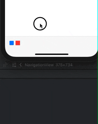
出于无障碍原因,我通常喜欢使用默认的颜色选项,但我有一个特定的用例,我无法更改单个.toolbar ToolbarItem的颜色。

我可以使用片段顶部的被注释掉的代码覆盖所有 ToolbarItem的颜色,但我想着色单独的图标。

import SwiftUI

struct ContentView: View {
    
//    init() {
//        UIBarButtonItem.appearance(whenContainedInInstancesOf: [UIToolbar.self]).tintColor = .systemRed
//    }
    
    var body: some View {
        
        NavigationView {
            
            Text("Hello, world!")
                .toolbar {
                    
                    // To be colored RED
                    ToolbarItem(placement: .bottomBar) {
                        Button(action: {}, label: {Label("Icon One", systemImage: "stop.fill")})
                    }
                    
                    // To be colored BLACK
                    ToolbarItem(placement: .bottomBar) {
                        Button(action: {}, label: {Label("Icon Two", systemImage: "play.fill")})
                    }
                    
                }
        }
    }
}

struct ContentView_Previews: PreviewProvider {
    static var previews: some View {
        ContentView()
    }
}
5个回答

13

是的,我也一直在努力应对同样的事情。看起来按钮正在使用系统色调颜色和整体样式。

这是我的观点:

content
    .toolbar {
        ToolbarItem(placement: .navigationBarLeading) {
            HStack {
                StyledButton(image: .system("arrow.left")) { ... }
                Spacer(minLength: 0)    // important to not fell button to default styling
            }
        }
    }

我的想法是不仅要显示按钮,而且还要与其他UI元素一起显示。对我来说,这看起来像是SwiftUI的一个bug。(或者只是想要超越你的智商。)


很奇怪但却非常有效!!作为一条注释,这个问题只发生在iPhone 11设备上,onTapGesture不起作用。我们需要使用一个按钮来代替。 - finalpets

3
我找到的最简单的解决方案是放弃使用

ToolbarItem似乎忽略了.onTapGesture。换句话说,我认为你的解决方案不起作用。颜色正确地改变了,但是你的新“按钮”没有调用任何操作。此外,标签在点击时不像普通按钮那样变暗。 - Daniel Lyons

2
如果您在UIKit中放置它,它对我来说是有效的。
struct ButtonRepresentation: UIViewRepresentable {
    let sfSymbolName: String
    let titleColor: UIColor
    let action: () -> ()
    
    func makeUIView(context: Context) -> UIButton {
        let b = UIButton()
        let largeConfig = UIImage.SymbolConfiguration(scale: .large)
        let image = UIImage(systemName: sfSymbolName, withConfiguration: largeConfig)
        b.setImage(image, for: .normal)
        b.tintColor = titleColor
        b.addTarget(context.coordinator, action: #selector(context.coordinator.didTapButton(_:)), for: .touchUpInside)
        return b
    }
    
    func updateUIView(_ uiView: UIButton, context: Context) {}
    
    func makeCoordinator() -> Coordinator {
        return Coordinator(action: action)
    }
    
    typealias UIViewType = UIButton
    
    class Coordinator {
        let action: () -> ()
        
        @objc
        func didTapButton(_ sender: UIButton) {
            self.action()
        }
        
        init(action: @escaping () -> ()) {
            self.action = action
        }
    }
}

然后您可以添加具有不同颜色的单独ButtonRepresentations。
.toolbar {
    ToolbarItem(placement: .cancellationAction) {
        ButtonRepresentation(sfSymbolName: closeIcon, titleColor: closeIconColor) { 
        presentationMode.wrappedValue.dismiss()
    }
}

2
看起来所有标准类型(按钮,图像,文本等)都被 ToolbarItem 拦截并转换为适当的内部表示。但是自定义视图(例如基于形状的视图)则不会。因此,请参见下面可能的演示方法。
演示已在 Xcode 12 / iOS 14 上进行了准备和测试。
请点击以下链接查看演示效果:demo
ToolbarItem(placement: .bottomBar) {
    ShapeButton(shape: Rectangle(), color: .red) {
        print(">> works")
    }
}

以及简单的基于形状的自定义按钮

struct ShapeButton<S:Shape>: View {
    var shape: S
    var color: Color
    var action: () -> ()

    @GestureState private var tapped = false
    var body: some View {
        shape
            .fill(color).opacity(tapped ? 0.4 : 1)
            .animation(.linear(duration: 0.15), value: tapped)
            .frame(width: 18, height: 18)
            .gesture(DragGesture(minimumDistance: 0)
                .updating($tapped) { value, state, _ in
                    state = true
                }
                .onEnded { _ in
                    action()
                })
    }
}

1

不幸的是,这个技巧只适用于iOS。

但好消息是它也适用于菜单:

Menu {
    Button("A title") {}
} label : {
    HStack {
            Label("Star"), systemImage: "star")
                .labelStyle(.iconOnly)
                .foregroundColor(.red)
                Spacer(minLength: 0)
    }
}


网页内容由stack overflow 提供, 点击上面的
可以查看英文原文,
原文链接