Plotly如何在同一Y轴上绘制具有不同X数组的多条线?

3
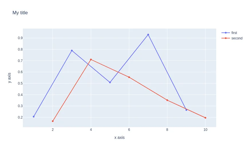
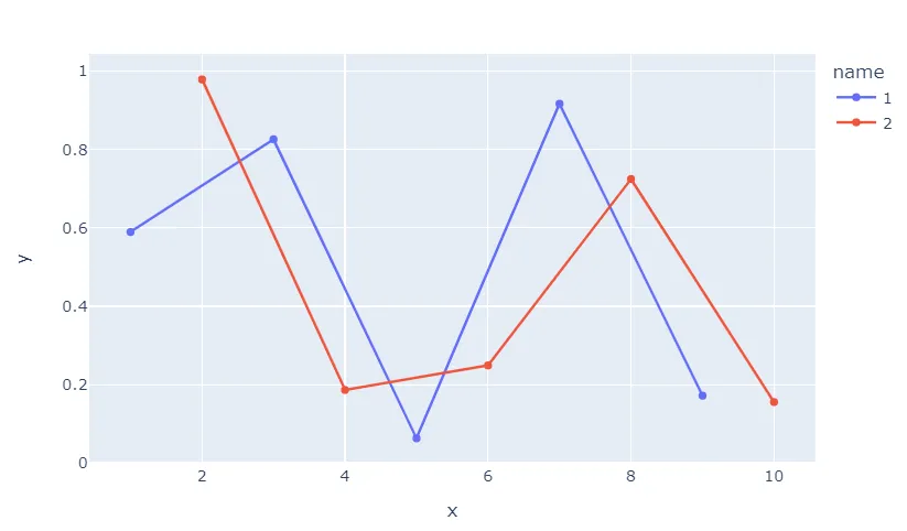
我尝试在Python中使用Plotly绘制多条线,在同一图表上具有它们自己的X值,例如。
x1 = [1, 3, 5, 7, 9]
y1 = np.random.random(5)

x2 = [2, 4, 6, 8, 10]
y2 = np.random.random(5)

我希望在一个x轴上从1到10绘制这个图表。所有StackOverFlow上的答案(例如这个)都是使用一个pandas dataframe来描述解决方案,其中所有线条(y1和y2)都具有相同的x值数组,对应于每个线条。然而,在我的情况下,y1和y2具有不同的(虽然是相同的单位)对应x值。我该怎么做才能在plotly中制作这样的图形呢?
2个回答

5
当您没有数据框时,我认为最简单的方法是使用plotly.graph_objects
import plotly.graph_objects as go

x1 = [1, 3, 5, 7, 9]
y1 = np.random.random(5)
x2 = [2, 4, 6, 8, 10]
y2 = np.random.random(5)

f1 = go.Figure(
    data = [
        go.Scatter(x=x1, y=y1, name="first"),
        go.Scatter(x=x2, y=y2, name="second"),
    ],
    layout = {"xaxis": {"title": "x axis"}, "yaxis": {"title": "y axis"}, "title": "My title"}
)
f1

enter image description here

你也可以使用 plotly.express 模块,但是需要编写更多代码来设置图例名称。
在这个 文档页面 中了解更多信息。

3
只需对您的示例数据进行一点点的数据整理,您就可以使用这一行代码:
fig = px.line(df, x = 'x', y = 'y', color = 'name', markers = True)

而且听好了:

enter image description here

这个争论只是将您的类别构建成两个数据框,并将它们堆叠成所谓的长格式,plotly express可以很好地处理。与所谓的宽格式数据相反,如果不同的类别具有不同数量的观测值,这并不重要。

完整代码:

import plotly.express as px
import pandas as pd
import numpy as np

x1 = [1, 3, 5, 7, 9]
y1 = np.random.random(5)

x2 = [2, 4, 6, 8, 10]
y2 = np.random.random(5)

df1 = pd.DataFrame({'name': ['1']*len(x1),
                    'x': x1,
                    'y': y1})

df2 = pd.DataFrame({'name': ['2']*len(x2),
                    'x': x2,
                    'y': y2})

df = pd.concat([df1, df2])

fig = px.line(df, x = 'x', y = 'y', color = 'name', markers = True)
fig.show()

网页内容由stack overflow 提供, 点击上面的
可以查看英文原文,
原文链接