我正在尝试自定义滑块小部件,使其具有自定义的拇指形状。
为了实现这个目标,我需要扩展SliderComponentShape。
这个类要求我实现自己的绘制方法。
绘制方法只提供给我一个画布Canvas来进行绘制。
不幸的是,我想要使用的拇指形状相当复杂。
手动绘制会非常繁琐,而使用Flutter的小部件构建会更加容易。
是否有一种方法将Widget绘制到Canvas上?
如何在画布(Canvas)上绘制小部件(Widget)?
10
- Ymi_Yugy
1个回答
1
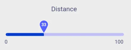
你可以使用图片或矢量图作为拇指图像,从而降低绘制复杂度。
例如,要获取以下地图滑块:
例如,要获取以下地图滑块:
 class DistanceSlider extends StatefulWidget {
  const DistanceSlider({
    Key key,
    @required this.imageUrl,
    @required this.minDistance,
    @required this.maxDistance,
  }) : super(key: key);
  final String imageUrl;
  final double maxDistance;
  final double minDistance;

  @override
  _DistanceSliderState createState() => _DistanceSliderState();
}

class _DistanceSliderState extends State<DistanceSlider> {
  double distance = 20;

  ui.Image customImage;
  Future<ui.Image> loadImage(String imageUrl) async {
    ByteData data = await rootBundle.load(imageUrl);
    ui.Codec codec = await ui.instantiateImageCodec(data.buffer.asUint8List());
    ui.FrameInfo fi = await codec.getNextFrame();
    return fi.image;
  }

  @override
  void initState() {
    loadImage(widget.imageUrl).then((image) {
      setState(() {
        customImage = image;
      });
    });
    super.initState();
  }

  @override
  Widget build(BuildContext context) {
    return Container(
      child: SliderTheme(
        data: SliderThemeData(
          trackHeight: 8,
          thumbShape: SliderThumbImage(
              image: customImage,
              thumbRadius: 0,
              max: widget.maxDistance.toInt()),
          overlayColor: kSecondaryColorLight.withAlpha(32),
          overlayShape: RoundSliderOverlayShape(overlayRadius: 28.0),
          activeTrackColor: kSecondaryColorDark,
          inactiveTrackColor: kSecondaryColorLight.withOpacity(0.5),
          valueIndicatorShape: PaddleSliderValueIndicatorShape(),
          valueIndicatorTextStyle: TextStyle(
            color: Colors.white,
          ),
          valueIndicatorColor: Colors.white,
        ),
        child: Stack(
          children: <Widget>[
            Slider(
              label: distance.abs().toString(),
              value: distance,
              min: widget.minDistance,
              max: widget.maxDistance,
              onChanged: (value) {
                setState(() {
                  distance = value;
                });
              },
            ),
            Container(
              margin: EdgeInsets.only(left: 25, right: 25, top: 40),
              child: Row(
                mainAxisAlignment: MainAxisAlignment.spaceBetween,
                crossAxisAlignment: CrossAxisAlignment.center,
                children: <Widget>[
                  Text(widget.minDistance.toInt().toString()),
                  Text(widget.maxDistance.toInt().toString())
                ],
              ),
            ),
          ],
        ),
      ),
    );
  }
}

class SliderThumbImage extends SliderComponentShape {
  final ui.Image image;
  final double thumbRadius;
  final int max;
  SliderThumbImage({this.image, this.thumbRadius, this.max});

  @override
  Size getPreferredSize(bool isEnabled, bool isDiscrete) {
    return Size.fromRadius(thumbRadius);
  }

  @override
  void paint(PaintingContext context, Offset center,
      {Animation<double> activationAnimation,
      Animation<double> enableAnimation,
      bool isDiscrete,
      TextPainter labelPainter,
      RenderBox parentBox,
      SliderThemeData sliderTheme,
      TextDirection textDirection,
      double value}) {
    final canvas = context.canvas;
    final imageWidth = image?.width ?? 10;
    final imageHeight = image?.height ?? 10;

    Offset imageOffset = Offset(
      center.dx - (imageWidth / 2),
      center.dy - (imageHeight / 0.935),
    );

    Paint paint = Paint()..filterQuality = FilterQuality.high;

    if (image != null) {
      canvas.drawImage(image, imageOffset, paint);
    }

    TextSpan span = new TextSpan(
        style: new TextStyle(
            fontSize: imageHeight * .3,
            fontWeight: FontWeight.w700,
            color: sliderTheme.valueIndicatorColor,
            height: 0.9),
        text: '${getValue(value)}');
    TextPainter tp = new TextPainter(
        text: span,
        textAlign: TextAlign.left,
        textDirection: TextDirection.ltr);
    tp.layout();
    Offset textCenter = Offset(
      center.dx - (tp.width / 2),
      center.dy - (tp.height / 0.32),
    );
    tp.paint(canvas, textCenter);
  }

  String getValue(double value) {
    return ((max * value).round()).toString();
  }
}
- zavora
网页内容由stack overflow 提供, 点击上面的可以查看英文原文,
原文链接
原文链接