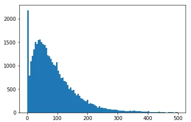
我有这段代码。
类似于这样:
df1 = df['T1'].values

df1 = df1 [~np.isnan(df1 )].tolist()

plt.hist(df1 , bins='auto', range=(0,100))
plt.show()
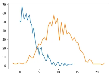
这给了我这个图表
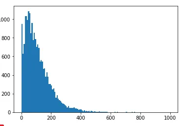
和这段代码
df2 = df['T2'].values

df2 = df2 [~np.isnan(df2 )].tolist()

plt.hist(df2 , bins='auto', range=(0,100))
plt.show()
这给了我这个
类似于这样:
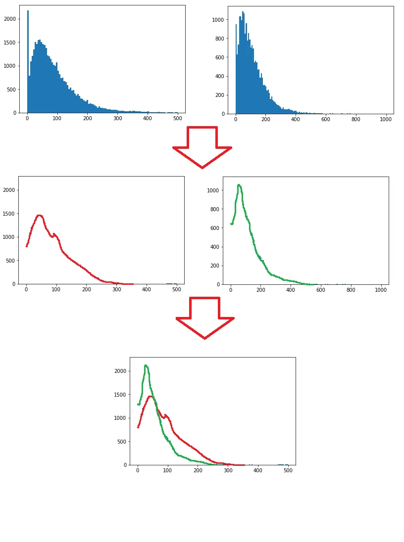
data = plt.hist(...),您可以使用plt.plot(data[0])。 - furas