绘制两个不同长度的列表

8

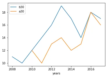
我有两个价格不同的列表。第一个清单是2008年至2018年,第二个清单是2010年至2018年。如何在条件下将它们绘制出来,使得2008年至2018年的年份在X轴上,而第二个列表从2010年开始?

以下是一个简短代码的示例:

from matplotlib import pyplot as plt

Geb_b30 = [11, 10, 12, 14, 16, 19, 17, 14, 18, 17]
Geb_a30 = [12, 10, 13, 14, 12, 13, 18, 16]

fig, ax = plt.subplots()
ax.plot(Geb_b30, label='Prices 2008-2018', color='blue')
ax.plot(Geb_a30, label='Prices 2010-2018', color = 'red')
legend = ax.legend(loc='center right', fontsize='x-large')
plt.xlabel('years')
plt.ylabel('prices')
plt.title('Comparison of the different prices')
plt.show()

1
你能接受一个答案吗? - Laurent H.
对不起,我忘记接受其中一个答案了。你的回答非常好,所以我使用了那个。 - Pyrmon55
5个回答

15

我建议您为每组点简单定义x值(即年份列表),并将它们作为ax.plot()的参数传递,如下所示:

我建议你只需为每组点定义x值(即年份列表),并将其作为ax.plot()的参数传递,如下所示:

from matplotlib import pyplot as plt

Geb_b30 = [11, 10, 12, 14, 16, 19, 17, 14, 18, 17]
years_b30 = range(2008,2018)
Geb_a30 = [12, 10, 13, 14, 12, 13, 18, 16]
years_a30 = range(2010,2018)

fig, ax = plt.subplots()
ax.plot(years_b30, Geb_b30, label='Prices 2008-2018', color='blue')
ax.plot(years_a30, Geb_a30, label='Prices 2010-2018', color = 'red')
legend = ax.legend(loc='center right', fontsize='x-large')
plt.xlabel('years')
plt.ylabel('prices')
plt.title('Comparison of the different prices')
plt.show()

@MadPhysicist 当然可以。输入列表Geb_b30中只有10个价格,因此它从2008年到2017年,我使用了range(2018,2018) - Laurent H.
抱歉我之前说话有点刻薄。我自己数错了,现在已经修复好了我的代码。投票结果当然也被翻转了。 - Mad Physicist

5

理解我的意思,只需用NoneNaN填充您缺失的年份即可:

import pandas as pd

years = list(range(2008, 2018))
Geb_b30 = [11, 10, 12, 14, 16, 19, 17, 14, 18, 17]
Geb_a30 = [None, None, 12, 10, 13, 14, 12, 13, 18, 16]
df = pd.DataFrame({"years":years, "b30": Geb_b30, "a30": Geb_a30})

df.plot(x="years")

plot


这并不一定会产生期望的效果。虽然在某些情况下可能有效,但引入虚假数据通常不是一个好主意。 - Mad Physicist
1
将数据替换为NaN,我会同意您正在复制预期的结果。 - Mad Physicist
好的,没问题 - 正在更新。 - andrew_reece
我还是喜欢这张图片 :) - Mad Physicist
imgur告诉我它坏了...正在处理中。另外,你是完全正确的 - 这里的零是完全错误的。只是动作太快了。感谢你的指出。 - andrew_reece

4
要告诉Matplotlib您希望点在x轴上停留的位置,必须明确提供x值。 x轴值的大小必须与y值的大小相对应,但是独立数据集之间不需要有任何关系,正如您已经看到的那样。
Geb_x = range(2008, 2018)

...

ax.plot(Geb_x, Geb_b30, label='Prices 2008-2018', color='blue')
ax.plot(Geb_x[2:], Geb_a30, label='Prices 2010-2018', color = 'red')

你为什么要将 Geb_b30_x 转换为 list?即使不转换为 list 或使用 np.arange,你的两个解决方案都可以正常工作。 - Sheldore
@巴辛嘎。修复了第一个。第二个应该很清楚了。 - Mad Physicist
我的意思是,如果你只写 years = range(2008, 2019) 然后使用 years[2:],它仍然可以工作。不需要使用 np.arange - Sheldore
@Bazinga。我明白了。已修复。 - Mad Physicist

3

你需要创建一个包含你的年份的新列表。 然后,你可以通过执行years[10:18]来指定在x轴上想要绘制的位置。

from matplotlib import pyplot as plt

Geb_b30 = [11, 10, 12, 14, 16, 19, 17, 14, 18, 17]
Geb_a30 = [12, 10, 13, 14, 12, 13, 18, 16]

years = list(range(2008,2018))

fig, ax = plt.subplots()
ax.plot(years[0:len(Geb_b30)],Geb_b30, label='Prices 2008-2018', 
color='blue')
ax.plot(years[2:],Geb_a30, label='Prices 2010-2018', color = 
'red')
legend = ax.legend(loc='center right', fontsize='x-large')
plt.xlabel('years')
plt.ylabel('prices')
plt.title('Comparison of the different prices')
plt.show()

编辑:已更新正确的x轴


1
那个x轴现在甚至更不正确了。范围2008是一个巨大的序列,几乎不包含感兴趣的数字,直到2018年。尝试运行你的代码。 - Mad Physicist
1
请在发布之前运行您的代码。现在您有一个明显的语法错误。 - Mad Physicist
再次感谢,是的,你说得对。我有点草率了。 - VegardKT
现在我们都有相同的答案 :) - Mad Physicist

1

有很多方法可以实现这一点。一种优雅的方式是使用pandas。这样,您将自动获得正确标记和对齐的x刻度。

from matplotlib import pyplot as plt
import pandas as pd

geb_b30_x = pd.date_range(start="20080101", end="20180101", freq="A")
geb_b30_y = [11, 10, 12, 14, 16, 19, 17, 14, 18, 17]
geb_b30 = pd.Series(data=geb_b30_y, index=geb_b30_x)

geb_a30_x = pd.date_range(start="20100101", end="20180101", freq="A")
geb_a30_y = [12, 10, 13, 14, 12, 13, 18, 16]
geb_a30 = pd.Series(data=geb_a30_y, index=geb_a30_x)

fig, ax = plt.subplots()
ax.plot(geb_b30, label='Prices 2008-2018', color='blue')
ax.plot(geb_a30, label='Prices 2010-2018', color = 'red')
legend = ax.legend(loc='center right', fontsize='x-large')
plt.xlabel('years')
plt.ylabel('prices')
plt.title('Comparison of the different prices')
plt.show()

网页内容由stack overflow 提供, 点击上面的
可以查看英文原文,
原文链接