以下是 Jetpack Compose 中 OutlinedTextField 代码的样子:
OutlinedTextField(
    value = "",
    onValueChange = {},
    label = {Text("Input")}
)
这个文本框的默认轮廓颜色是紫色。我想要改变轮廓颜色,同时也要改变标签的颜色。
以下是 Jetpack Compose 中 OutlinedTextField 代码的样子:
OutlinedTextField(
value = "",
onValueChange = {},
label = {Text("Input")}
)
这个文本框的默认轮廓颜色是紫色。我想要改变轮廓颜色,同时也要改变标签的颜色。
OutlinedTextField使用的默认值由TextFieldDefaults.outlinedTextFieldColors中的focusedBorderColor、unfocusedBorderColor和disabledBorderColor定义。
在M2版本中:
focusedBorderColor: Color = MaterialTheme.colors.primary.copy(alpha = ContentAlpha.high),
unfocusedBorderColor: Color = MaterialTheme.colors.onSurface.copy(alpha = ContentAlpha.disabled),
您可以在主题中更改 colors.primary 和 colors.onSurface。
使用M3:
    focusedBorderColor: Color = OutlinedTextFieldTokens.FocusOutlineColor.toColor(),
    unfocusedBorderColor: Color = OutlinedTextFieldTokens.OutlineColor.toColor(),
primary和outline颜色。 OutlinedTextField(
value = "",
onValueChange = {},
label = {Text("Input")},
colors = TextFieldDefaults.outlinedTextFieldColors(
focusedBorderColor = Green,
unfocusedBorderColor = Yellow)
)
@Preview
@Composable
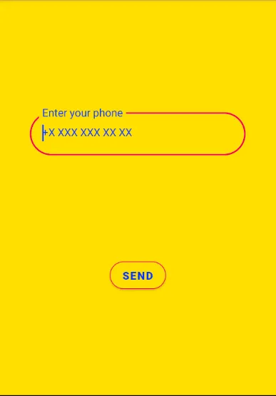
fun TelephoneEditText() {
val textValue = remember {
mutableStateOf("")
}
OutlinedTextField(
label = {
Text(
text = stringResource(
id = R.string.phoneNumber
),
style = TextStyle(
color = MaterialTheme.colors.primaryVariant,
)
)
},
placeholder = {
Text(
text = stringResource(id = R.string.phone_placeholder),
style = TextStyle(
color = MaterialTheme.colors.primaryVariant,
textAlign = TextAlign.Center
)
)
},
colors = TextFieldDefaults.outlinedTextFieldColors(
focusedBorderColor = MaterialTheme.colors.secondary,
unfocusedBorderColor = MaterialTheme.colors.secondary,
focusedLabelColor = MaterialTheme.colors.secondary,
cursorColor = MaterialTheme.colors.primaryVariant
),
keyboardOptions = KeyboardOptions.Default.copy(keyboardType = KeyboardType.Number),
value = textValue.value,
onValueChange = { textValue.value = it },
)
WhatsAppButton(textValue)
}
Colors.kt
val Yellow500 = Color(0XFFFFDE03)
val Blue700 = Color(0xFF0036FF)
val Pink500 = Color(0xFFf50057)
val Pink700 = Color(0xFFff5983)

val LightColors = lightColors(
    primary = Yellow500,
    primaryVariant = Blue700,
    secondary = Pink500,
    secondaryVariant = Pink700
)

val DarkColors = darkColors(
    primary = Yellow500,
    primaryVariant = Blue700,
    secondary = Pink700
)
对于1.0.0 beta-1版本
OutlinedTextField(
    value = "",
    onValueChange = {},
    label = {Text("Input")},
    color = TextFieldDefaults.outlinedTextFieldColors(
            focusedBorderColor: Color = MaterialTheme.colors.primary.copy(alpha =
              ContentAlpha.high),
            unfocusedBorderColor: Color = MaterialTheme.colors.onSurface.copy(alpha =
              ContentAlpha.disabled),
            disabledBorderColor: Color = unfocusedBorderColor.copy(alpha =
              ContentAlpha.disabled),
            errorBorderColor: Color = MaterialTheme.colors.error,
    )
)
根据上述参数设置边框颜色,具体取决于情况。
使用compose androidx.compose:compose-bom:2023.04.01 现在需要使用颜色。 背景使用容器颜色,边框使用指示器颜色
  OutlinedTextField(
            searchValue.value,
            {
                searchValue.value = it
            },
            placeholder = { Text(text = stringResource(id = R.string.hint_search_food)) },
            keyboardOptions = KeyboardOptions(
                keyboardType = KeyboardType.Text, imeAction = ImeAction.Search
            ),
            modifier = Modifier.fillMaxWidth(),
            shape = RoundedCornerShape(24.dp),
            colors = TextFieldDefaults.colors(
                unfocusedContainerColor = fieldBackGroundColor,
                focusedContainerColor = fieldBackGroundColor,
                focusedIndicatorColor = fieldBackGroundColor,
                unfocusedIndicatorColor = fieldBackGroundColor
            ),
            leadingIcon = {
                Icon(Icons.Outlined.Search, "Search")
            },
        )
我相信这是M3的解决方案:
colors = TextFieldDefaults.textFieldColors(
                backgroundColor = Color.Transparent,
                cursorColor = androidx.compose.material3.MaterialTheme.colorScheme.onPrimaryContainer.copy(alpha = ContentAlpha.medium),
                focusedIndicatorColor = androidx.compose.material3.MaterialTheme.colorScheme.onPrimaryContainer.copy(alpha = ContentAlpha.medium),
                focusedLabelColor = androidx.compose.material3.MaterialTheme.colorScheme.onPrimaryContainer.copy(alpha = ContentAlpha.medium)
            )
OutlinedTextFieldDefaults.colors(
                    focusedBorderColor = // someColor,
                    unfocusedBorderColor = //someColor,
                )
例子,
OutlinedTextField(
                value = status,
                onValueChange = { status = it },
                shape = RoundedCornerShape(8.dp),
                colors = OutlinedTextFieldDefaults.colors(
                    focusedBorderColor = Grey80,
                    unfocusedBorderColor = Grey80,
                )

            )
    OutlinedTextField(
        value = "Hello",
        onValueChange = {},
        colors = TextFieldDefaults.outlinedTextFieldColors(
            containerColor =,
            focusedBorderColor =,
            unfocusedBorderColor =
        ),
    )
enabled=false,你必须使用disabledBorderColor属性。 - Gabriele Mariotti