CSS3旋转与nth-child不像预期的那样工作

3
我有一个留言簿。 
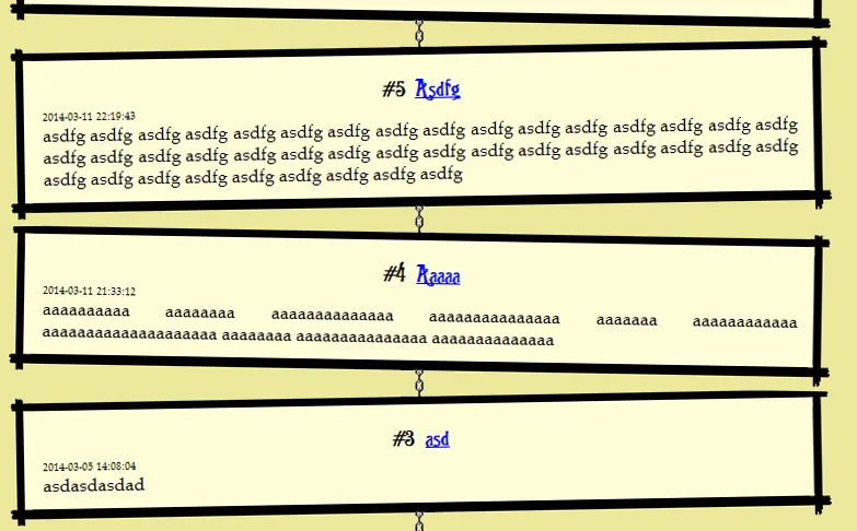
我想要旋转每个第一篇文章(-0.7度)和每个第二篇文章(0.7度)。 .chain 只有一个背景图像。 当没有 .chain div 时,它可以与 .post:nth-child(2n+1) 一起使用。 使用这个css,我只能将所有内容旋转到同一个方向。 我尝试了一切,但它不起作用。请帮帮我。 enter image description here
<form></form>    
<div class="chain"></div>
<article class="post">
   <h3>Peter Parker</h3>
   <span class="time">2014.03.17 18:53</span>
   <span class="message">This is a nice page.</span>
</article>
<div class="chain"></div>
<article class="post">
   <h3>John Smith</h3>
   <span class="time">2014.03.17 18:00</span>
   <span class="message">Hi! My name is John</span>
</article>
...

样式表:

.post{
    border: 30px solid transparent;
    border-image:url("stb/border.png") 45 45 45 45 repeat stretch;
    border-width:20px 20px 20px 20px;
    -moz-border-image:url("stb/border.png") 45 45 45 45 repeat stretch;
    -webkit-border-image:url("stb/border.png") 45 45 45 45 repeat stretch;
    border-image-outset: 10px;
    background-color:#fffcd6;
    text-align:center;  
}
.chain{
    margin:0 auto;
    height:30px;
    width:30px;
    min-width:30px;
    min-height:30px;
    background: url('stb/lanc.png');
    background-repeat: repeat-y;
    background-position: center center;
}
.post:nth-child(4n+3) .post:nth-child(4n+4){
    -ms-transform:rotate(0.7deg);
    -webkit-transform:rotate(0.7deg);
    transform:rotate(0.7deg);
}
.post:nth-child(4n+1) .post:nth-child(4n+2){
    -ms-transform:rotate(-0.7deg);
    -webkit-transform:rotate(-0.7deg);
    transform:rotate(-0.7deg);
}

我也尝试了这个:

.chain:nth-child(odd) .vk:nth-child(odd){
    -ms-transform:rotate(0.7deg); 
    -webkit-transform:rotate(0.7deg);
    transform:rotate(0.7deg);
}

1
问题不在于度数。如果0.7可行,那么它就可以正常工作。但事实并非如此。 - darksoul90
1个回答

4

你需要在选择器之间加上逗号。你使用了后代组合器

这里有个例子

.post:nth-child(4n+3), .post:nth-child(4n+4){
/*                   ^                      */
    -ms-transform:rotate(0.7deg);
    -webkit-transform:rotate(0.7deg);
    transform:rotate(0.7deg);
}
.post:nth-child(4n+1), .post:nth-child(4n+2){
/*                   ^                      */
    -ms-transform:rotate(-0.7deg);
    -webkit-transform:rotate(-0.7deg);
    transform:rotate(-0.7deg);
}

你可以简化代码并使用 :nth-child(even)/nth-child(odd)。但是由于存在 <div class="chain"></div> 元素,这种方法不起作用。因此,你可以像这样使用伪元素(:before/:after)来替换它们:

这里有例子

.post:nth-child(even) {
    -ms-transform:rotate(2deg);
    -webkit-transform:rotate(2deg);
    transform:rotate(2deg);
}
.post:nth-child(odd) {
    -ms-transform:rotate(-2deg);
    -webkit-transform:rotate(-2deg);
    transform:rotate(-2deg);
}
.post {
    /* other styling.. */
    position:relative;
}
.post:after {
    content:'';
    position: absolute;
    height: 30px;
    width: 30px;
    background: url('//placehold.it/10x200');
    background-repeat: repeat-y;
    background-position: center center;
    left: 50%;
    top: 100%;
    margin-left: -15px; /* Half the width.. */
}

是的,在 CSS 中的 421593 更改后,逗号消失了。非常感谢。 - darksoul90
2
很好的发现。此外,在第一个演示中,4n+1和4n+3是无用的。为了使其在webkit和FF中看起来更好,将透视函数添加到变换中。http://jsfiddle.net/VhrHV/1/ - vals
这里不适用 :after,因为帖子高度不同。http://users.atw.hu/darksoul90/egyeb/atw2.png - darksoul90
1
@darksoul90 在这里使用不同的高度是有效的。http://jsfiddle.net/rdfWL/ 至于另一种解决方案,您可以使链条更长,以便它们延伸到空间之外...然后您只需使用负z-index隐藏多余部分...至于另一种解决方案,您可以使用一个单独的元素来扩展整个背景的高度。 - Josh Crozier

网页内容由stack overflow 提供, 点击上面的
可以查看英文原文,
原文链接