如何使用日期时间更改x轴的范围?

60

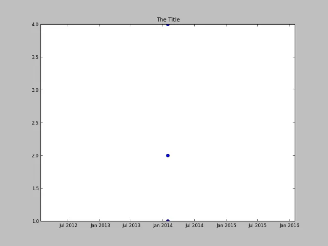
我正在尝试绘制一个以日期为x轴,数值为y轴的图表。它工作得很好,除了我无法使x轴的范围适当。无论我的日期是从今天开始,x轴范围总是2012年1月到2016年1月。我甚至指定xlim应该是第一个和最后一个日期。

如果相关的话,我是为Python-Django编写这个程序。
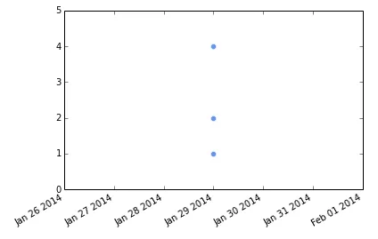
 import datetime
 import matplotlib.pyplot as plt

 x = [datetime.date(2014, 1, 29), datetime.date(2014, 1, 29), datetime.date(2014, 1, 29)] 
 y = [2, 4, 1]

 fig, ax = plt.subplots()
 ax.plot_date(x, y)
 ax.set_xlim([x[0], x[-1]])

 canvas = FigureCanvas(plt.figure(1))
 response = HttpResponse(content_type='image/png')
 canvas.print_png(response)
 return response

以下是输出结果: 输入图像说明


2
我们需要查看一些你的数据以运行你的例子。简短、自助式的答案是在将数据添加到轴后调用print(ax.get_xlim()),并查看返回的值。然后您可以根据需要进行微调。 - Paul H
2个回答

75

编辑:

根据原帖提供的实际数据,所有数值都是在同一日期/时间。因此,matplotlib会自动将x轴缩放到最大范围。您仍然可以使用datetime对象手动设置x轴限制。


如果我在 matplotlib v1.3.1 上执行以下操作:

import datetime
import matplotlib.pyplot as plt

x = [datetime.date(2014, 1, 29)] * 3 
y = [2, 4, 1]

fig, ax = plt.subplots()
ax.plot_date(x, y, markerfacecolor='CornflowerBlue', markeredgecolor='white')
fig.autofmt_xdate()
ax.set_xlim([datetime.date(2014, 1, 26), datetime.date(2014, 2, 1)])
ax.set_ylim([0, 5])

我得到:

enter image description here

而且坐标轴的范围与我指定的日期相匹配。


1
@aled1027你所有的点都在同一时间吗?那真的是你正在处理的数据吗? - Paul H
谢谢帮忙。我已经解决了。当我从数据库检索数据时,数据没有包含小时、分钟和秒数。 - aled1027
5
这个解决方案可以从datetime.date推广到datetime.datetime,使用ax.set_xlim([datetime.datetime(2014, 1, 28, 23, 50, 0), datetime.datetime(2014, 1, 29, 0, 10, 0)])。另一种方法是导入pandas库并使用ax.set_xlim([pd.to_datetime('2014-01-28 23:50:00'), pd.to_datetime('2014-01-29 00:10:00')]) - Qaswed
@Qaswed 不确定这是如何“泛化”的,但是是的,datedatetime对象都可以使用。 - Paul H
@PaulH "generalized" 的意思是 datetime 允许 datetime(2014, 1, 28, 23, 50, 0) datetime(2014, 1, 29, 0, 0, 0),但是(据我所知)date 只允许 date(2014, 1, 29) - Qaswed

11

在Paul H的帮助下,我成功地改变了基于时间的X轴的范围。

以下是适用于其他初学者的更一般性的解决方案。

import matplotlib.pyplot as plt
import datetime as dt
import matplotlib.dates as mdates

# Set X range. Using left and right variables makes it easy to change the range.
#
left = dt.date(2020, 3, 15)
right = dt.date(2020, 7, 15)

# Create scatter plot of Positive Cases
#
plt.scatter(
  x, y, c="blue", edgecolor="black", 
  linewidths=1, marker = "o", alpha = 0.8, label="Total Positive Tested"
)

# Format the date into months & days
plt.gca().xaxis.set_major_formatter(mdates.DateFormatter('%m-%d')) 

# Change the tick interval
plt.gca().xaxis.set_major_locator(mdates.DayLocator(interval=30)) 

# Puts x-axis labels on an angle
plt.gca().xaxis.set_tick_params(rotation = 30)  

# Changes x-axis range
plt.gca().set_xbound(left, right)

plt.show()

enter image description here


2
关于使用 ax.set_xbound() 而不是通常的 ax.set_xlim(),这个答案进行了(一些)澄清,详见此处 - mins
添加 import matplotlib.dates as mdates - Binyamin Even

网页内容由stack overflow 提供, 点击上面的
可以查看英文原文,
原文链接