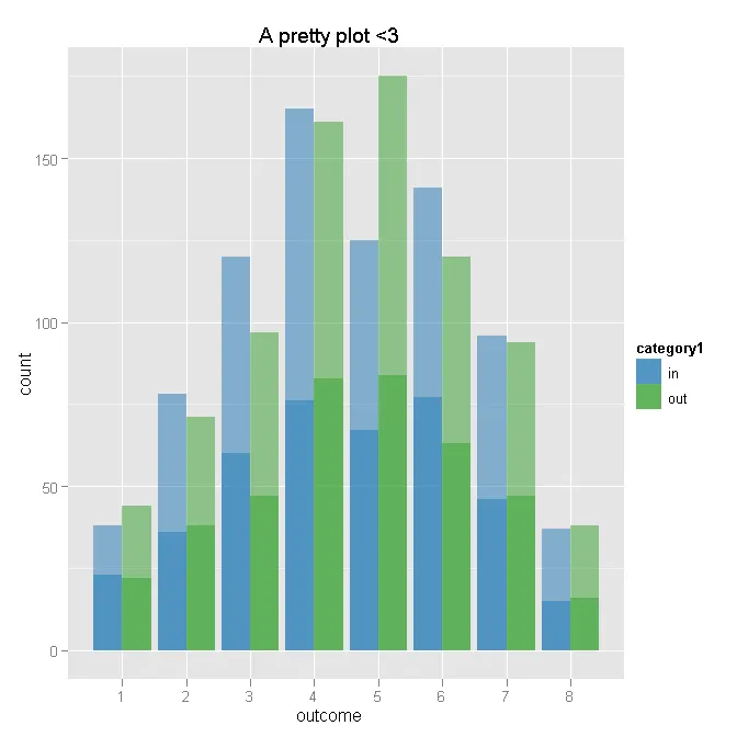
我有以下图表,它实际上是两个分布的直方图并排绘制在一起:
my.barplot <- function( df, title="", ... ) {
  df.count <- aggregate( df$outcome, by=list(df$category1,df$outcome), FUN=length )
  colnames( df.count ) <- c("category1","outcome","n")
  df.total <- aggregate( df.count$n, by=list(df.count$category1), FUN=sum )
  colnames( df.total ) <- c("category1","total")
  df.dens <- merge(df.count, df.total)
  df.dens$dens <- with( df.dens, n/total )
  p <- ggplot( df.dens, aes( x=outcome, fill=category1 ), ... )
  p <- p + geom_bar( aes( y=dens ), position="dodge" )
  p <- p + opts( axis.text.x=theme_text(angle=-90,hjust=0), title=title )
  p
}

N <- 50*(2*8*2)
outcome <- sample(ordered(seq(8)),N,replace=TRUE,prob=c(seq(4)/20,rev(seq(4)/20)) )
category2 <- ifelse( outcome==1, sample(c("yes","not"), prob=c(.95,.05)), sample(c("yes","not"), prob=c(.35,.65)) )
dat <- data.frame(
  category1=rep(c("in","out"),each=N/2),
  category2=category2,
  outcome=outcome
  )

my.barplot(dat)
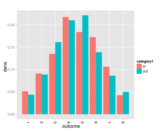
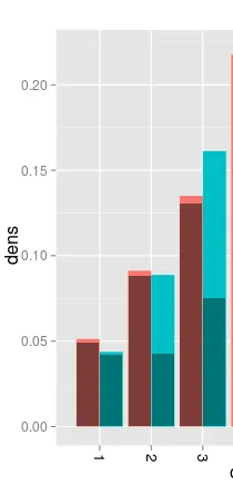
我想在每个条形图中绘制属于某个第二类别的比例。如果没有按照第一类别进行组织的需要,我就会叠放这些柱形图。但是,我无法弄清楚如何按第二类别叠加。基本上,在每个结果-类别1条中,我希望类别2中的比例被阴影较深地涂色。
下面是我想要创建的GIMP图片: