我想在Jetpack Compose中使用工具栏(Toolbar),它有这样的组合组件吗?
Android Jetpack Compose是否支持工具栏小部件?
21
- Commander Tvis
5个回答
36
- Gabriele Mariotti
13
使用
compose_version = '1.0.0-beta01'
TopAppBar(
        title = {
            Text(text = "Pets Show")
        },
        navigationIcon = {
            IconButton(onClick = { }) {
                Icon(imageVector = Icons.Filled.Menu, contentDescription = "Menu Btn")
            }
        },
        backgroundColor = Color.Transparent,
        contentColor = Color.Gray,
        elevation = 2.dp
    )
- Ali Azaz Alam
4
TopAppBar是一个预定义的组合控件,可帮助您实现所需效果。您可以与Scaffold一起使用,以获得基本的材料设计脚手架来连接TopAppBar。以下是一个例子,包含详细的注释,以了解如何使用它:https://github.com/vinaygaba/Learn-Jetpack-Compose-By-Example/blob/1f843cb2bf18b9988a0dfc611b631f216f02149e/app/src/main/java/com/example/jetpackcompose/material/FixedActionButtonActivity.kt#L70 在此将其复制以便易于消化。
// Scaffold is a pre-defined composable that implements the basic material design visual
    // layout structure. It takes in child composables for all the common elements that you see
    // in an app using material design - app bar, bottom app bar, floating action button, etc. It
    // also takes care of laying out these child composables in the correct positions - eg bottom
    // app bar is automatically placed at the bottom of the screen even though I didn't specify
    // that explicitly.
    Scaffold(
        scaffoldState = scaffoldState,
        topAppBar = { TopAppBar(title = { Text("Scaffold Examples") }) },
        bottomAppBar = { fabConfiguration ->
            // We specify the shape of the FAB bu passing a shape composable (fabShape) as a
            // parameter to cutoutShape property of the BottomAppBar. It automatically creates a
            // cutout in the BottomAppBar based on the shape of the Floating Action Button.
            BottomAppBar(fabConfiguration = fabConfiguration, cutoutShape = fabShape) {}
        },
        floatingActionButton = {
            FloatingActionButton(
                onClick = {},
                // We specify the same shape that we passed as the cutoutShape above.
                shape = fabShape,
                // We use the secondary color from the current theme. It uses the defaults when
                // you don't specify a theme (this example doesn't specify a theme either hence
                // it will just use defaults. Look at DarkModeActivity if you want to see an
                // example of using themes.
                backgroundColor = MaterialTheme.colors.secondary
            ) {
                IconButton(onClick = {}) {
                    Icon(asset = Icons.Filled.Favorite)
                }
            }
        },
        floatingActionButtonPosition = Scaffold.FabPosition.CenterDocked,
        bodyContent = { modifier ->
            // Vertical scroller is a composable that adds the ability to scroll through the
            // child views
            VerticalScroller {
                // Column is a composable that places its children in a vertical sequence. You
                // can think of it similar to a LinearLayout with the vertical orientation.
                Column(modifier) {
                    repeat(100) {
                        // Card composable is a predefined composable that is meant to represent
                        // the card surface as specified by the Material Design specification. We
                        // also configure it to have rounded corners and apply a modifier.
                        Card(color = colors[it % colors.size],
                            shape = RoundedCornerShape(8.dp),
                            modifier = Modifier.padding(8.dp)
                        ) {
                            Spacer(modifier = Modifier.fillMaxWidth() + Modifier.preferredHeight(200.dp))
                        }
                    }
                }
            }
        }
    )
- Vinay Gaba
3
是的,这是TopAppBar(在androidx.ui.material中)。它允许您指定标题、颜色、导航图标和操作。有关更多信息,请参见文档。
- Ryan M
1
提供的链接已经失效。 - Rumit Patel
0
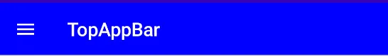
使用TopAppBar就像这样
TopAppBar(
                title = {
                    Text(text = "Jetpack Compose")
                },
                navigationIcon = {
                    IconButton(onClick = {}) {
                        Icon(imageVector = Icons.Filled.Menu, contentDescription = "Menu")
                    }
                },
                actions = {
                    IconButton(onClick = {}) {
                        Icon(imageVector = Icons.Rounded.Search,
                            contentDescription = "Search",
                            tint = Color.White)

                    }
                },
                backgroundColor = Color.Blue,
                contentColor = Color.White,
                elevation = 12.dp
            )
- Abhishek Vadodariya
网页内容由stack overflow 提供, 点击上面的可以查看英文原文,
原文链接
原文链接
- 相关问题
- 41 Jetpack Compose 折叠工具栏
- 32 如何在Jetpack Compose中使用EditText或TextInput小部件?
- 5 Jetpack Compose 支持哪些 Android 版本?
- 4 Jetpack Compose 的工具栏结构行为
- 31 如何在Jetpack Compose中使小部件不可见?
- 12 Android Jetpack Compose 数字选择器小部件的等效替代品。
- 21 Jetpack Compose能用于构建应用程序小部件吗?
- 6 在Jetpack Compose中,是否可能“缩放”任何小部件的宽度和高度?
- 4 在Jetpack Compose中如何从另一个组件访问小部件
- 3 Jetpack Compose(查看)小部件在位图加载后不会重新组合。