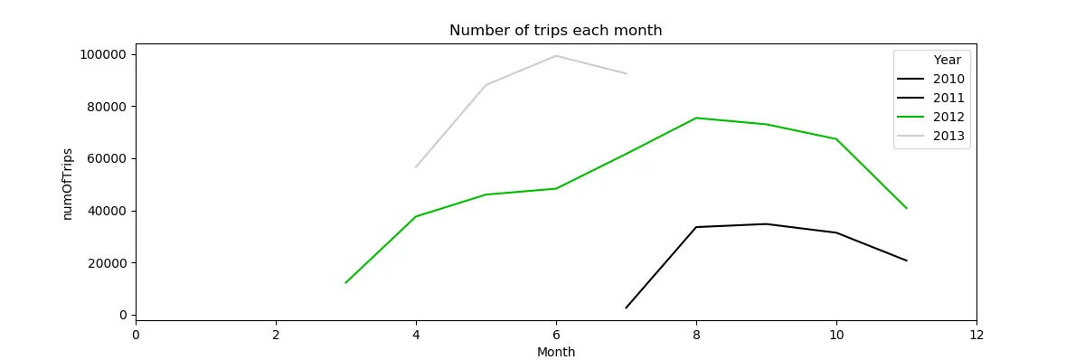
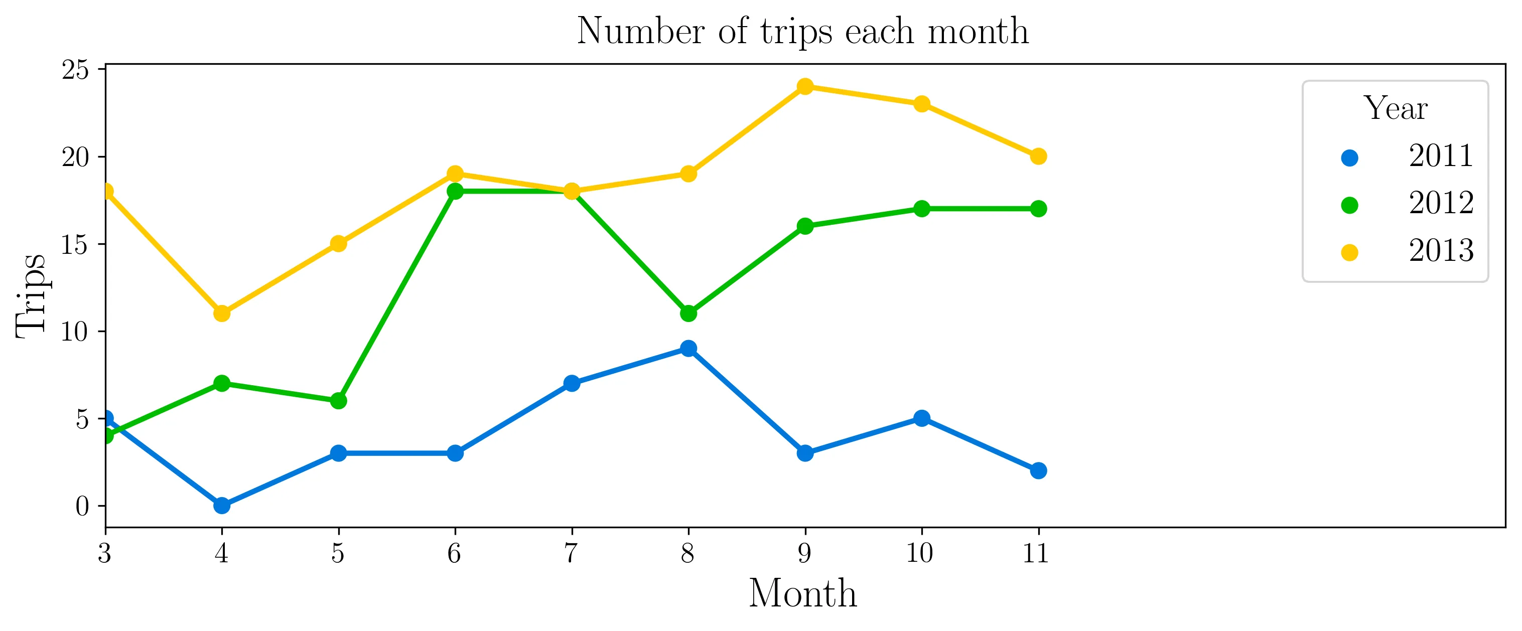
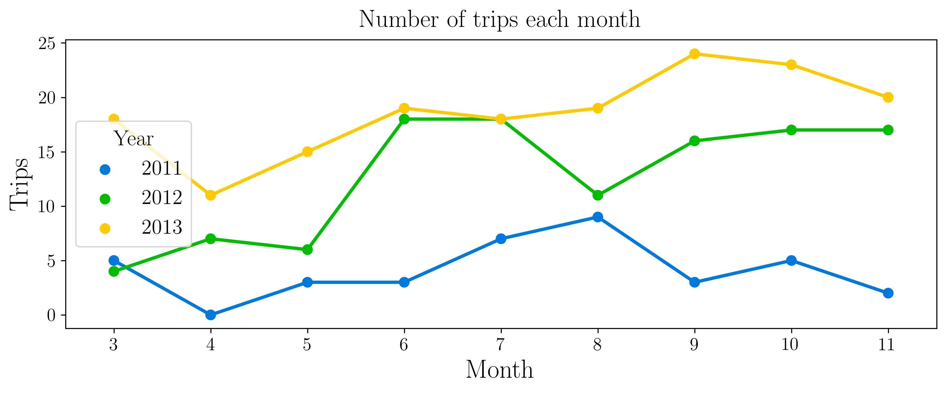
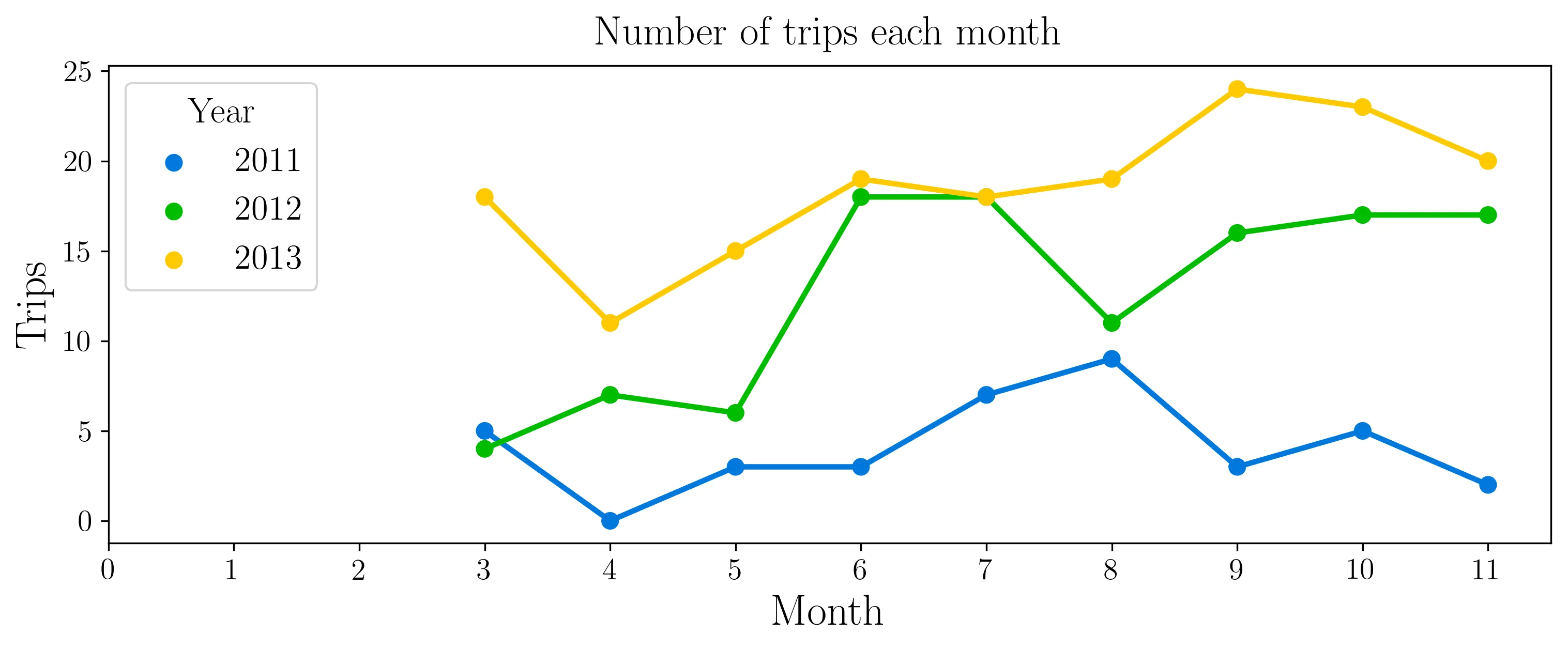
我创建了一个 pointplot(),但是我无法更改 x 轴限制。尽管我的数据只包含 9 个月,但我想在轴上显示所有的 12 个。
fig,ax = plt.subplots(figsize=(12,4))
sns.pointplot(data=tr_df, x='Month', y='numOfTrips', hue='Year', ax=ax, palette='nipy_spectral')
# sns.plt.xlim(0, 12) # AttributeError: module 'seaborn' has no attribute 'plt'
# ax.set_xlim=(0, 12) # does nothing
ax.set(xlim=(0, 12))
ax.set(title="Number of trips each month")
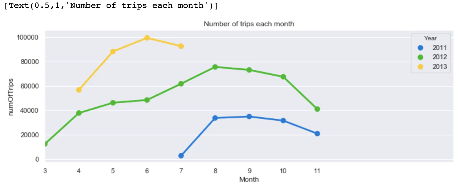
编辑:用于创建图表的数据。
    Year Month numOfTrips
0   2011   7     2608
1   2011   8     33579
2   2011   9     34756
3   2011   10    31423
4   2011   11    20746
5   2012   3     12240
6   2012   4     37637
7   2012   5     46056
8   2012   6     48315
9   2012   7     61659
10  2012   8     75443
11  2012   9     73012
12  2012   10    67372
13  2012   11    40862
14  2013   4     56625
15  2013   5     88105
16  2013   6     99301
17  2013   7     92504