使一张图片覆盖在另外两张图片上。

3
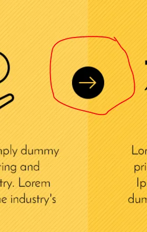
我想在两个背景图像之间添加一个箭头图片图标,使其显示效果如下图。

enter image description here

我的HTML和CSS是这样的

@media (min-width: 1200px)
{
    .content {
    padding: 25px 0;
}
}

@media (min-width: 1200px)
{
    .content {
    padding: 48px 0;
}
}

@media (min-width: 992px)
{
    .content {
    padding: 32px 0;
}
}

@media (min-width: 768px)

{
    .content {
    padding: 24px 0;
}
}
.content {
    padding: 16px 0;
}
section {
    background-size: 100% 100%;
}
article, aside, details, figcaption, figure, footer, header, hgroup, main, menu, nav, section, summary {
    display: block;
}
* {
    -webkit-box-sizing: border-box;
    -moz-box-sizing: border-box;
    box-sizing: border-box;
}
body {
    position: relative;
    color: #555555;
    padding-top: 90px;
    background-color: #f4f4f4;
    background-color: rgba(244,244,244,1);
    -webkit-animation-duration: 0.5s;
    animation-duration: 0.5s;
    -webkit-animation-name: fadeIn;
    animation-name: fadeIn;
}
body {
    /* font-family: 'Helvetica', sans-serif; */
    font-family: 'Josefin Sans', sans-serif;
    font-weight: 400;
    /* font-size: 14px; */
    font-size: 20px;
    -webkit-font-smoothing: antialiased;
}
body {
    font-family: "Helvetica Neue", Helvetica, Arial, sans-serif;
    font-size: 14px;
    line-height: 1.42857143;
    color: #333333;
    background-color: #ffffff;
}
Inherited from html.js.flexbox.flexboxlegacy.canvas.canvastext.webgl.no-touch.geolocation.postmessage.websqldatabase.indexeddb.hashchange.history.draganddrop.websockets.rgba.hsla.multiplebgs.backgroundsize.borderimage.borderradius.boxshadow.textshadow.opacity.cssanimations.csscolumns.cssgradients.cssreflections.csstransforms.csstransforms3d.csstransitions.fontface.generatedcontent.video.audio.localstorage.sessionstorage.webworkers.applicationcache.svg.inlinesvg.smil.svgclippaths.nav-down
html {
    font-size: 10px;
    -webkit-tap-highlight-color: rgba(0, 0, 0, 0);
}
html {
    font-family: sans-serif;
    -ms-text-size-adjust: 100%;
    -webkit-text-size-adjust: 100%;
}
element.style {
    animation-delay: 0s;
}
.yellow-boxes .pod-header {
    position: absolute;
    z-index: 1;
    margin: 120px 0px 0px 0px;
    width: 100%;
    font-weight: bold;
}
.os-animation.animated {
    opacity: 1;
}
.os-animation {
    opacity: 0;
}
.fadeIn {
    -webkit-animation-name: fadeIn;
    animation-name: fadeIn;
}
.animated {
    -webkit-animation-duration: 1.25s;
    animation-duration: 1.25s;
    -webkit-animation-fill-mode: both;
    animation-fill-mode: both;
}
.row {
    margin-left: -15px;
    margin-right: -15px;
}
* {
    -webkit-box-sizing: border-box;
    -moz-box-sizing: border-box;
    box-sizing: border-box;
}
.text-center {
    text-align: center;
}
* {
    -webkit-box-sizing: border-box;
    -moz-box-sizing: border-box;
    box-sizing: border-box;
}
user agent stylesheet
div {
    display: block;
}
Inherited from div.row.overview.os-animation.pod-header.animated.fadeIn
.yellow-boxes .pod-header {
    position: absolute;
    z-index: 1;
    margin: 120px 0px 0px 0px;
    width: 100%;
    font-weight: bold;
}
.pod-header h2 {
    font-weight: bold;
}
.heading, h1, h2, h3, h4, h5, h6, .tables .head {
    color: #181818;
    color: rgba(24,24,24,1);
}
h1, h2, h3, h4, h5, h6, .heading, nav.main, table thead th, nav.tabs, .btn, button, .link.text-uppercase a, nav.sub, .pricing-menu .head .heading {
    line-height: 1.2;
}
@media (min-width: 1200px)
{
    h2 {
    font-size: 35px;
}
}

@media (min-width: 992px)
{
    h2 {
    font-size: 30px;
}
}

h1, h2, h3 {
    margin-top: 16px 0;
}
h2 {
    font-size: 25px;
}
h2, .h2 {
    font-size: 30px;
}
h1, .h1, h2, .h2, h3, .h3 {
    margin-top: 20px;
    margin-bottom: 10px;
}
.yellow-boxes ul.sp-pods {
    list-style: none;
    text-decoration: none;
    margin: 0px 0px 0px 0px;
    padding: 0px;
    background: url(/media/1058/2.png?anchor=center&mode=crop&width=10&height=10&rnd=131247937640000000);
    position: relative;
    margin-bottom: -33px !important;
}
ul.sp-pods {
    list-style: none;
}
ul {
    align-items: center;
}
ul {
    margin-left: 16px;
    list-style: disc outside;
}
ul, ol {
    padding: 0;
    margin: 0 0 16px;
    line-height: 1.4;
}
ul, ol {
    margin-top: 0;
    margin-bottom: 10px;
}.yellow-boxes ul.sp-pods li:nth-child(1) {
    background: none !important;
    width: 15% !important;
}
.yellow-boxes ul.sp-pods li {
    display: inline-block;
    padding: 200px 40px 50px 40px;
    margin: 0px -2px;
    box-shadow: none;
    border-radius: none;
}
ul.sp-pods li:nth-child(1), ul.sp-pods li:nth-child(5) {
    width: 14%;
    box-shadow: none;
}
ul.sp-pods li {
    width: 20%;
    display: inline-block;
    padding: 2.5%;
    margin: 1%;
    box-shadow: 0px 0px 5px rgba(0,0,0,0.2);
    border-radius: 4px;
}
li {
    margin-bottom: 4px;
}
* {
    -webkit-box-sizing: border-box;
    -moz-box-sizing: border-box;
    box-sizing: border-box;
}
<section class="content advanced-component promo_pods yellow-boxes  secondary_colour_3-bg">


    <!-- ROW - OVERVIEW -->
    <div class="row overview os-animation pod-header animated fadeIn" data-os-animation="fadeIn" data-os-animation-delay="0s" style="animation-delay: 0s;">
        <div class="text-center">
            <h2 class="heading main ">How it Works</h2>
        </div>
    </div>
    <!--// ROW - OVERVIEW -->


    <ul class="sp-pods">
        <li style="background:url('https://s15.postimg.org/gof79y13v/image.png?anchor=center&amp;mode=crop&amp;width=10&amp;height=10&amp;rnd=131247937640000000')" class="odd">

        </li>

        <!-- ROW -->

        <li style="background:url('https://s15.postimg.org/gof79y13v/image.png?anchor=center&amp;mode=crop&amp;width=10&amp;height=10&amp;rnd=131247937640000000')" class="even">
            <div class="item   os-animation odd animated fadeIn" data-os-animation="fadeIn" data-os-animation-delay="0.1s" style="animation-delay: 0.1s;">
                <div class="secondary_colour_3-bg">
                    <div class="image text-center pod-image">
                        <img src="/media/1023/330-150.png?anchor=center&amp;mode=crop&amp;width=330&amp;height=150&amp;rnd=131238614990000000" alt="">
                    </div>
                    <div class="info text-center">
                        <div class="text "><p><strong>Lorem Ipsum</strong><span> is simply dummy text of the printing and typesetting industry. Lorem Ipsum has been the industry's standard dummy text ever since the 1500s,&nbsp;</span></p></div>
                    </div>
                </div>
            </div>
        </li>
        <img src="https://s11.postimg.org/crm1nyjar/i15.png"/>
        <li style="background:url('https://s14.postimg.org/pwbt15ypd/image.png?anchor=center&amp;mode=crop&amp;width=10&amp;height=10&amp;rnd=131247937640000000')" class="odd">
            <div class="item   os-animation odd animated fadeIn" data-os-animation="fadeIn" data-os-animation-delay="0.1s" style="animation-delay: 0.1s;">
                <div class="secondary_colour_3-bg">
                    <div class="image text-center pod-image">
                        <img src="/media/1026/2.png?anchor=center&amp;mode=crop&amp;width=330&amp;height=150&amp;rnd=131238615390000000" alt="">
                    </div>
                    <div class="info text-center">
                        <div class="text "><p><strong>Lorem Ipsum</strong><span> is simply dummy text of the printing and typesetting industry. Lorem Ipsum has been the industry's standard dummy text ever since the 1500s,&nbsp;</span></p></div>
                    </div>
                </div>
            </div>
        </li>
        <img src="https://s11.postimg.org/crm1nyjar/i15.png" />
        <li style="background:url('https://s17.postimg.org/oi039x9v3/image.png?anchor=center&amp;mode=crop&amp;width=10&amp;height=10&amp;rnd=131247937640000000')" class="even">
            <div class="item   os-animation odd animated fadeIn" data-os-animation="fadeIn" data-os-animation-delay="0.1s" style="animation-delay: 0.1s;">
                <div class="secondary_colour_3-bg">
                    <div class="image text-center pod-image">
                        <img src="/media/1025/3.png?anchor=center&amp;mode=crop&amp;width=330&amp;height=150&amp;rnd=131238615210000000" alt="">
                    </div>
                    <div class="info text-center">
                        <div class="text "><p><strong>Lorem Ipsum</strong><span> is simply dummy text of the printing and typesetting industry. Lorem Ipsum has been the industry's standard dummy text ever since the 1500s,&nbsp;</span></p></div>
                    </div>
                </div>
            </div>
        </li>


        <!--// ROW -->

        <li style="background:url('https://s17.postimg.org/oi039x9v3/image.png?anchor=center&amp;mode=crop&amp;width=10&amp;height=10&amp;rnd=131247937640000000')" class="odd">

        </li>
    </ul>
</section>

我找不到一种方法来制作并确保它在响应式情况下工作良好。有没有人能指出更好的方法?


使用 position: absolute; - Ron.Basco
@Ron.Basco 在哪里? - None
将箭头图像的 position 设为 absolute,将其放置在 li 元素内,并将 liposition 设为 relative - Ron.Basco
我也一样,我也遇到了同样的问题。你认为是因为移动设备的原因吗?但我认为,如果你有以像素为单位的宽度和高度,那会更容易些,但如果它们是以百分比表示,那就会麻烦些。 - Obink
4个回答

2

这段代码仅供参考,首先将图像放在li标签中并给li标签添加position:relative属性,而图像应该使用position:absolute属性,只需运行此代码片段即可。

@media (min-width: 1200px) {
.content {
 padding: 25px 0;
}
}
 @media (min-width: 1200px) {
.content {
 padding: 48px 0;
}
}
 @media (min-width: 992px) {
.content {
 padding: 32px 0;
}
}
 @media (min-width: 768px) {
.content {
 padding: 24px 0;
}
}
.content {
 padding: 16px 0;
}
section {
 background-size: 100% 100%;
}
article, aside, details, figcaption, figure, footer, header, hgroup, main, menu, nav, section, summary {
 display: block;
}
* {
 -webkit-box-sizing: border-box;
 -moz-box-sizing: border-box;
 box-sizing: border-box;
}
body {
 position: relative;
 color: #555555;
 padding-top: 90px;
 background-color: #f4f4f4;
 background-color: rgba(244,244,244,1);
 -webkit-animation-duration: 0.5s;
 animation-duration: 0.5s;
 -webkit-animation-name: fadeIn;
 animation-name: fadeIn;
}
body {
 /* font-family: 'Helvetica', sans-serif; */
 font-family: 'Josefin Sans', sans-serif;
 font-weight: 400;
 /* font-size: 14px; */
 font-size: 20px;
 -webkit-font-smoothing: antialiased;
}
body {
 font-family: "Helvetica Neue", Helvetica, Arial, sans-serif;
 font-size: 14px;
 line-height: 1.42857143;
 color: #333333;
 background-color: #ffffff;
}
Inherited from html.js.flexbox.flexboxlegacy.canvas.canvastext.webgl.no-touch.geolocation.postmessage.websqldatabase.indexeddb.hashchange.history.draganddrop.websockets.rgba.hsla.multiplebgs.backgroundsize.borderimage.borderradius.boxshadow.textshadow.opacity.cssanimations.csscolumns.cssgradients.cssreflections.csstransforms.csstransforms3d.csstransitions.fontface.generatedcontent.video.audio.localstorage.sessionstorage.webworkers.applicationcache.svg.inlinesvg.smil.svgclippaths.nav-down  html {
 font-size: 10px;
 -webkit-tap-highlight-color: rgba(0, 0, 0, 0);
}
html {
 font-family: sans-serif;
 -ms-text-size-adjust: 100%;
 -webkit-text-size-adjust: 100%;
}
element.style {
 animation-delay: 0s;
}
.yellow-boxes .pod-header {
 position: absolute;
 z-index: 1;
 margin: 120px 0px 0px 0px;
 width: 100%;
 font-weight: bold;
}
.os-animation.animated {
 opacity: 1;
}
.os-animation {
 opacity: 0;
}
.fadeIn {
 -webkit-animation-name: fadeIn;
 animation-name: fadeIn;
}
.animated {
 -webkit-animation-duration: 1.25s;
 animation-duration: 1.25s;
 -webkit-animation-fill-mode: both;
 animation-fill-mode: both;
}
.row {
 margin-left: -15px;
 margin-right: -15px;
}
* {
 -webkit-box-sizing: border-box;
 -moz-box-sizing: border-box;
 box-sizing: border-box;
}
.text-center {
 text-align: center;
}
* {
 -webkit-box-sizing: border-box;
 -moz-box-sizing: border-box;
 box-sizing: border-box;
}
user agent stylesheet  div {
 display: block;
}
Inherited from div.row.overview.os-animation.pod-header.animated.fadeIn  .yellow-boxes .pod-header {
 position: absolute;
 z-index: 1;
 margin: 120px 0px 0px 0px;
 width: 100%;
 font-weight: bold;
}
.pod-header h2 {
 font-weight: bold;
}
.heading, h1, h2, h3, h4, h5, h6, .tables .head {
 color: #181818;
 color: rgba(24,24,24,1);
}
h1, h2, h3, h4, h5, h6, .heading, nav.main, table thead th, nav.tabs, .btn, button, .link.text-uppercase a, nav.sub, .pricing-menu .head .heading {
 line-height: 1.2;
}
 @media (min-width: 1200px) {
h2 {
 font-size: 35px;
}
}
 @media (min-width: 992px) {
h2 {
 font-size: 30px;
}
}
h1, h2, h3 {
 margin-top: 16px 0;
}
h2 {
 font-size: 25px;
}
h2, .h2 {
 font-size: 30px;
}
h1, .h1, h2, .h2, h3, .h3 {
 margin-top: 20px;
 margin-bottom: 10px;
}
.yellow-boxes ul.sp-pods {
 list-style: none;
 text-decoration: none;
 margin: 0px 0px 0px 0px;
 padding: 0px;
 background: url(/media/1058/2.png?anchor=center&mode=crop&width=10&height=10&rnd=131247937640000000);
 position: relative;
 margin-bottom: -33px !important;
}
ul.sp-pods {
 list-style: none;
}
ul {
 align-items: center;
}
ul {
 margin-left: 16px;
 list-style: disc outside;
}
ul, ol {
 padding: 0;
 margin: 0 0 16px;
 line-height: 1.4;
}
ul, ol {
 margin-top: 0;
 margin-bottom: 10px;
}
.yellow-boxes ul.sp-pods li:nth-child(1) {
 background: none !important;
 width: 15% !important;
}
.yellow-boxes ul.sp-pods li {
 display: inline-block;
 padding: 200px 40px 50px 40px;
 margin: 0px -2px;
 box-shadow: none;
 border-radius: none;
}
ul.sp-pods li:nth-child(1), ul.sp-pods li:nth-child(5) {
 width: 14%;
 box-shadow: none;
}
ul.sp-pods li {
 width: 20%;
 display: inline-block;
 padding: 2.5%;
 margin: 1%;
 box-shadow: 0px 0px 5px rgba(0,0,0,0.2);
 border-radius: 4px;
}
li {
 margin-bottom: 4px;
 position:relative;
}
li > img {
    position: absolute;
    right: -32px;
    top: 50%;
    z-index: 99;
}

* {
 -webkit-box-sizing: border-box;
 -moz-box-sizing: border-box;
 box-sizing: border-box;
}
@media (max-width: 768px) {
.yellow-boxes ul.sp-pods li { width:100%; }
li > img { bottom: -28px; top:auto; position: absolute; right: 45%; z-index: 99;  -ms-transform: rotate(90deg); /* IE 9 */
    -webkit-transform: rotate(90deg); /* Chrome, Safari, Opera */
    transform: rotate(90deg);} 

}
<!doctype html>
<html>
<head>
<meta charset="utf-8">
<title>Untitled Document</title>

</head>

<body>
<div id="container"></div>
<section class="content advanced-component promo_pods yellow-boxes  secondary_colour_3-bg"> 
  
  <!-- ROW - OVERVIEW -->
  <div class="row overview os-animation pod-header animated fadeIn" data-os-animation="fadeIn" data-os-animation-delay="0s" style="animation-delay: 0s;">
    <div class="text-center">
      <h2 class="heading main ">How it Works</h2>
    </div>
  </div>
  <!--// ROW - OVERVIEW -->
  
  <ul class="sp-pods">
    <li style="background:url('https://s15.postimg.org/gof79y13v/image.png?anchor=center&amp;mode=crop&amp;width=10&amp;height=10&amp;rnd=131247937640000000')" class="odd"> </li>
    
    <!-- ROW -->
    
    <li style="background:url('https://s15.postimg.org/gof79y13v/image.png?anchor=center&amp;mode=crop&amp;width=10&amp;height=10&amp;rnd=131247937640000000')" class="even">
      <div class="item   os-animation odd animated fadeIn" data-os-animation="fadeIn" data-os-animation-delay="0.1s" style="animation-delay: 0.1s;">
        <div class="secondary_colour_3-bg">
          <div class="image text-center pod-image"> <img src="/media/1023/330-150.png?anchor=center&amp;mode=crop&amp;width=330&amp;height=150&amp;rnd=131238614990000000" alt=""> </div>
          <div class="info text-center">
            <div class="text ">
              <p><strong>Lorem Ipsum</strong><span> is simply dummy text of the printing and typesetting industry. Lorem Ipsum has been the industry's standard dummy text ever since the 1500s,&nbsp;</span></p>
            </div>
          </div>
        </div>
      </div>
      <img src="https://s11.postimg.org/crm1nyjar/i15.png"/>
    </li>
    
    
    <li style="background:url('https://s14.postimg.org/pwbt15ypd/image.png?anchor=center&amp;mode=crop&amp;width=10&amp;height=10&amp;rnd=131247937640000000')" class="odd">
      <div class="item   os-animation odd animated fadeIn" data-os-animation="fadeIn" data-os-animation-delay="0.1s" style="animation-delay: 0.1s;">
        <div class="secondary_colour_3-bg">
          <div class="image text-center pod-image"> <img src="/media/1026/2.png?anchor=center&amp;mode=crop&amp;width=330&amp;height=150&amp;rnd=131238615390000000" alt=""> </div>
          <div class="info text-center">
            <div class="text ">
              <p><strong>Lorem Ipsum</strong><span> is simply dummy text of the printing and typesetting industry. Lorem Ipsum has been the industry's standard dummy text ever since the 1500s,&nbsp;</span></p>
            </div>
          </div>
        </div>
      </div>
      <img src="https://s11.postimg.org/crm1nyjar/i15.png" />
    </li>
    
    <li style="background:url('https://s17.postimg.org/oi039x9v3/image.png?anchor=center&amp;mode=crop&amp;width=10&amp;height=10&amp;rnd=131247937640000000')" class="even">
      <div class="item   os-animation odd animated fadeIn" data-os-animation="fadeIn" data-os-animation-delay="0.1s" style="animation-delay: 0.1s;">
        <div class="secondary_colour_3-bg">
          <div class="image text-center pod-image"> <img src="/media/1025/3.png?anchor=center&amp;mode=crop&amp;width=330&amp;height=150&amp;rnd=131238615210000000" alt=""> </div>
          <div class="info text-center">
            <div class="text ">
              <p><strong>Lorem Ipsum</strong><span> is simply dummy text of the printing and typesetting industry. Lorem Ipsum has been the industry's standard dummy text ever since the 1500s,&nbsp;</span></p>
            </div>
          </div>
        </div>
      </div>
    </li>
    
    <!--// ROW -->
    
    <li style="background:url('https://s17.postimg.org/oi039x9v3/image.png?anchor=center&amp;mode=crop&amp;width=10&amp;height=10&amp;rnd=131247937640000000')" class="odd"> </li>
  </ul>
</section>
<script src="https://ajax.googleapis.com/ajax/libs/jquery/1.12.4/jquery.min.js"></script> 

</body>
</html>


1
你的代码运行良好,但在移动设备上,当方框一个接一个地下降时,箭头仍然在右侧,我希望它们出现在背景图像的底部。有没有办法实现这个效果? - None
它可以简单地执行Nop,在移动设备中,我们正在使用媒体查询。 - Jishnu V S
请检查代码。在768屏幕上,方框应该是全宽的,并且向下箭头应该居中显示。 - Jishnu V S

1

我刚刚减少了顶部图片的顶部位置,真正的功劳归功于@Jishnu V S。

    @media (min-width: 1200px)
    {
        .content {
        padding: 25px 0;
    }
    }

    @media (min-width: 1200px)
    {
        .content {
        padding: 48px 0;
    }
    }

    @media (min-width: 992px)
    {
        .content {
        padding: 32px 0;
    }
    }

    @media (min-width: 768px)

    {
        .content {
        padding: 24px 0;
    }
    }
    .content {
        padding: 16px 0;
    }
    section {
        background-size: 100% 100%;
    }
    article, aside, details, figcaption, figure, footer, header, hgroup, main, menu, nav, section, summary {
        display: block;
    }
    * {
        -webkit-box-sizing: border-box;
        -moz-box-sizing: border-box;
        box-sizing: border-box;
    }
    body {
        position: relative;
        color: #555555;
        padding-top: 90px;
        background-color: #f4f4f4;
        background-color: rgba(244,244,244,1);
        -webkit-animation-duration: 0.5s;
        animation-duration: 0.5s;
        -webkit-animation-name: fadeIn;
        animation-name: fadeIn;
    }
    body {
        /* font-family: 'Helvetica', sans-serif; */
        font-family: 'Josefin Sans', sans-serif;
        font-weight: 400;
        /* font-size: 14px; */
        font-size: 20px;
        -webkit-font-smoothing: antialiased;
    }
    body {
        font-family: "Helvetica Neue", Helvetica, Arial, sans-serif;
        font-size: 14px;
        line-height: 1.42857143;
        color: #333333;
        background-color: #ffffff;
    }
    Inherited from html.js.flexbox.flexboxlegacy.canvas.canvastext.webgl.no-touch.geolocation.postmessage.websqldatabase.indexeddb.hashchange.history.draganddrop.websockets.rgba.hsla.multiplebgs.backgroundsize.borderimage.borderradius.boxshadow.textshadow.opacity.cssanimations.csscolumns.cssgradients.cssreflections.csstransforms.csstransforms3d.csstransitions.fontface.generatedcontent.video.audio.localstorage.sessionstorage.webworkers.applicationcache.svg.inlinesvg.smil.svgclippaths.nav-down
    html {
        font-size: 10px;
        -webkit-tap-highlight-color: rgba(0, 0, 0, 0);
    }
    html {
        font-family: sans-serif;
        -ms-text-size-adjust: 100%;
        -webkit-text-size-adjust: 100%;
    }
    element.style {
        animation-delay: 0s;
    }
    .yellow-boxes .pod-header {
        position: absolute;
        z-index: 1;
        margin: 120px 0px 0px 0px;
        width: 100%;
        font-weight: bold;
    }
    .os-animation.animated {
        opacity: 1;
    }
    .os-animation {
        opacity: 0;
    }
    .fadeIn {
        -webkit-animation-name: fadeIn;
        animation-name: fadeIn;
    }
    .animated {
        -webkit-animation-duration: 1.25s;
        animation-duration: 1.25s;
        -webkit-animation-fill-mode: both;
        animation-fill-mode: both;
    }
    .row {
        margin-left: -15px;
        margin-right: -15px;
    }
    * {
        -webkit-box-sizing: border-box;
        -moz-box-sizing: border-box;
        box-sizing: border-box;
    }
    .text-center {
        text-align: center;
    }
    * {
        -webkit-box-sizing: border-box;
        -moz-box-sizing: border-box;
        box-sizing: border-box;
    }
    user agent stylesheet
    div {
        display: block;
    }
    Inherited from div.row.overview.os-animation.pod-header.animated.fadeIn
    .yellow-boxes .pod-header {
        position: absolute;
        z-index: 1;
        margin: 120px 0px 0px 0px;
        width: 100%;
        font-weight: bold;
    }
    .pod-header h2 {
        font-weight: bold;
    }
    .heading, h1, h2, h3, h4, h5, h6, .tables .head {
        color: #181818;
        color: rgba(24,24,24,1);
    }
    h1, h2, h3, h4, h5, h6, .heading, nav.main, table thead th, nav.tabs, .btn, button, .link.text-uppercase a, nav.sub, .pricing-menu .head .heading {
        line-height: 1.2;
    }
    @media (min-width: 1200px)
    {
        h2 {
        font-size: 35px;
    }
    }

    @media (min-width: 992px)
    {
        h2 {
        font-size: 30px;
    }
    }

    h1, h2, h3 {
        margin-top: 16px 0;
    }
    h2 {
        font-size: 25px;
    }
    h2, .h2 {
        font-size: 30px;
    }
    h1, .h1, h2, .h2, h3, .h3 {
        margin-top: 20px;
        margin-bottom: 10px;
    }
    .yellow-boxes ul.sp-pods {
        list-style: none;
        text-decoration: none;
        margin: 0px 0px 0px 0px;
        padding: 0px;
        background: url(/media/1058/2.png?anchor=center&mode=crop&width=10&height=10&rnd=131247937640000000);
        position: relative;
        margin-bottom: -33px !important;
    }
    ul.sp-pods {
        list-style: none;
    }
    ul {
        align-items: center;
    }
    ul {
        margin-left: 16px;
        list-style: disc outside;
    }
    ul, ol {
        padding: 0;
        margin: 0 0 16px;
        line-height: 1.4;
    }
    ul, ol {
        margin-top: 0;
        margin-bottom: 10px;
    }.yellow-boxes ul.sp-pods li:nth-child(1) {
        background: none !important;
        width: 15% !important;
    }
    .yellow-boxes ul.sp-pods li {
        display: inline-block;
        padding: 200px 40px 50px 40px;
        margin: 0px -2px;
        box-shadow: none;
        border-radius: none;
    }
    ul.sp-pods li:nth-child(1), ul.sp-pods li:nth-child(5) {
        width: 14%;
        box-shadow: none;
    }
    ul.sp-pods li {
        width: 20%;
        display: inline-block;
        padding: 2.5%;
        margin: 1%;
        box-shadow: 0px 0px 5px rgba(0,0,0,0.2);
        border-radius: 4px;
    }
    li {
        margin-bottom: 4px;
    }
    * {
        -webkit-box-sizing: border-box;
        -moz-box-sizing: border-box;
        box-sizing: border-box;
    }
    <section class="content advanced-component promo_pods yellow-boxes  secondary_colour_3-bg">


        <!-- ROW - OVERVIEW -->
        <div class="row overview os-animation pod-header animated fadeIn" data-os-animation="fadeIn" data-os-animation-delay="0s" style="animation-delay: 0s;">
            <div class="text-center">
        </div>
        <!--// ROW - OVERVIEW -->


        <ul class="sp-pods">
            <li style="background:url('https://s15.postimg.org/gof79y13v/image.png?anchor=center&amp;mode=crop&amp;width=10&amp;height=10&amp;rnd=131247937640000000')" class="odd">

            </li>

            <!-- ROW -->

            <li style="background:url('https://s15.postimg.org/gof79y13v/image.png?anchor=center&amp;mode=crop&amp;width=10&amp;height=10&amp;rnd=131247937640000000')" class="even">
                <div class="item   os-animation odd animated fadeIn" data-os-animation="fadeIn" data-os-animation-delay="0.1s" style="animation-delay: 0.1s;">
                    <div class="secondary_colour_3-bg">
                        <div class="image text-center pod-image">
                            <img src="/media/1023/330-150.png?anchor=center&amp;mode=crop&amp;width=330&amp;height=150&amp;rnd=131238614990000000" alt="">
                        </div>
                        <div class="info text-center">
                            <div class="text "><p><strong>Lorem Ipsum</strong><span> is simply dummy text of the printing and typesetting industry. Lorem Ipsum has been the industry's standard dummy text ever since the 1500s,&nbsp;</span></p></div>
                        </div>
                    </div>
                </div>
            </li>
            <img src="https://s11.postimg.org/crm1nyjar/i15.png"/>
            <li style="background:url('https://s14.postimg.org/pwbt15ypd/image.png?anchor=center&amp;mode=crop&amp;width=10&amp;height=10&amp;rnd=131247937640000000')" class="odd">
                <div class="item   os-animation odd animated fadeIn" data-os-animation="fadeIn" data-os-animation-delay="0.1s" style="animation-delay: 0.1s;">
                    <div class="secondary_colour_3-bg">
                        <div class="image text-center pod-image">
                            <img src="/media/1026/2.png?anchor=center&amp;mode=crop&amp;width=330&amp;height=150&amp;rnd=131238615390000000" alt="">
                        </div>
                        <div class="info text-center">
                            <div class="text "><p><strong>Lorem Ipsum</strong><span> is simply dummy text of the printing and typesetting industry. Lorem Ipsum has been the industry's standard dummy text ever since the 1500s,&nbsp;</span></p></div>
                        </div>
                    </div>
                </div>
            </li>
            <img src="https://s11.postimg.org/crm1nyjar/i15.png" />
            <li style="background:url('https://s17.postimg.org/oi039x9v3/image.png?anchor=center&amp;mode=crop&amp;width=10&amp;height=10&amp;rnd=131247937640000000')" class="even">
                <div class="item   os-animation odd animated fadeIn" data-os-animation="fadeIn" data-os-animation-delay="0.1s" style="animation-delay: 0.1s;">
                    <div class="secondary_colour_3-bg">
                        <div class="image text-center pod-image">
                            <img src="/media/1025/3.png?anchor=center&amp;mode=crop&amp;width=330&amp;height=150&amp;rnd=131238615210000000" alt="">
                        </div>
                        <div class="info text-center">
                            <div class="text "><p><strong>Lorem Ipsum</strong><span> is simply dummy text of the printing and typesetting industry. Lorem Ipsum has been the industry's standard dummy text ever since the 1500s,&nbsp;</span></p></div>
                        </div>
                    </div>
                </div>
            </li>

            <li style="background:url('https://s17.postimg.org/oi039x9v3/image.png?anchor=center&amp;mode=crop&amp;width=10&amp;height=10&amp;rnd=131247937640000000')" class="odd">

            </li>
        </ul>
    </section>

@media (min-width: 1200px) {
.content {
 padding: 25px 0;
}
}
 @media (min-width: 1200px) {
.content {
 padding: 48px 0;
}
}
 @media (min-width: 992px) {
.content {
 padding: 32px 0;
}
}
 @media (min-width: 768px) {
.content {
 padding: 24px 0;
}
}
.content {
 padding: 16px 0;
}
section {
 background-size: 100% 100%;
}
article, aside, details, figcaption, figure, footer, header, hgroup, main, menu, nav, section, summary {
 display: block;
}
* {
 -webkit-box-sizing: border-box;
 -moz-box-sizing: border-box;
 box-sizing: border-box;
}
body {
 position: relative;
 color: #555555;
 padding-top: 90px;
 background-color: #f4f4f4;
 background-color: rgba(244,244,244,1);
 -webkit-animation-duration: 0.5s;
 animation-duration: 0.5s;
 -webkit-animation-name: fadeIn;
 animation-name: fadeIn;
}
body {
 /* font-family: 'Helvetica', sans-serif; */
 font-family: 'Josefin Sans', sans-serif;
 font-weight: 400;
 /* font-size: 14px; */
 font-size: 20px;
 -webkit-font-smoothing: antialiased;
}
body {
 font-family: "Helvetica Neue", Helvetica, Arial, sans-serif;
 font-size: 14px;
 line-height: 1.42857143;
 color: #333333;
 background-color: #ffffff;
}
Inherited from html.js.flexbox.flexboxlegacy.canvas.canvastext.webgl.no-touch.geolocation.postmessage.websqldatabase.indexeddb.hashchange.history.draganddrop.websockets.rgba.hsla.multiplebgs.backgroundsize.borderimage.borderradius.boxshadow.textshadow.opacity.cssanimations.csscolumns.cssgradients.cssreflections.csstransforms.csstransforms3d.csstransitions.fontface.generatedcontent.video.audio.localstorage.sessionstorage.webworkers.applicationcache.svg.inlinesvg.smil.svgclippaths.nav-down  html {
 font-size: 10px;
 -webkit-tap-highlight-color: rgba(0, 0, 0, 0);
}
html {
 font-family: sans-serif;
 -ms-text-size-adjust: 100%;
 -webkit-text-size-adjust: 100%;
}
element.style {
 animation-delay: 0s;
}
.yellow-boxes .pod-header {
 position: absolute;
 z-index: 1;
 margin: 120px 0px 0px 0px;
 width: 100%;
 font-weight: bold;
}
.os-animation.animated {
 opacity: 1;
}
.os-animation {
 opacity: 0;
}
.fadeIn {
 -webkit-animation-name: fadeIn;
 animation-name: fadeIn;
}
.animated {
 -webkit-animation-duration: 1.25s;
 animation-duration: 1.25s;
 -webkit-animation-fill-mode: both;
 animation-fill-mode: both;
}
.row {
 margin-left: -15px;
 margin-right: -15px;
}
* {
 -webkit-box-sizing: border-box;
 -moz-box-sizing: border-box;
 box-sizing: border-box;
}
.text-center {
 text-align: center;
}
* {
 -webkit-box-sizing: border-box;
 -moz-box-sizing: border-box;
 box-sizing: border-box;
}
user agent stylesheet  div {
 display: block;
}
Inherited from div.row.overview.os-animation.pod-header.animated.fadeIn  .yellow-boxes .pod-header {
 position: absolute;
 z-index: 1;
 margin: 120px 0px 0px 0px;
 width: 100%;
 font-weight: bold;
}
.pod-header h2 {
 font-weight: bold;
}
.heading, h1, h2, h3, h4, h5, h6, .tables .head {
 color: #181818;
 color: rgba(24,24,24,1);
}
h1, h2, h3, h4, h5, h6, .heading, nav.main, table thead th, nav.tabs, .btn, button, .link.text-uppercase a, nav.sub, .pricing-menu .head .heading {
 line-height: 1.2;
}
 @media (min-width: 1200px) {
h2 {
 font-size: 35px;
}
}
 @media (min-width: 992px) {
h2 {
 font-size: 30px;
}
}
h1, h2, h3 {
 margin-top: 16px 0;
}
h2 {
 font-size: 25px;
}
h2, .h2 {
 font-size: 30px;
}
h1, .h1, h2, .h2, h3, .h3 {
 margin-top: 20px;
 margin-bottom: 10px;
}
.yellow-boxes ul.sp-pods {
 list-style: none;
 text-decoration: none;
 margin: 0px 0px 0px 0px;
 padding: 0px;
 background: url(/media/1058/2.png?anchor=center&mode=crop&width=10&height=10&rnd=131247937640000000);
 position: relative;
 margin-bottom: -33px !important;
}
ul.sp-pods {
 list-style: none;
}
ul {
 align-items: center;
}
ul {
 margin-left: 16px;
 list-style: disc outside;
}
ul, ol {
 padding: 0;
 margin: 0 0 16px;
 line-height: 1.4;
}
ul, ol {
 margin-top: 0;
 margin-bottom: 10px;
}
.yellow-boxes ul.sp-pods li:nth-child(1) {
 background: none !important;
 width: 15% !important;
}
.yellow-boxes ul.sp-pods li {
 display: inline-block;
 padding: 200px 40px 50px 40px;
 margin: 0px -2px;
 box-shadow: none;
 border-radius: none;
}
ul.sp-pods li:nth-child(1), ul.sp-pods li:nth-child(5) {
 width: 14%;
 box-shadow: none;
}
ul.sp-pods li {
 width: 20%;
 display: inline-block;
 padding: 2.5%;
 margin: 1%;
 box-shadow: 0px 0px 5px rgba(0,0,0,0.2);
 border-radius: 4px;
}
li {
 margin-bottom: 4px;
 position:relative;
}
li > img {
    position: absolute;
    right: -32px;
    top: 30%;
    z-index: 99;
}

* {
 -webkit-box-sizing: border-box;
 -moz-box-sizing: border-box;
 box-sizing: border-box;
}
<!doctype html>
<html>
<head>
<meta charset="utf-8">
<title>Untitled Document</title>

</head>

<body>
<div id="container"></div>
<section class="content advanced-component promo_pods yellow-boxes  secondary_colour_3-bg"> 
  
  <!-- ROW - OVERVIEW -->
  <div class="row overview os-animation pod-header animated fadeIn" data-os-animation="fadeIn" data-os-animation-delay="0s" style="animation-delay: 0s;">
    <div class="text-center">
      <h2 class="heading main ">How it Works</h2>
    </div>
  </div>
  <!--// ROW - OVERVIEW -->
  
  <ul class="sp-pods">
    <li style="background:url('https://s15.postimg.org/gof79y13v/image.png?anchor=center&amp;mode=crop&amp;width=10&amp;height=10&amp;rnd=131247937640000000')" class="odd"> </li>
    
    <!-- ROW -->
    
    <li style="background:url('https://s15.postimg.org/gof79y13v/image.png?anchor=center&amp;mode=crop&amp;width=10&amp;height=10&amp;rnd=131247937640000000')" class="even">
      <div class="item   os-animation odd animated fadeIn" data-os-animation="fadeIn" data-os-animation-delay="0.1s" style="animation-delay: 0.1s;">
        <div class="secondary_colour_3-bg">
          <div class="image text-center pod-image"> <img src="/media/1023/330-150.png?anchor=center&amp;mode=crop&amp;width=330&amp;height=150&amp;rnd=131238614990000000" alt=""> </div>
          <div class="info text-center">
            <div class="text ">
              <p><strong>Lorem Ipsum</strong><span> is simply dummy text of the printing and typesetting industry. Lorem Ipsum has been the industry's standard dummy text ever since the 1500s,&nbsp;</span></p>
            </div>
          </div>
        </div>
      </div>
      <img src="https://s11.postimg.org/crm1nyjar/i15.png"/>
    </li>
    
    
    <li style="background:url('https://s14.postimg.org/pwbt15ypd/image.png?anchor=center&amp;mode=crop&amp;width=10&amp;height=10&amp;rnd=131247937640000000')" class="odd">
      <div class="item   os-animation odd animated fadeIn" data-os-animation="fadeIn" data-os-animation-delay="0.1s" style="animation-delay: 0.1s;">
        <div class="secondary_colour_3-bg">
          <div class="image text-center pod-image"> <img src="/media/1026/2.png?anchor=center&amp;mode=crop&amp;width=330&amp;height=150&amp;rnd=131238615390000000" alt=""> </div>
          <div class="info text-center">
            <div class="text ">
              <p><strong>Lorem Ipsum</strong><span> is simply dummy text of the printing and typesetting industry. Lorem Ipsum has been the industry's standard dummy text ever since the 1500s,&nbsp;</span></p>
            </div>
          </div>
        </div>
      </div>
      <img src="https://s11.postimg.org/crm1nyjar/i15.png" />
    </li>
    
    <li style="background:url('https://s17.postimg.org/oi039x9v3/image.png?anchor=center&amp;mode=crop&amp;width=10&amp;height=10&amp;rnd=131247937640000000')" class="even">
      <div class="item   os-animation odd animated fadeIn" data-os-animation="fadeIn" data-os-animation-delay="0.1s" style="animation-delay: 0.1s;">
        <div class="secondary_colour_3-bg">
          <div class="image text-center pod-image"> <img src="/media/1025/3.png?anchor=center&amp;mode=crop&amp;width=330&amp;height=150&amp;rnd=131238615210000000" alt=""> </div>
          <div class="info text-center">
            <div class="text ">
              <p><strong>Lorem Ipsum</strong><span> is simply dummy text of the printing and typesetting industry. Lorem Ipsum has been the industry's standard dummy text ever since the 1500s,&nbsp;</span></p>
            </div>
          </div>
        </div>
      </div>
    </li>
    
    <!--// ROW -->
    
    <li style="background:url('https://s17.postimg.org/oi039x9v3/image.png?anchor=center&amp;mode=crop&amp;width=10&amp;height=10&amp;rnd=131247937640000000')" class="odd"> </li>
  </ul>
</section>

</body>
</html>


你的代码运行良好,但在移动设备上,当方框一个接一个地下降时,箭头仍然在右侧,我希望它们出现在背景图像的底部。有没有办法实现这个效果? - None

1

我刚刚为你的<img>标签添加了一些CSS属性,希望这能帮到你。

img{
  position: absolute;
  margin-top : 400px;
  margin-left:-30px;
  }

@media (min-width: 1200px)
{
    .content {
    padding: 25px 0;
}
}

@media (min-width: 1200px)
{
    .content {
    padding: 48px 0;
}
}

@media (min-width: 992px)
{
    .content {
    padding: 32px 0;
}
}

@media (min-width: 768px)

{
    .content {
    padding: 24px 0;
}
}
.content {
    padding: 16px 0;
}
section {
    background-size: 100% 100%;
}
article, aside, details, figcaption, figure, footer, header, hgroup, main, menu, nav, section, summary {
    display: block;
}
* {
    -webkit-box-sizing: border-box;
    -moz-box-sizing: border-box;
    box-sizing: border-box;
}
body {
    position: relative;
    color: #555555;
    padding-top: 90px;
    background-color: #f4f4f4;
    background-color: rgba(244,244,244,1);
    -webkit-animation-duration: 0.5s;
    animation-duration: 0.5s;
    -webkit-animation-name: fadeIn;
    animation-name: fadeIn;
}
body {
    /* font-family: 'Helvetica', sans-serif; */
    font-family: 'Josefin Sans', sans-serif;
    font-weight: 400;
    /* font-size: 14px; */
    font-size: 20px;
    -webkit-font-smoothing: antialiased;
}
body {
    font-family: "Helvetica Neue", Helvetica, Arial, sans-serif;
    font-size: 14px;
    line-height: 1.42857143;
    color: #333333;
    background-color: #ffffff;
}
Inherited from html.js.flexbox.flexboxlegacy.canvas.canvastext.webgl.no-touch.geolocation.postmessage.websqldatabase.indexeddb.hashchange.history.draganddrop.websockets.rgba.hsla.multiplebgs.backgroundsize.borderimage.borderradius.boxshadow.textshadow.opacity.cssanimations.csscolumns.cssgradients.cssreflections.csstransforms.csstransforms3d.csstransitions.fontface.generatedcontent.video.audio.localstorage.sessionstorage.webworkers.applicationcache.svg.inlinesvg.smil.svgclippaths.nav-down
html {
    font-size: 10px;
    -webkit-tap-highlight-color: rgba(0, 0, 0, 0);
}
html {
    font-family: sans-serif;
    -ms-text-size-adjust: 100%;
    -webkit-text-size-adjust: 100%;
}
element.style {
    animation-delay: 0s;
}
.yellow-boxes .pod-header {
    position: absolute;
    z-index: 1;
    margin: 120px 0px 0px 0px;
    width: 100%;
    font-weight: bold;
}
.os-animation.animated {
    opacity: 1;
}
.os-animation {
    opacity: 0;
}
.fadeIn {
    -webkit-animation-name: fadeIn;
    animation-name: fadeIn;
}
.animated {
    -webkit-animation-duration: 1.25s;
    animation-duration: 1.25s;
    -webkit-animation-fill-mode: both;
    animation-fill-mode: both;
}
.row {
    margin-left: -15px;
    margin-right: -15px;
}
* {
    -webkit-box-sizing: border-box;
    -moz-box-sizing: border-box;
    box-sizing: border-box;
}
.text-center {
    text-align: center;
}
* {
    -webkit-box-sizing: border-box;
    -moz-box-sizing: border-box;
    box-sizing: border-box;
}
user agent stylesheet
div {
    display: block;
}
Inherited from div.row.overview.os-animation.pod-header.animated.fadeIn
.yellow-boxes .pod-header {
    position: absolute;
    z-index: 1;
    margin: 120px 0px 0px 0px;
    width: 100%;
    font-weight: bold;
}
.pod-header h2 {
    font-weight: bold;
}
.heading, h1, h2, h3, h4, h5, h6, .tables .head {
    color: #181818;
    color: rgba(24,24,24,1);
}
h1, h2, h3, h4, h5, h6, .heading, nav.main, table thead th, nav.tabs, .btn, button, .link.text-uppercase a, nav.sub, .pricing-menu .head .heading {
    line-height: 1.2;
}

img{
  position: absolute;
  float:left;
  margin-top : 400px;
  margin-left:-30px;
  }
@media (min-width: 1200px)
{
    h2 {
    font-size: 35px;
}
}

@media (min-width: 992px)
{
  
    h2 {
    font-size: 30px;
}
}

h1, h2, h3 {
    margin-top: 16px 0;
}
h2 {
    font-size: 25px;
}
h2, .h2 {
    font-size: 30px;
}
h1, .h1, h2, .h2, h3, .h3 {
    margin-top: 20px;
    margin-bottom: 10px;
}
.yellow-boxes ul.sp-pods {
    list-style: none;
    text-decoration: none;
    margin: 0px 0px 0px 0px;
    padding: 0px;
    background: url(/media/1058/2.png?anchor=center&mode=crop&width=10&height=10&rnd=131247937640000000);
    position: relative;
    margin-bottom: -33px !important;
}
ul.sp-pods {
    list-style: none;
}
ul {
    align-items: center;
}
ul {
    margin-left: 16px;
    list-style: disc outside;
}
ul, ol {
    padding: 0;
    margin: 0 0 16px;
    line-height: 1.4;
}
ul, ol {
    margin-top: 0;
    margin-bottom: 10px;
}.yellow-boxes ul.sp-pods li:nth-child(1) {
    background: none !important;
    width: 15% !important;
}
.yellow-boxes ul.sp-pods li {
    display: inline-block;
    padding: 200px 40px 50px 40px;
    margin: 0px -2px;
    box-shadow: none;
    border-radius: none;
}
ul.sp-pods li:nth-child(1), ul.sp-pods li:nth-child(5) {
    width: 14%;
    box-shadow: none;
}
ul.sp-pods li {
    width: 20%;
    display: inline-block;
    padding: 2.5%;
    margin: 1%;
    box-shadow: 0px 0px 5px rgba(0,0,0,0.2);
    border-radius: 4px;
}
li {
    margin-bottom: 4px;
}
* {
    -webkit-box-sizing: border-box;
    -moz-box-sizing: border-box;
    box-sizing: border-box;
}
<section class="content advanced-component promo_pods yellow-boxes  secondary_colour_3-bg">


    <!-- ROW - OVERVIEW -->
    <div class="row overview os-animation pod-header animated fadeIn" data-os-animation="fadeIn" data-os-animation-delay="0s" style="animation-delay: 0s;">
        <div class="text-center">
            <h2 class="heading main ">How it Works</h2>
        </div>
    </div>
    <!--// ROW - OVERVIEW -->


    <ul class="sp-pods">
        <li style="background:url('https://s15.postimg.org/gof79y13v/image.png?anchor=center&amp;mode=crop&amp;width=10&amp;height=10&amp;rnd=131247937640000000')" class="odd">

        </li>

        <!-- ROW -->

        <li style="background:url('https://s15.postimg.org/gof79y13v/image.png?anchor=center&amp;mode=crop&amp;width=10&amp;height=10&amp;rnd=131247937640000000')" class="even">
            <div class="item   os-animation odd animated fadeIn" data-os-animation="fadeIn" data-os-animation-delay="0.1s" style="animation-delay: 0.1s;">
                <div class="secondary_colour_3-bg">
                    <div class="image text-center pod-image">
                        <img src="/media/1023/330-150.png?anchor=center&amp;mode=crop&amp;width=330&amp;height=150&amp;rnd=131238614990000000" alt="">
                    </div>
                    <div class="info text-center">
                        <div class="text "><p><strong>Lorem Ipsum</strong><span> is simply dummy text of the printing and typesetting industry. Lorem Ipsum has been the industry's standard dummy text ever since the 1500s,&nbsp;</span></p></div>
                    </div>
                </div>
            </div>
        </li>
        <img src="https://s11.postimg.org/crm1nyjar/i15.png"/>
        <li style="background:url('https://s14.postimg.org/pwbt15ypd/image.png?anchor=center&amp;mode=crop&amp;width=10&amp;height=10&amp;rnd=131247937640000000')" class="odd">
            <div class="item   os-animation odd animated fadeIn" data-os-animation="fadeIn" data-os-animation-delay="0.1s" style="animation-delay: 0.1s;">
                <div class="secondary_colour_3-bg">
                    <div class="image text-center pod-image">
                        <img src="/media/1026/2.png?anchor=center&amp;mode=crop&amp;width=330&amp;height=150&amp;rnd=131238615390000000" alt="">
                    </div>
                    <div class="info text-center">
                        <div class="text "><p><strong>Lorem Ipsum</strong><span> is simply dummy text of the printing and typesetting industry. Lorem Ipsum has been the industry's standard dummy text ever since the 1500s,&nbsp;</span></p></div>
                    </div>
                </div>
            </div>
        </li>
        <img src="https://s11.postimg.org/crm1nyjar/i15.png" />
        <li style="background:url('https://s17.postimg.org/oi039x9v3/image.png?anchor=center&amp;mode=crop&amp;width=10&amp;height=10&amp;rnd=131247937640000000')" class="even">
            <div class="item   os-animation odd animated fadeIn" data-os-animation="fadeIn" data-os-animation-delay="0.1s" style="animation-delay: 0.1s;">
                <div class="secondary_colour_3-bg">
                    <div class="image text-center pod-image">
                        <img src="/media/1025/3.png?anchor=center&amp;mode=crop&amp;width=330&amp;height=150&amp;rnd=131238615210000000" alt="">
                    </div>
                    <div class="info text-center">
                        <div class="text "><p><strong>Lorem Ipsum</strong><span> is simply dummy text of the printing and typesetting industry. Lorem Ipsum has been the industry's standard dummy text ever since the 1500s,&nbsp;</span></p></div>
                    </div>
                </div>
            </div>
        </li>


        <!--// ROW -->

        <li style="background:url('https://s17.postimg.org/oi039x9v3/image.png?anchor=center&amp;mode=crop&amp;width=10&amp;height=10&amp;rnd=131247937640000000')" class="odd">

        </li>
    </ul>
</section>


1
你的代码运行良好,但在移动设备上,当方框一个接一个地下降时,箭头仍然在右侧,我希望它们出现在背景图像的底部。有没有办法实现这个效果? - None
现在我已经定义了img标签的CSS属性,你可以使用@media查询来进行调整。 - ADH - THE TECHIE GUY

1
你应该使用position:relative,并使用百分比及position:absolute将箭头放置在中央。
.arrow{
  position:absolute;
  left:-48%;
  top:50%;
}

就像你提到的那样,如果你想让箭头出现在底部子元素中,你可以给子元素一个position:relative,并将箭头放在该子元素内。

这是一个演示


网页内容由stack overflow 提供, 点击上面的
可以查看英文原文,
原文链接