Chrome和Firefox工作正常
从22版开始,这是Chrome有意处理fixed元素层叠的方式。正如Google自己在一篇文章中所述:
在Chrome 22中,position: fixed元素的布局行为与以前的版本略有不同。现在所有的position: fixed元素都会形成新的堆栈上下文。这将改变某些页面的堆栈顺序,可能会破坏页面布局。
(https://developers.google.com/web/updates/2012/09/Stacking-Changes-Coming-to-position-fixed-elements?hl=en)
Firefox也在按预期工作。Mozilla文档指出,这种行为只局限于移动端的WebKit和Chrome 22以上版本:
在移动端的WebKit和Chrome 22+上,position: fixed始终创建一个新的堆栈上下文,即使z-index是“auto”。
(https://developer.mozilla.org/en-US/docs/Web/Guide/CSS/Understanding_z_index/The_stacking_context)
为什么会这样
这个改变的结果意味着即使父容器的z-index设置为auto(默认值),Chrome都将始终创建一个新的堆栈上下文。这与position: absolute;和position: relative;不同,它们只在z-index不等于auto时形成自己的堆栈上下文。
页面上大多数元素都在单个根堆栈上下文中,但具有非auto z-index值的绝对或相对定位的元素会形成自己的堆栈上下文(也就是说,所有它们的子元素将在父元素内进行z排序,而不会与来自父元素外部的内容交错)。从Chrome 22开始,position: fixed元素也将创建自己的堆栈上下文。
(https://developers.google.com/web/updates/2012/09/Stacking-Changes-Coming-to-position-fixed-elements?hl=en)
这意味着在您的示例中,.el的z-index相对于其父元素.parent计算。它显示在.bodycontent下面,因为:
.bodycontent 的 z-index 相对于根元素而言.el 的 z-index 相对于 .parent 元素而言.parent 的 z-index 相对于根元素而言.parent 的 z-index 未指定,因此被设置为默认值 auto(实际上是0).parent 的 z-index 比 .bodycontent 低,因此它在其下方显示。因为 .el 属于 .parent,所以也会在 .bodycontent 下方显示。
body {
  margin: 0;
}
div {
  height: 100px;
  width: 100px;
}
.parent {
  background-color: red;
  position: fixed;
  top: 0;
}
.el {
  background-color: blue;
  left: 25px;
  position: fixed;
  top: 25px;
  z-index: 100;
}
.bodycontent {
  background-color: green;
  left: 50px;
  position: relative;
  top: 50px;
  z-index: 1;
}
<div class="parent">
  <div class="el"></div>
</div>
<div class="bodycontent"></div>
以上代码在Chrome和Firefox中的结果如下:
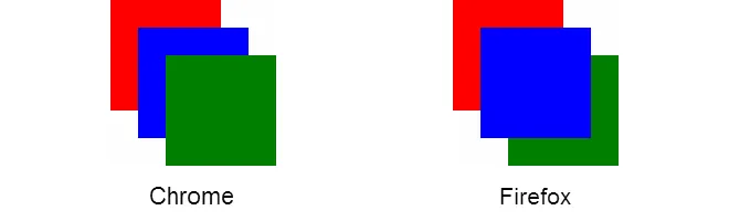
哪个是正确的?
看起来Chrome没有遵循W3C规范,这次更改是为了使桌面实现与移动实现匹配:
移动浏览器(Mobile Safari,Android浏览器,基于Qt的浏览器)将position:fixed元素放在自己的层叠上下文中已经有一段时间了(自从iOS5,Android Gingerbread等),因为它允许某些滚动优化,使网页对触摸更加响应。这个变化正在带到桌面,原因有三个:
1 - 在“移动”和“桌面”浏览器上具有不同的渲染行为是Web作者的绊脚石;CSS在可能时应该在所有地方都起作用。
2 - 对于平板电脑,不清楚“移动”或“桌面”堆栈上下文创建算法更合适。
3 - 将移动端的滚动性能优化带到桌面对用户和作者都有好处。
Firefox以正确的方式处理层叠。
如何获得所需结果
唯一能规避这种行为的方法是将 .el移出.parent,并将其改为同级:
body {
  margin: 0;
}
div {
  height: 100px;
  width: 100px;
}
.parent {
  background-color: red;
  position: fixed;
  top: 0;
}
.el {
  background-color: blue;
  left: 25px;
  position: fixed;
  top: 25px;
  z-index: 100;
}
.bodycontent {
  background-color: green;
  left: 50px;
  position: relative;
  top: 50px;
  z-index: 1;
}
<div class="parent"></div>
<div class="el"></div>
<div class="bodycontent"></div>