我想做的事情看起来很简单,但是我似乎无法弄清如何做。
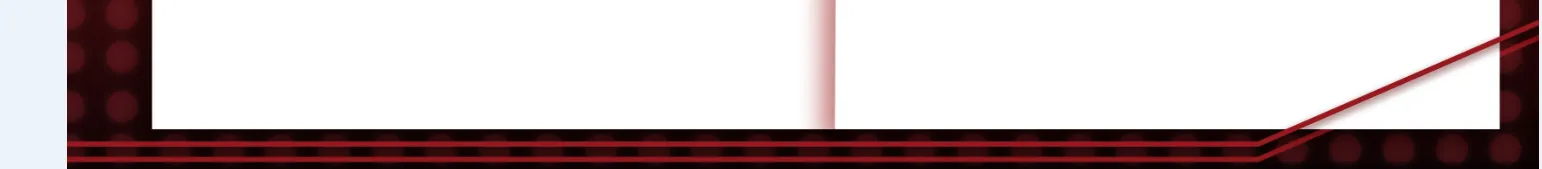
正如您在我的图片中所看到的,有几条红线横穿底部,然后向右侧弯曲。
CSS是否有一种方法可以画出这样的线条?
我想做的事情看起来很简单,但是我似乎无法弄清如何做。
正如您在我的图片中所看到的,有几条红线横穿底部,然后向右侧弯曲。
CSS是否有一种方法可以画出这样的线条?
要在 CSS 中创建倾斜线,可以使用 skew 变换(transform: skew(Xdeg))。以下是一个示例代码片段:
.shape {
  height: 50px;
  width: 200px;
  border-bottom: 2px solid red;
  border-right: 2px solid red;
  -moz-transform: skew(-45deg);
  -webkit-transform: skew(-45deg);
  transform: skew(-45deg);
}<div class="shape"></div>使用单个元素(以及几个伪元素)也可以实现在内容区域上方和下方都有双线,就像下面的代码片段中所示:
.shape:before {
  position: absolute;
  bottom: -5px;
  left: -5px;
  content: '';
  height: 50px;
  width: 100%;
  border-bottom: 3px solid red;
  border-right: 4px solid red;
  -webkit-transform: skew(-45deg);
  -moz-transform: skew(-45deg);
  transform: skew(-45deg);
}
.shape:after {
  position: absolute;
  content: '';
  bottom: -10px;
  left: 0px;
  height: 55px;
  width: 100%;
  border-bottom: 3px solid red;
  border-right: 4px solid red;
  -webkit-transform: skew(-45deg);
  -moz-transform: skew(-45deg);
  transform: skew(-45deg);
  z-index: -1;
}
.shape {
  position: relative;
  height: 80px;
  width: 400px;
  background: whitesmoke;
}<div class="shape">
Some text that goes within the element...
</div>linear-gradient。它在顶部的20像素处使用透明渐变,然后在其余内容所需的实际背景上使用。即使页面背景是图像或另一个渐变,这也可以起作用。 - Harry