有没有一种方法可以将行标签移动到 Plotly 热力图的右侧?

3
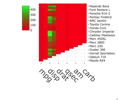
我想知道在plotly中是否有可能将行标签移动到热力图的右侧,而不是左侧,或者这不能在plotly中移动。
data<-as.matrix(mtcars)
data[upper.tri(data)] <- NA

library(plotly)
plot_ly(x=colnames(data), y=rownames(data), z = data,colors = colorRamp(c("red","green")), type = "heatmap") %>%
  layout(
    xaxis=list(tickfont = list(size = 30), tickangle = 45),
    margin = list(l = 150, r = 50, b = 150, t = 0, pad = 4))

您想把图例放在哪里? - pogibas
无论是左还是右,这都不是问题。 - firmo23
1个回答

3

为此,我们可以使用yaxis = list(side = "right")并使用colorbar = list(x = -0.4)调整颜色条的位置(您可能需要根据您的具体图表稍微调整一下这个值):

plot_ly(x = colnames(data), y = rownames(data), z = data,
        colors = colorRamp(c("red","green")), 
        type = "heatmap", colorbar = list(x = -0.4)) %>%
  layout(xaxis = list(tickfont = list(size = 30), tickangle = 45), 
         yaxis = list(side = "right"), 
         margin = list(l = 150, r = 50, b = 150, t = 0, pad = 4))

enter image description here


网页内容由stack overflow 提供, 点击上面的
可以查看英文原文,
原文链接