我有一个看起来像橙色正方形的 div
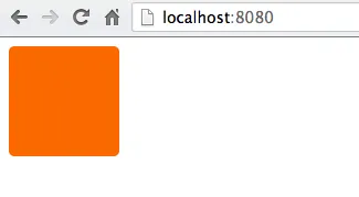
我想在这个 div 里面画一个白色 X,使它看起来更像

是否有办法在 CSS 中实现这个效果,还是直接在 Photoshop 上绘制并将图像用作 div 的背景会更容易?这个 div 代码只是这样的
div {
    height: 100px;
    width: 100px;
    background-color: #FA6900;
    border-radius: 5px;
}
我有一个看起来像橙色正方形的 div
我想在这个 div 里面画一个白色 X,使它看起来更像
是否有办法在 CSS 中实现这个效果,还是直接在 Photoshop 上绘制并将图像用作 div 的背景会更容易?这个 div 代码只是这样的
div {
height: 100px;
width: 100px;
background-color: #FA6900;
border-radius: 5px;
}
您需要一个被称为交叉符号的实体:
http://www.fileformat.info/info/unicode/char/274c/index.htm
它的代码是❌,它将显示为 ❌
如果您想要一个完美居中的交叉符号,像这样:
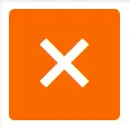
请尝试以下CSS:
div {
    height: 100px;
    width: 100px;
    background-color: #FA6900;
    border-radius: 5px;
    position: relative;
}

div:after {
    position: absolute;
    top: 0;
    bottom: 0;
    left: 0;
    right: 0;
    content: "\274c"; /* use the hex value here... */
    font-size: 50px;
    color: #FFF;
    line-height: 100px;
    text-align: center;
}
交叉标记实体在Safari或Chrome中无法显示。 然而,相同的实体在Firefox、IE和Opera中显示良好。
使用较小但形状类似的乘号实体×是安全的,它显示为×。
\D7(U+00D7),因此CSS代码应为content: "\D7";。 - Spyryto单元素解决方案: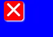
body{
    background:blue;
}

div{
    width:40px;
    height:40px;
    background-color:red;
    position:relative;
    border-radius:6px;
    box-shadow:2px 2px 4px 0 white;
}

div:before,div:after{
    content:'';
    position:absolute;
    width:36px;
    height:4px;
    background-color:white;
    border-radius:2px;
    top:16px;
    box-shadow:0 0 2px 0 #ccc;
}

div:before{
    -webkit-transform:rotate(45deg);
    -moz-transform:rotate(45deg);
    transform:rotate(45deg);
    left:2px;
}
div:after{
    -webkit-transform:rotate(-45deg);
    -moz-transform:rotate(-45deg);
    transform:rotate(-45deg);
    right:2px;
}<div></div>这是另一种纯CSS解决方案(即不使用图像、字符或其他字体),基于@Bansoa is the answer的答案。
我简化了它并添加了一些Flexbox魔法,使其具有响应性。
在此示例中,十字架自动缩放到任何正方形容器,并且要更改其线条的粗细,只需调整height: 4px;(为使十字架真正具有响应性,您可能需要将height设置为百分比或其他相对单位)。
div {
    position: relative;
    height: 150px; /* this can be anything */
    width: 150px;  /* ...but maintain 1:1 aspect ratio */
    display: flex;
    flex-direction: column;
    justify-content: center;
}

div::before,
div::after {
    position: absolute;
    content: '';
    width: 100%;
    height: 4px; /* cross thickness */
    background-color: black;
}

div::before {
    transform: rotate(45deg);
}

div::after {
    transform: rotate(-45deg);
}<div></div>transform: scale(1, 0.75); 的东西来缩放十字形状。它必须应用于 <div>。 - Neurotransmitter使用CSS渐变可以创建一个漂亮的X:

演示: https://codepen.io/JasonWoof/pen/rZyRKR
代码:
<span class="close-x"></span>
<style>
    .close-x {
        display: inline-block;
        width: 20px;
        height: 20px;
        border: 7px solid #f56b00;
        background:
            linear-gradient(45deg, rgba(0,0,0,0) 0%,rgba(0,0,0,0) 43%,#fff 45%,#fff 55%,rgba(0,0,0,0) 57%,rgba(0,0,0,0) 100%),
            linear-gradient(135deg, #f56b00 0%,#f56b00 43%,#fff 45%,#fff 55%,#f56b00 57%,#f56b00 100%);
    }
</style>
这是另一次尝试... 这次使用 ×。这个页面上很多例子对我来说只显示成一个框,但 × 是有效的
<div class="close"></div>
.close {
    height: 100px;
    width: 100px;
    background-color: #FA6900;
    border-radius: 5px;
}
.close:after {
    position:relative;
    content:"\d7";
    font-size:177px;
    color:white;
    font-weight:bold;
    top:-53px;
    left:-2px
}
× 实体的参考资料:http://www.fileformat.info/info/unicode/char/00d7/index.htm - Marc Audet<div id="orangeBox">
<span id="x">X</span>
</div>
#orangeBox {
  background: #f90;
  color: #fff;
  font-family: 'Helvetica', 'Arial', sans-serif;
  font-size: 2em;
  font-weight: bold;
  text-align: center;
  width: 40px;
  height: 40px;
  border-radius: 5px;
}
::before或::after)的答案都更值得推荐,因为这会与该答案相比在语义上更加正确。问题提问者选择了这个答案,表明可能缺乏理解...! - Netsurfer<input> 或 <button> 元素。如果不是,则纯粹是“表示性标记”。因此,在这两种情况下都是错误的。并且假设它仅用于表示目的,则应使用 CSS 实现,并且不向标记添加任何非内容元素。 - Netsurferdiv {
height: 100px;
width: 100px;
background-color: #FA6900;
border-radius: 5px;
}
div:after {
content: "X";
font-size: 2em;
color: #FFF;
}
#x{
    width: 20px;
    height: 20px;
    background-color:orange;
    position:relative;
    border-radius:2px;
}
#x::after,#x::before{
    position:absolute;
    top:9px;
    left:0px;
    content:'';
    display:block;
    width:20px;
    height:2px;
    background-color:red;

}
#x::after{
    -webkit-transform: rotate(45deg);
    -moz-transform: rotate(45deg);
    -ms-transform: rotate(45deg);
    -o-transform: rotate(45deg);
    transform: rotate(45deg);
}
#x::before{
    -webkit-transform: rotate(-45deg);
    -moz-transform: rotate(-45deg);
    -ms-transform: rotate(-45deg);
    -o-transform: rotate(-45deg);
    transform: rotate(-45deg);
}<div id=x>
</div>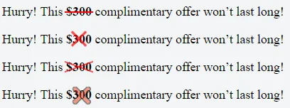
以下是 SCSS 代码(可以很容易地转换成 CSS):
$pFontSize: 18px;
p {
  font-size: $pFontSize;
}
span{
  font-weight: bold;
}
.x-overlay,
.x-emoji-overlay {
  position: relative;
}

.x-overlay,
.x-emoji-overlay {
  &:after {
    position: absolute;
    top: 0;
    bottom: 0;
    left: 0;
    right: 0;
    color: red;
    text-align: center;
  }
}

.x-overlay:after {
  content: '\d7';
  font-size: 3 * $pFontSize;
  line-height: $pFontSize;
  opacity: 0.7;
}

.x-emoji-overlay:after {
  content: "\274c";
  padding: 3px;
  font-size: 1.5 * $pFontSize;
  line-height: $pFontSize;
  opacity: 0.5;
}

.strike {
  position: relative;
  display: inline-block;
}

.strike::before {
  content: '';
  border-bottom: 2px solid red;
  width: 110%;
  position: absolute;
  left: -2px;
  top: 46%;
}

.crossed-out {
  /*inspired by https://www.tjvantoll.com/2013/09/12/building-custom-text-strikethroughs-with-css/*/
  position: relative;
  display: inline-block;
  &::before,
  &::after {
    content: '';
    width: 110%;
    position: absolute;
    left: -2px;
    top: 45%;
    opacity: 0.7;
  }
  &::before {
    border-bottom: 2px solid red;
    -webkit-transform: skewY(-20deg);
    transform: skewY(-20deg);
  }
  &::after {
    border-bottom: 2px solid red;
    -webkit-transform: skewY(20deg);
    transform: skewY(20deg);
  }
}
text-align: center;
font-size: 120px;
line-height: 100px;
color: white;
font-family: monospace;